
When you build a WordPress page with Gutenberg, you make dozens of design decisions every session. You choose your blocks, pick your fonts, set your column widths, and arrange your content. But here is the uncomfortable truth: most of your visitors will never read what you wrote. They will scan it. And the direction they scan follows a remarkably predictable path, one that researchers have been studying for decades. That path is called the F-Pattern layout.
Understanding the F-Shape Pattern is not just an academic exercise. It is a practical, evidence-backed framework that helps you design Gutenberg pages that align with how human eyes actually behave on screen. When your layout matches your reader’s natural scanning behavior, your content gets read, your calls to action get noticed, and your bounce rate drops. When it does not match, you lose people in the first few seconds.
This blog will walk you through what the F-Shaped Pattern is, the research behind it, how F Pattern web design applies specifically to Gutenberg block layouts, and what you can do today to design pages that work with your readers rather than against them.
TL;DR
| Key Takeaway | Summary |
| What is the F-Pattern? | A scanning behavior where users read in a horizontal sweep at the top, a shorter sweep lower, then scan vertically down the left side. |
| Who discovered it? | Nielsen Norman Group, through eye-tracking research first published in 2006 and updated in 2017. |
| Why it matters for Gutenberg | Block-based layouts give you precise control over where content lands — aligning key content with F-Pattern hotspots improves engagement. |
| Where to place important content | First two paragraphs, left-aligned headings, the first few words of every line, and the top of the left column. |
| Common mistakes to avoid | Burying key information in the center or right side, hiding CTAs below the fold, and using long, uniform paragraphs. |
| Gutenberg-specific tips | Use the Cover block for top-of-page impact, leverage Column blocks to create left-biased layouts, and front-load every heading and paragraph. |
| Does it apply to all pages? | Not always. The F-Pattern is most common on text-heavy pages. Image-heavy or task-focused pages may trigger different patterns. |
What Is F-Pattern Layout And Where Did It Come From
Before you can apply the F-Shape Pattern to your Gutenberg pages, you need to understand what it actually is and why researchers trust it. This section covers the origin of the concept and what the eye-tracking data really shows.
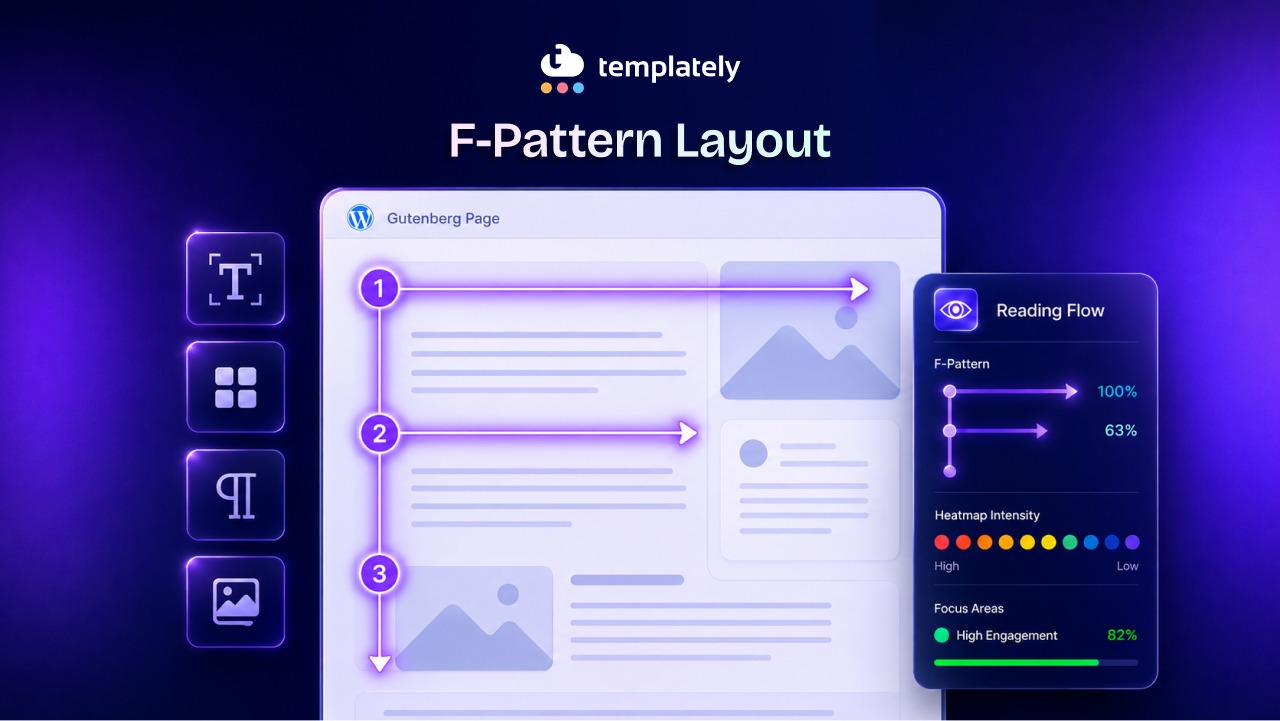
The F-Shaped Pattern was first documented by the Nielsen Norman Group, a leading UX research firm, in a 2006 study involving 232 participants who were tracked as they read web pages. Researchers tracked eye movements using specialized cameras and heat-map software. What emerged was striking: reading behavior on the web does not look like reading a book. It looks like the letter F.
Here is what the pattern actually involves:
- The first horizontal movement: Users make a full horizontal sweep across the top of the content area. This is where they take in headlines, hero text, and the opening of the first paragraph. It is the longest and most attentive scan of the entire reading session.
- The second horizontal movement: Users move down slightly and make another horizontal sweep, but it is shorter than the first. They typically read the beginning of the second paragraph or subheading, then stop before reaching the right edge.
- The vertical movement: After those two sweeps, users drop their gaze to the left side of the page and scan vertically downward, picking up on the first words of each line, subheadings, and bullet points along the left margin.
The result, when mapped onto a heat map, looks exactly like the letter F. The top bar is the first sweep, the middle bar is the second, and the vertical stroke runs down the left side.
In 2017, the Nielsen Norman Group revisited this research with updated eye-tracking data. They confirmed the F Pattern web design still holds, while also identifying related patterns like the spotted pattern, the layer-cake pattern, and the commitment pattern. Their conclusion was clear: the F-Shape Pattern remains the dominant reading behavior for text-heavy web content.
Why the F-Shape Pattern Matters Specifically for Gutenberg
Gutenberg is not just a text editor. It is a visual page-building system built on blocks, and that distinction changes how the F-Shaped Pattern affects your design decisions. This section explains the relationship between block-based design and eye-tracking behavior.
When WordPress moved to the Gutenberg block editor in version 5.0, it gave everyday site builders a level of layout control that previously required a page builder plugin or custom coding. With the latest version upgrades, you can now place content in columns, create full-width sections, control spacing with Spacer blocks, and anchor calls to action wherever you choose.
That level of control is exactly why the F-Shape Pattern matters more in Gutenberg than it did in the old classic editor. With a simple text editor, your layout options were limited. Every paragraph stacked on top of the next. The F-Shape Pattern applied, but there was not much you could do about it.
With Gutenberg, you have choices. You can place a strong call to action in the top-left of a two-column layout, or you can bury it in the right column. You can front-load your paragraph with a compelling hook, or you can bury the key point in the third sentence. Every block decision you make either works with the F-Shape Pattern or against it.
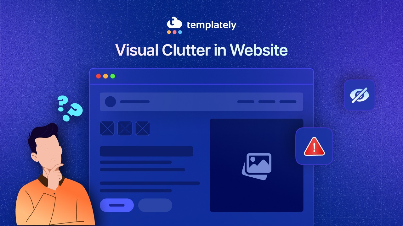
The danger in Gutenberg is that beautiful visual design can actually hurt content consumption. A centered, symmetrical layout looks polished and balanced. But it puts equal visual weight on both the left and right sides of the screen, which runs counter to how users scan. Content on the right side receives significantly less attention than content on the left, especially once readers move past the first sweep.
Breaking Down the F-Shaped Pattern: What Your Readers Actually See
Understanding the F-Pattern Layout at a conceptual level is a starting point. But to apply it effectively, you need to think through what happens at each stage of the reading process on a real Gutenberg page. Here is a step-by-step view.
Stage 1: The Critical First Sweep Across the Top
When a user lands on your Gutenberg page, their eyes go straight to the top of the content area. This is the most valuable real estate on your entire page. Research from the Nielsen Norman Group confirms that users spend 57% of their viewing time above the fold on a given page.
In Gutenberg terms, this means your hero section, your Cover block, your page title, and your opening paragraph carry enormous weight. The first sentence of your page must deliver value immediately. If it does, users engage with the second sweep. If it does not, they leave.
The first sweep also captures any large image, icon, or visual element placed at the top of the page. If you are using a full-width Cover block with an overlay and headline text, users will read the headline during this first sweep. Make that headline count.
Stage 2: The Second Sweep And the Decision Point
After reading the top of the page, users scan slightly downward and make a shorter horizontal sweep. This is often where the first subheading or the opening of the second paragraph sits on a typical Gutenberg blog post.
This is the decision point. At this stage, users are deciding whether to keep reading. They are looking for evidence that the page will answer their question, solve their problem, or give them something worth their time. A strong H2 or H3 heading placed in this zone does a huge amount of work.
This is also where the TL;DR section, a quick-benefit summary, or a formatted list of key takeaways performs extremely well. Readers who reach the second sweep and find a clear signal of value are far more likely to continue scrolling.
Stage 3: The Left-Side Vertical Scan
Once users move past the second sweep, they shift into skimming mode. Their eyes drift to the left side of the page and move downward, picking up the first few words of each paragraph, the text of subheadings, and the beginning of bullet list items.
In Gutenberg, this means your H2 and H3 blocks need to be left-aligned and front-loaded with meaningful keywords. Your paragraphs need to open with their most important information. And any element you place in the center or right side of the page during this phase will receive little to no attention.
This does not mean your right column is worthless. It means you need to use it strategically. Sidebar content like related links, newsletter signups, or secondary CTAs can live there, but your primary message should never depend on the right side of the screen.
How to Apply the F-Pattern in Your Gutenberg Page Design
Knowing the F Pattern web design theory is one thing. Applying it inside the Gutenberg editor is another. This section gives you concrete, actionable steps you can take right now to align your block layouts with natural reading behavior.
Front-Load Every Paragraph And Heading Block
The most impactful change you can make today costs nothing and requires no design skills. Simply rewrite the opening of every paragraph so the most important information comes first.
Instead of: “If you are looking for a way to increase conversions on your landing page, one approach that many designers overlook is the strategic placement of elements according to reading behavior research.”
Write: “Strategic content placement increases conversions. Reading behavior research shows that the first words of each paragraph get the most attention, so put your key point there first.”
The same rule applies to your Heading blocks. Start H2s and H3s with the keyword or core concept, not with a filler phrase. “Why Front-Loading Works” outperforms “The Reason Why Front-Loading Your Content Can Work for You.”
Use Left-Aligned Text And Heading Blocks
Gutenberg allows you to center or right-align text in any block. For decorative headings and pull quotes, centered text can look elegant. For body content and section headings, left alignment is almost always the right choice.
Left-aligned text anchors the reading experience on the left side of the screen, which is exactly where users scan during the vertical phase of the F-Shaped Pattern. Centered body text creates ambiguity about where each line begins, which slows reading and increases cognitive load.
Set your default block styles to left-align text. Reserve centered alignment for short, decorative elements like testimonial quotes, section dividers, or icon blocks where readability is not the primary concern.
Structure Your Column Blocks Around F-Shape Pattern Hotspots
Gutenberg’s Columns block is one of the most powerful tools in your layout arsenal. It is also one of the most commonly misused.
When you set up a two-column layout, the left column sits directly in the F-Pattern Layout’s vertical scan zone. That makes it the natural home for your primary content: your key benefits, your main call to action, your most persuasive copy. The right column is secondary territory. Use it for supporting information, social proof, images that add context, or supplementary links.
For landing pages and service pages, consider a 60/40 split with the wider column on the left. This gives your primary content more space and signals visual hierarchy to the reader.
Place Your Most Important CTAs Above the Fold in the F-Zone
Where you put your call to action is a strategic decision, not an aesthetic one. The F-Pattern Layout tells you that the most-viewed areas on your page are the top-left region and the opening of each content block.
Place your primary CTA either at the end of your opening paragraph (still within the first sweep zone) or at the top of a left-aligned column. Avoid placing your only CTA at the very bottom of a long page, especially if the page has not given readers a reason to scroll all the way there.
Gutenberg’s Button block can be positioned with full control. Pair a short, punchy benefit statement with a left-aligned or centered button near the top of the page, and repeat the CTA lower on the page for users who do scroll.
Use the Cover Block to Command the First Sweep
The Cover block in Gutenberg creates a full-width section with a background image or color, overlaid with text. When placed at the top of a page, it dominates the first sweep.
Use this block for your page headline and a single supporting subheadline. Keep the text concise, left-aligned or centered for visual balance at the top, and make sure the headline includes your primary keyword. This is the first thing users see, and it needs to answer the unspoken question: “Is this the right page for me?”
Utilize Whitespace with the Spacer Block
The white space is often overlooked, but it plays an important role in F-Pattern design. Whitespace between sections gives users’ eyes a natural resting point and signals a new content zone.
Without adequate spacing, content blocks blur together during the vertical scan phase. Users lose their place and stop reading. With deliberate spacing, each section feels distinct and readable.
Add Spacer blocks between major sections, especially between H2 headings and their opening paragraphs. This small change significantly improves scannability.
F-Pattern Layout Mistakes That Gutenberg Designers Commonly Make
Even experienced WordPress designers make layout mistakes that work against the F-Pattern design guide. Knowing what to avoid is just as important as knowing what to do. Here are the most frequent errors.
Hiding Key Information in the Right Column
This is the single most common F-Pattern design mistake in Gutenberg layouts. Designers set up a two-column block and place their most persuasive content in the right column because it looks balanced. But during the vertical scan phase, users rarely reach the right column. They are scanning down the left side.
If your right column contains your pricing, your primary benefit, or your contact form, reconsider the placement. Move primary conversion content to the left column and use the right column for supporting elements.
Using Long, Unbroken Paragraphs
Long paragraphs are invisible during a scan. When a user’s eye hits a wall of text during the vertical phase of the F-Pattern Layout, it simply slides past. Readers do not pause to parse a dense paragraph unless they are already deeply engaged.
Break your paragraphs into two to four sentences maximum. Each paragraph should contain one idea. The opening sentence of each paragraph does all the heavy lifting during the scan, so make it count.
Burying Subheadings Too Deep
Some Gutenberg page designs use subheadings sparingly, relying on strong paragraph writing to carry the content. This works in print. On screen, it fails.
Subheadings are F-Pattern anchors. During the vertical scan, they are the primary way users navigate a page and decide where to slow down and read. A page with only two or three H2 headings across 1,500 words will lose most of its scanning readers. Aim for a subheading every 200 to 300 words of body content.
Centering Everything
A fully centered layout can look clean and professional on a design mockup. On a live web page with real users, it disrupts the F-Pattern Layout completely. When every element is centered, users have no left-side anchor for their vertical scan. They end up reading less, not more.
Save centered alignment for decorative sections, hero text over images, and short testimonial blocks. Keep body content and section headings left-aligned throughout.
Ignoring Mobile Reading Patterns
Mobile devices change the F-Pattern web design significantly. On a narrow screen, column blocks collapse into a single column, and horizontal sweeps become much shorter. The F-Pattern design compresses into something closer to a vertical scan from the start.
In Gutenberg, preview every layout in mobile view before publishing. Make sure your most important content appears early in the collapsed column order. Use Gutenberg’s block visibility and responsive controls to adjust content order on smaller screens where needed.
Real-World Examples of F-Shape Pattern Done Right in Gutenberg
Applying theory to real page types helps clarify how the F-Pattern Layout works in practice. Here are three common Gutenberg page types and how each one can be optimized.
Blog Post Pages
A typical Gutenberg blog post starts with a title, then an opening paragraph, then body content with H2 and H3 subheadings. This structure is naturally aligned with the F-Pattern, but most posts still fail because they bury the value.
The best-performing blog post format opens with the most important insight in the first two sentences. It includes a scannable summary table or bullet list within the first scroll. It uses short paragraphs throughout and places subheadings every few paragraphs to anchor the vertical scan. Every subheading begins with a keyword-rich phrase.
Landing Pages
Landing pages built in Gutenberg often use the Columns block heavily for feature sections and testimonials. The risk here is spreading important content across both columns equally.
An effective landing page puts the headline and primary benefit in a full-width block at the top. Below that, it uses a left-heavy column layout for the main selling points. Social proof, like testimonials and logos, goes in a full-width block that interrupts the scan and reinforces trust. The CTA appears early, repeats in the middle, and appears again at the bottom.
Service Pages
Service pages often fail because designers treat them like brochures: dense paragraphs, centered headings, equal columns. Users come to service pages with a specific question: “Can this service solve my problem?”
Reframe the service page as a left-aligned, scannable document. Open with the problem statement (not the company story). Use short H2 headings that describe outcomes, not features. Place a CTA in the top-left region and another after the key benefits list.
How Templately Gutenberg Templates Are Built for Better Readability
If you are building pages in WordPress with the Gutenberg editor and want layouts that already align with proven reading patterns, starting with a well-designed template saves significant time and reduces guesswork.
Templately offers a large library of Gutenberg-ready templates built with real layout principles in mind. Rather than starting from a blank canvas and risking common F-Pattern layout mistakes, these templates give you a structured starting point with left-biased content placement, clear heading hierarchies, and visual flow that guides readers naturally through the page.
Whether you are building a blog post template, a landing page, or a full website pack, the block structures in Templately’s Gutenberg templates reflect the kind of thoughtful content hierarchy that keeps readers engaged. You can customize any template to match your brand and content while keeping the layout logic intact.
For designers and developers working with multiple clients, Templately’s ‘Cloud WorkSpace’ feature also lets you save your customized templates for reuse across projects, so you do not have to rebuild optimized layouts from scratch every time.
Design with the Reader’s Eye in Mind
The F Pattern design is not just a design trend. It is a behavioral reality backed by years of eye-tracking research and millions of real reading sessions. When you design your Gutenberg pages without the F-Shaped Pattern in mind, you are essentially asking readers to work harder to find the value you are offering. Most of them will simply leave instead.
The good news is that applying F Pattern design principles in Gutenberg is straightforward. Front-load your paragraphs. Left-align your content. Use subheadings frequently. Place your most important information in the top-left region of the page. Structure your column blocks so the primary content lives on the left. And never bury your CTA where the vertical scan cannot reach it.
When your layout works with your reader’s natural behavior instead of against it, every page you build performs better. More people read your content, more people click your calls to action, and more people convert.
If you are looking for a faster path to well-structured Gutenberg layouts, explore Templately’s Gutenberg template library and find a starting point that already has the right bones for reader-friendly design.
Was this blog helpful for you? Let us know in our Facebook Community. For more web design-related tips and tricks, subscribe to our blog.
Frequently Asked Questions
What is the F-Pattern Layout in web design?
The F-Pattern is a reading behavior pattern identified through eye-tracking research where users scan web pages in the shape of the letter F. They make two horizontal sweeps across the top of the content, then scan vertically down the left side. It was first documented by the Nielsen Norman Group in 2006 and remains one of the most influential findings in UX research for text-heavy web pages.
Does the F-Pattern Web Design apply to Gutenberg block layouts?
Yes, the F-Pattern applies directly to Gutenberg page layouts. Because Gutenberg gives designers precise control over block placement, column structures, and alignment, understanding the F-Pattern Layout helps you make smarter decisions about where to place headings, CTAs, and key content. Layouts that align with the F-Pattern tend to have better engagement and lower bounce rates.
Where should I place my call to action based on the F-Pattern Web Design?
Your primary call to action should appear in the top-left region of your page, within the zone covered by the first and second horizontal sweeps. In Gutenberg, this means placing your CTA button within or just below your opening paragraph, or at the top of a left-column block. Repeating the CTA further down the page is also recommended for users who scroll through the vertical phase.
Does the F-Pattern Layout change on mobile devices?
On mobile devices, the F-Pattern compresses significantly because the screen is narrow and horizontal sweeps are much shorter. Mobile reading behavior tends to be more of a direct vertical scan from the start. This makes it even more important to front-load every paragraph and heading with your key information. Always preview your Gutenberg layouts in mobile view and adjust block order as needed for smaller screens.
Is the F-Pattern the only reading pattern on the web?
What is the F-Pattern Layout in web design?
The F-Pattern is a reading behavior pattern identified through eye-tracking research where users scan web pages in the shape of the letter F. They make two horizontal sweeps across the top of the content, then scan vertically down the left side. It was first documented by the Nielsen Norman Group in 2006 and remains one of the most influential findings in UX research for text-heavy web pages.
How many subheadings should I use to support F-Pattern scanning?
As a practical guideline, aim for one H2 or H3 subheading every 200 to 300 words of body content. This gives users’ eyes enough anchor points during the vertical scan phase to navigate the page efficiently. Each subheading should start with the most important word or phrase, not a filler introduction. In Gutenberg, use the Heading block set to H2 for major sections and H3 for subsections within those areas.