
Design tokens are one of the simplest ideas behind a scalable website, yet they solve some of the biggest design and development problems teams face. Instead of hardcoding values like #0055FF, 16px, or 8px across dozens of files, teams assign those decisions meaningful names and reuse them everywhere. That small shift creates consistency, speeds up updates and makes websites easier to maintain as they grow.
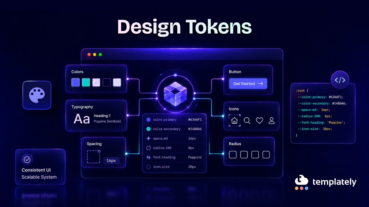
If you have ever wondered what design tokens are, the short answer is this: they are named values for visual decisions such as color, spacing, typography, shadows, motion, and borders. Modern websites depend on them because they help design and code stay aligned, especially when brands, themes, components, and platforms all need to work together.
TL;DR
Design tokens may sound technical at first, but the concept is easy to grasp once you see them in action. They act like a shared vocabulary between design and development, turning scattered visual choices into a structured system. The table below gives a quick summary before we dive deeper.
| Topic | Quick Summary |
| Design tokens meaning | Named values for design decisions like colors, spacing, typography, and shadows |
| What are design tokens | A system for storing reusable visual choices in a consistent, scalable way |
| Why websites use them | They improve consistency, speed up updates, support theming, and reduce maintenance |
| Common examples | color-primary, space-200, font-size-body, radius-small |
| Main types | Primitive tokens, semantic tokens, and component tokens |
| Best use cases | Large websites, design systems, multi-theme products, multi-team workflows |
| Less useful when | Very small, simple projects with limited UI variation |
| How to manage them | Define naming rules, centralize values, map semantics, document usage, and maintain governance |
What Are Design Tokens?
At their core, design tokens are named variables that store design decisions. Instead of repeating raw values everywhere, teams define reusable tokens that represent how a brand or interface should look and feel. This makes updates more predictable and keeps the visual language consistent across pages, components and themes.
Even if you have never used the term “design token,” you have likely used them already. Elementor‘s Global Colors, Global Fonts, Gutenberg’s Global Styles and modern design systems all rely on token-like principles. When you update a global color and see that change reflected across multiple pages, you are benefiting from the same idea behind design tokens.
In practical terms, design tokens simply mean replacing hardcoded values with meaningful names. Rather than manually setting a button text color to #FFFFFF in every instance, a team might use a token like color-text-inverse. That token can then point to a specific value behind the scenes.
A simple example
Imagine a website uses the same blue for primary actions:
- Raw value: #2563EB
- Token name: color-brand-primary
Instead of writing #2563EB again and again, the website references color-brand-primary.
The same happens with spacing:
- Raw value: 16px
- Token name: space-400
And typography:
- Raw value: 20px
- Token name: font-size-heading-md
So if the brand color changes or the spacing scale gets updated, the team changes the token once rather than hunting through dozens or hundreds of files.
A Basic Token Example in Code
Here is a basic token example in code version below. If you are not a developer, do not worry about the syntax. The example below simply shows how a named token can be reused instead of repeating design values manually.
:root {
–color-brand-primary: #2563EB;
–color-text-inverse: #FFFFFF;
–space-400: 16px;
–radius-md: 8px;
}
.button-primary {
background-color: var(–color-brand-primary);
color: var(–color-text-inverse);
padding: var(–space-400);
border-radius: var(–radius-md);
}
Source of code example: Atlassian — Use tokens in code
That is the easiest way to understand design tokens’ meaning: named values that make design decisions reusable, readable, and easier to scale.
Why Are Tokens Important?
Tokens matter because modern websites are no longer a handful of static pages. They are living systems with components, states, themes and updates happening constantly. Without a shared token structure, design choices become inconsistent fast, and maintenance gets expensive.
This is why design system tokens are now central to product teams. They reduce guesswork, support collaboration and make design updates ripple through the product in a controlled way instead of creating visual drift.
They Create Visual Consistency
When every team member uses the same token names, the website looks more unified. Buttons, links, headings, cards and alerts all pull from the same foundation instead of being styled differently by accident.
Example:
If every success message uses color-background-success and color-text-success, the UI stays visually consistent across checkout flows, dashboards, and forms.
They Make Updates Easier
A token lets you change a value once and apply it everywhere. That is far more efficient than updating hardcoded colors, spacing, or font sizes across multiple files or components.
Example:
If your brand refresh changes the primary blue to a slightly deeper shade, updating color-brand-primary instantly affects every element using that token.
They Improve Collaboration Between Design And Development
Tokens create a shared language. Designers define the intended visual decisions and developers implement those same decisions in code without translating vague style notes again and again.
Example:
Instead of saying “use that slightly muted gray from the card title,” teams can align on color-text-subtle, which is clearer and less error-prone.
They Support Themes And Modes
Design tokens are especially powerful when a website supports light mode, dark mode, seasonal themes, accessibility modes, or brand variations. The token names stay stable while the underlying values change by theme.
Example:
color-background-surface can point to white in light mode and a dark gray in dark mode, without requiring developers to rewrite every component.
They Reduce Long-term Design And Technical Debt
When websites grow without tokens, small inconsistencies pile up. Different shades of gray, random spacing values and slightly mismatched button styles eventually make the interface harder to scale and more costly to fix.
Example:
A site with ten different spacing values for nearly identical card layouts will be harder to maintain than one using a spacing token scale like space-100, space-200, space-300, and space-400.
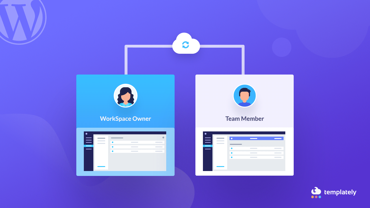
How Design Tokens Relate to WordPress Websites
For WordPress users, tokens are not just a design-system idea from large product teams. They map directly to how modern WordPress sites manage colors, typography, styles, templates and reusable patterns. If you build with the block editor or a visual builder, you are already working in token-like systems more often than you may realize.
That is why design tokens are especially relevant for WordPress-focused teams. They support cleaner site-wide styling, more consistent templates, and easier updates across reusable components, which is exactly the kind of structure growing content sites and template libraries benefit from.
Gutenberg Global Colors
In Gutenberg, a theme can define a color palette through theme.json and WordPress converts those presets into CSS custom properties. In practice, this behaves very much like a token system: colors are named, stored centrally, and reused throughout the editor and front end. That means a palette change can carry through the site more systematically than ad hoc styling.
Global Styles in WordPress
WordPress Global Styles gives site owners and theme authors a structured way to control typography, spacing, colors, and more through theme.json. Because those settings affect both the editor and the rendered site, they act like a common language between configuration and output. That is one of the clearest examples of token thinking inside the WordPress ecosystem.
Design Systems for WordPress
A WordPress design system becomes much stronger when it is built on named values rather than disconnected style choices. Whether you are creating a starter theme, a block library, or a site framework, tokens make it easier to keep the visual rules stable across posts, patterns and custom templates. This matters even more when multiple people contribute to the same website over time.
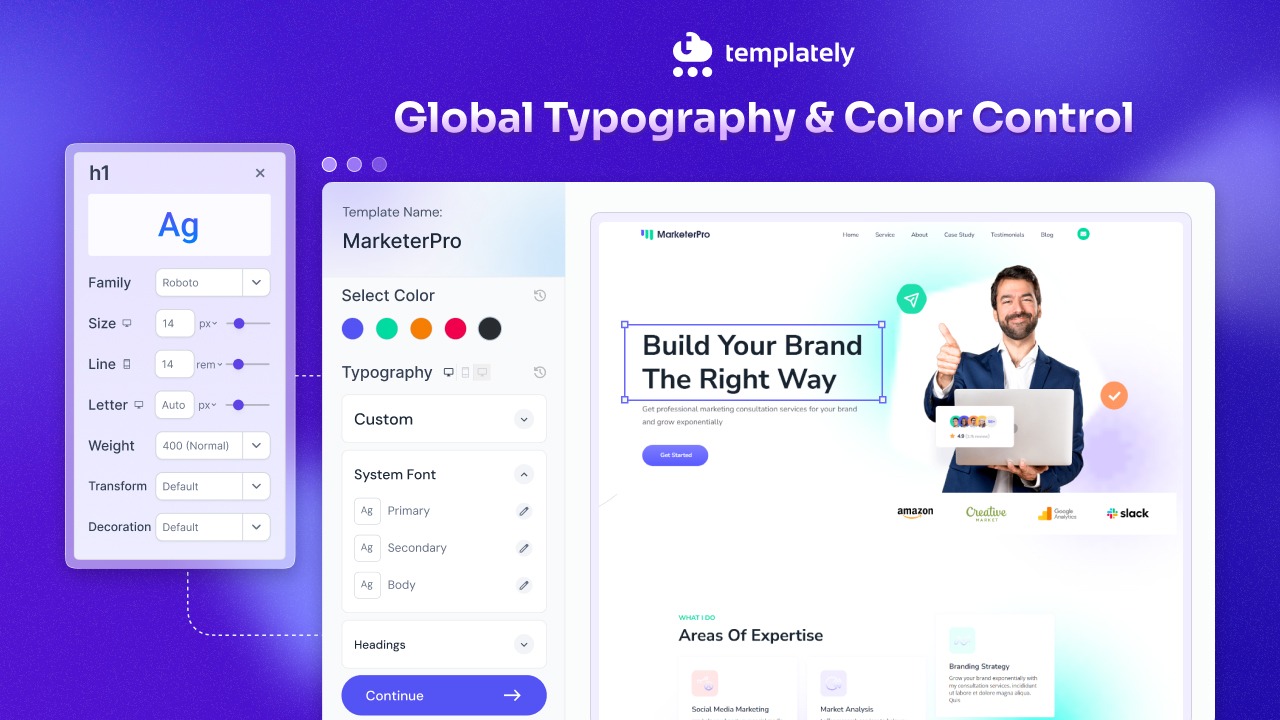
Elementor Global Colors & Typography
Elementor’s global style controls show another token-style workflow in action. Its design system supports Global Colors and Global Fonts, including default primary, secondary, text and accent roles, which can be inherited by controls across the site. That makes it easier to keep sections, widgets, and text styles consistent without manually redefining them over and over.
Reusable Templates And Design Consistency
Reusable patterns and template parts are where tokens prove their long-term value. In WordPress, patterns can be bundled into themes and template parts can be reused across multiple templates, keeping common sections aligned. When those reusable assets also rely on shared token logic for color, spacing and type, consistency becomes much easier to maintain at scale.
When Will Tokens Be More Helpful And When Won’t They?
Design tokens are not just useful for enterprise products. They can benefit many digital products, but their value becomes most obvious when complexity starts to rise. The more components, contributors, themes, and screens a website has, the more helpful the tokens become.
That said, not every project needs an elaborate token architecture on day one. The smartest approach is to match the token system to the scale and complexity of the product rather than over-engineering a simple website.
Tokens are especially helpful when:
- Your website has many reusable components: If buttons, forms, cards, modals, tables, and navigation elements appear throughout the site, tokens keep them aligned.
- You support multiple themes or modes: Light mode, dark mode, seasonal campaigns, brand variants and accessibility adjustments all become easier to manage.
- Several designers or developers work on the same product: Tokens reduce inconsistency when multiple people contribute to the same system.
- Your product exists across platforms: If the same product appears on web, iOS, Android, or internal tools, tokens help unify the experience.
- You expect ongoing design changes: Frequent updates become more manageable when visual values are centralized.
Tokens may be less necessary when:
- The site is very small and static: A five-page brochure site with minimal UI complexity may not need a full token strategy.
- There is only one simple theme and a tiny component set: If the design is unlikely to evolve much, a lightweight setup may be enough.
- The team is overcomplicating the system: Creating hundreds of tokens for a very simple interface can slow everyone down instead of helping.
A good rule of thumb: use enough tokens to create consistency and flexibility, but not so many that the system becomes hard to understand.
Types of Design Tokens
Not all tokens do the same job. A useful token system usually has layers, with each layer serving a different purpose. This structure helps teams organize values in a way that is reusable, meaningful and adaptable.
Understanding these layers is key to designing tokens, explained practically. Most systems group tokens into primitive, semantic, and component-level categories.
Primitive Tokens
Primitive tokens are the raw building blocks. They store base values without attaching specific UI meaning to them.
Examples:
- blue-500: #2563EB
- gray-900: #111827
- space-400: 16px
- radius-200: 8px
These are useful because they define the base scale of your design system, but on their own they do not explain where they should be used.
Semantic Tokens
Semantic tokens add meaning to primitive values. They describe purpose rather than appearance.
Examples:
- color-text-primary
- color-background-surface
- color-border-subtle
- space-layout-section
A semantic token might point to gray-900 for text in light mode and a lighter tone in dark mode. That means the usage stays the same even if the value changes.
Component Tokens
Component tokens are tied to a specific UI component or pattern. They help when a design system needs more control at the component level.
Examples:
- button-primary-background
- button-primary-background-hover
- card-padding-default
- input-border-focus
These are especially useful in large systems where shared semantics are not enough to cover unique component behavior.
Typography Tokens
Typography tokens define font families, sizes, weights, line heights, and letter spacing in a reusable way.
Examples:
- font-family-base
- font-size-body-md
- font-weight-semibold
- line-height-heading-lg
These make text styling far more consistent across headings, body copy, labels, and UI elements.
Spacing Tokens
Spacing tokens create a rhythm for margins, padding, gaps, and layout spacing. They prevent teams from using arbitrary values that slowly clutter the UI.
Examples:
- space-100: 4px
- space-200: 8px
- space-300: 12px
- space-400: 16px
Color Tokens
Color tokens are often the first type of team to adopt. They cover text, backgrounds, borders, icons, states and interactive elements.
Examples:
- color-text-primary
- color-background-brand
- color-border-danger
- color-icon-success
Motion And Elevation Tokens
These tokens handle transitions, animations, shadows and depth. They help keep interactions and layering consistent.
Examples:
- motion-duration-fast
- motion-easing-standard
- shadow-card-default
- shadow-modal-raised
How to Manage Design Tokens in a Website?
A token system only works well when it is managed with intention. Without structure, naming discipline and documentation, tokens can become just as messy as the hardcoded values they were meant to replace. Good management is what turns a token list into a usable system.
For websites, this usually means creating a central source of truth, mapping tokens clearly and making sure both designers and developers understand how to use them. Below are five practical ways to manage tokens effectively.
1. Start with a Clear Naming Convention
Token names should be understandable, predictable and scalable. A good naming system helps teams know what each token does without guessing.
Good examples:
- color-text-primary
- space-300
- button-primary-background-hover
Avoid vague or purely visual names when meaning matters. A token like blue-bright is less helpful than color-link-default if the purpose is linking behavior.
2. Separate Raw Values from Semantic Meaning
One of the smartest ways to manage tokens is to keep primitive values separate from semantic usage. This creates flexibility when themes or brand updates happen.
Example:
- Primitive: blue-500
- Semantic: color-action-primary
- Component: button-primary-background
This layered approach means your system can evolve without breaking the logic of how tokens are used.
3. Centralize Tokens in One Source of Truth
Tokens should live in a central, structured location so everyone works from the same set of decisions. That could be a token file, a design system repository, or a synced workflow between design and code.
If one team is updating colors in a design file while another team is hardcoding old values in CSS, the system will drift quickly. Centralization prevents that.
4. Document Usage, Not Just Values
A list of token names is not enough. Teams also need guidance on when to use each token and when not to use it.
For example:
- Use color-text-primary for default body text
- Use color-text-muted for supporting copy
- Do not use color-danger just because it “looks right” on a banner unless the content actually represents an error or destructive state
Documentation reduces misuse and keeps tokens meaningful.
5. Plan for Themes, States And Growth
A website may start small, but token systems should leave room for expansion. Think ahead about hover states, dark mode, accessibility needs, or future brand variations.
Example areas to plan for:
- Default, hover, active, and disabled states
- Light and dark mode mappings
- Layout density variations
- Campaign or brand-specific overrides
A manageable token system grows in layers rather than being rebuilt every time the product changes.
Common Mistakes to Avoid with Design Tokens
Even a well-intentioned token strategy can become messy if teams use tokens without enough structure. The goal is not to create the most tokens possible. The goal is to create the right tokens for the system you actually need.
Avoiding a few common mistakes can keep your token architecture cleaner, easier to maintain, and more useful over time.
Using Tokens Based Only on Appearance
Choosing a token just because the color looks right can cause problems later, especially across themes.
Bad approach:
Using a successful green token for a decorative icon because it matches visually.
Better approach:
Use a token whose meaning matches the context, such as color-icon-accent or color-icon-brand.
Creating Too Many One-Off Tokens
If every component variation gets a new token without a clear reason, the system becomes bloated. Not every property needs a custom component token.
Mixing Naming Styles
A token set becomes confusing fast when one part uses primaryBlue, another uses color-primary, and another uses btn-bg-main. Consistency matters as much as the values themselves.
Skipping documentation
Skipping documentation is one of the fastest ways for a token system to lose clarity over time. Even if the token names look clean at first, people will still interpret them differently unless there is guidance on what each token is meant to do. A name like color-text-secondary may seem obvious, but one team might use it for supporting copy, while another might apply it to disabled text, captions, or metadata. Over time, that inconsistency weakens the system and makes the interface harder to standardize.
Good documentation should go beyond listing names and values. It should explain the purpose, usage context, examples and any limits around where a token should or should not be used. That way, teams are not just picking tokens that “look right” in the moment. They are choosing tokens based on intended meaning, which is what keeps the design system stable as the website grows.
Treating Tokens As Developer Concern
A lot of teams make the mistake of thinking design tokens only matter once work reaches code. In reality, tokens are most effective when they are shaped jointly by design and development from the beginning. They are not simply variables for implementation; they are structured design decisions that define how a product expresses color, spacing, typography, motion and hierarchy.
When tokens are handled only by developers, the system can become too technical and disconnected from design intent. On the other hand, when only designers define them without technical collaboration, the tokens may be difficult to implement consistently in production. The strongest systems come from shared ownership: designers help define meaning and usage, while developers help ensure tokens are scalable, maintainable and practical across real components, themes and platforms. That shared approach is what turns tokens from a naming exercise into a reliable system.
Choose Your Design Tokens Today
Design tokens are the foundation of a modern, scalable interface. They turn scattered visual choices into a shared system that helps websites stay consistent, flexible, and easier to maintain. Whether you are managing a simple design language or a large multi-theme product, tokens reduce friction between design intent and coded reality.
So if you are still asking what design tokens are, think of them as the smallest units of a design system with the biggest long-term impact. They give structure to colors, spacing, typography, and components, making websites easier to update today and easier to scale tomorrow. That is exactly why modern websites depend on them.
If you have found this blog helpful, share your opinion with our Facebook community. You can subscribe to our blogs for valuable tutorials, guides, knowledge, tips and the latest updates.