
Web design is shifting from decoration to behavior. The trends that define 2026 are less about surface styling and more about how a site responds to visitors, how quickly it delivers content, how well it works for every user, and how respectfully it treats attention and data. Across the Elementor web design trends in this guide, the common thread is that design decisions are increasingly judged by performance and by the experience they create, not by how a page looks in a screenshot. The stronger the underlying structure, design system, content and accessibility, the more these trends compound into a website that simply feels right.
This guide unpacks the 15 most important Design Trends on every serious designer’s radar in 2026. Each entry explains what the trend actually means, shows real-world examples of brands and sites doing it well, and gives you practical, no-code steps to implement it inside Elementor, the most widely used WordPress page builder on the planet. Whether you’re a freelancer shipping client sites, an agency, or a business owner running your own website, you’ll close this post with a clear, prioritized checklist for modern, conversion-ready Web Design.
1. Organic Shapes, Gradients & Anti-Grid Layouts
The rigid twelve-column grid is loosening. In 2026, the most distinctive WordPress web design feels sculpted rather than stacked: irregular blob shapes, layered gradients, wavy dividers and sections that deliberately break the grid with overlapping, off-axis elements. The goal is to humanize the digital, to replace the cold feel with something warmer and more organic.
AI and wellness brands lead this direction: think flowing gradient blobs behind hero headlines, asymmetric card clusters and bento-style panels with rounded, blob-masked imagery. Even B2B SaaS sites are softening dashboards with gradient accents and playful spacing instead of hard-edged boxes.
Elementor makes anti-grid design surprisingly easy. Use ‘Shape Dividers’ to add fluid transitions between sections, apply gradient backgrounds to Containers and mask images with organic border-radius values. Overlap elements with custom-positioned containers so sections intentionally collide rather than align and apply a soft gradient fill to a headline for an instant 2026 feel.
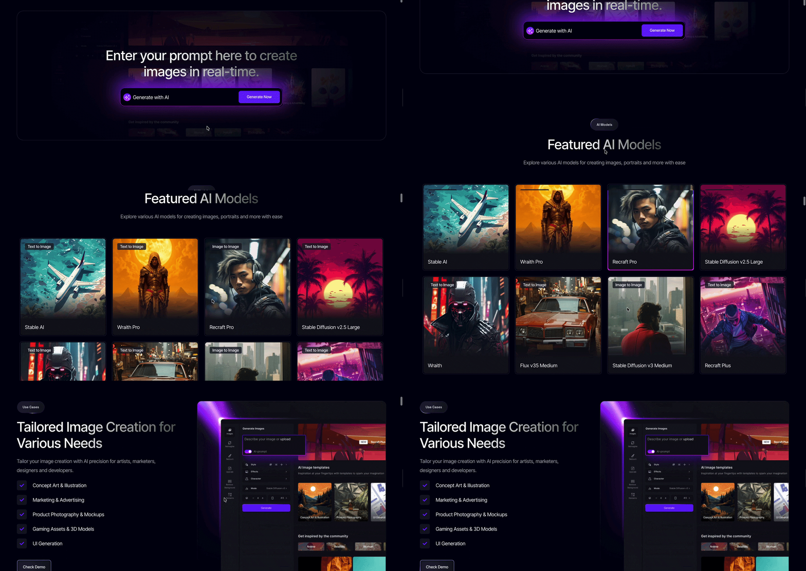
Do not hand-build all of this from scratch; modern template clouds already ship these layouts. Templately’s library of 6,500+ ready-made WordPress templates, with AI-powered matching, is a fast shortcut: import an organic, gradient-rich kit and customize instead of starting from a blank canvas.
2. Agentic Web Experiences: Sites That Act, Not Just Sit
Websites are learning to do things, not just show things. Agentic web experiences use AI agents that understand intent and take action: a concierge that books your appointment, a support agent that tracks your order and preemptively offers a return label, a search bar that answers instead of listing links.
This is the fastest-moving trend on the list. Industry research already shows a dramatic shift toward agent-building: 51% of Figma users working on AI products now report they’re building agents, up from just 21% the previous year.
What it means for design: your site’s “conversation surface” becomes a design asset. Layouts must accommodate chat interfaces, smart search bars and dynamic content regions where an agent can inject answers. On the WordPress side, agentic tools are arriving natively; Elementor’s AI assistant Angie automates content and product updates, while the Elementor One platform positions the site as a hub that connects data, content, and commerce.
Examples in the wild: a WooCommerce store whose agent keeps stock-linked pages automatically updated, or a service business whose booking flow coordinates with an assistant to fill calendar gaps. The old job description of a website, “display information,” is being replaced by a new one: “get things done.”
3. AI as Creative Co-Designer (Prompt → Partner)
Early AI design tools were one-shot generators: type a prompt, get an image or a block of copy, done. The 2026 evolution is subtler and far more powerful: AI is becoming a creative partner that iterates with you, critiques your layout, suggests refinements, and learns your brand’s style.
The data backs the shift. In a survey of 906 designers across five global regions, 72% said they now use generative AI in their workflows, and 91% reported it improves the quality of their output — not just their speed. Designers who increased their AI usage were also 25% more likely to report growing job satisfaction.
In practice, prompt-to-partner looks like this: instead of typing “make a hero section,” you sketch the hero, then prompt the AI to propose three layout variants with better CTA placement. It becomes a design critic and production assistant wrapped in one.
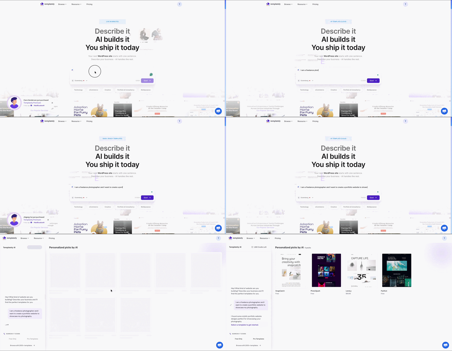
Inside Elementor, AI is now woven into the editor itself: AI copywriting that matches your tone, AI image generation, smart layout suggestions, and even automated A/B section variations generated from best practices. And Templately’s AI site builder takes the partnership further: describe your business in one sentence, and the AI scans its template cloud for the best match, writes your content and personalizes the design, turning the entire build into a dialogue rather than a search.
4. Design Tokens & CSS-First Design Systems
Consistency at scale is 2026’s silent superpower. Design tokens are named, reusable variables like primary brand color, large spacing, medium radius, that store every color, font, spacing and shadow decision in one place. Change the token, and the entire site updates. This is the scalable language of modern websites, and it’s becoming standard practice across design teams worldwide.
Why it matters: hardcoded colors and pixel values create inconsistency across pages and turn rebrands into nightmare projects. Tokens guarantee that “primary blue” is the same blue in the header, the button and the footer, always.
The CSS-first movement makes tokens the technical backbone: instead of layout tools fighting against CSS, the editor becomes a thin layer on top of clean, predictable styles.
Elementor has fully embraced this direction. Global Colors and Global Fonts let you define site-wide values once; the new Variables Manager provides a centralized workspace to view, create, and manage design variables; and the CSS-first Editor V4 architecture with its reusable Classes system brings true component-based design systems to WordPress. Paired with Grid Containers that map to native CSS Grid, you can hand developers a clean, token-driven foundation instead of spaghetti CSS.
5. Micro-Interactions & Motion Design: Function Over Flash
Motion design grew up. The 2026 rule is simple: animation must earn its place by making the interface clearer, not louder. Decorative parallax and gratuitous bounces are out; purposeful micro-interactions are in.
Functional animation includes: buttons that confirm an action with a checkmark, hover states that preview content, accordions that ease open so users keep their place, scroll progress indicators that orient long pages and skeleton loaders that reduce perceived waiting time.
In Elementor, use the Transform & Transition controls on widgets: a card that lifts and casts a shadow on hover, a button with a gradient sweep and an image that gently zooms on scroll. Motion Effects add scroll-triggered movement, while Entrance Animations with staggered delays create a layered reveal without heavy JavaScript.
The craft constraints matter: keep interactions between 150 and 300 milliseconds, respect the visitor’s reduced-motion preference, and sequence animations so they tell a story instead of competing. Function over flash is not a slogan; it is a performance budget for your interface’s attention.
6. Hyper-Personalised Web Journeys
In 2026, the strongest WordPress Web Design adapts in real time: content, offers, and layouts shift based on who’s visiting, where they are, what they’ve browsed, and where they sit in the funnel.
Examples: a first-time visitor sees a welcome offer; a returning shopper sees recently viewed products and a loyalty discount; a UK visitor sees UK pricing and local events; a logged-in member skips the signup wall entirely.
Technically, this sits on dynamic content and conditional logic. Elementor’s dynamic content lets you populate fields from WordPress data, while conditional display logic shows or hides widgets based on user state, device, or custom rules. That powers scenarios like: show the registration form only to logged-out users, or swap the hero for a first-visit offer; no duplicated pages needed.
The design side matters too. Personalization should feel like a thoughtful host, not surveillance. Pair it with consent-first data practices and clear privacy messaging, and hyper-personalization becomes trust-building rather than creepy.
7. Immersive Brand Storytelling
The story-led homepage is 2026’s answer to attention scarcity. Instead of talking about features, leading sites open with a narrative: who the brand is, why it exists and how it changes the customer’s day, told through layered visuals, motion, and pacing.
A short product demo loop in the hero outperforms three paragraphs of copy, and a consulting site with a clear value proposition and polished visual hierarchy beats a text-heavy homepage every time. Immersion means guiding the eye and building emotion, not overwhelming with effects.
This is the trend where motion and storytelling fuse. Scrollytelling, a narrative that unfolds as the user scrolls, keeps engagement high when executed with restraint. Imagine a logistics company whose scroll journey starts with “the problem” (a map of delays) and resolves with “the solution” (their network lines animating into place), or a skincare brand that layers texture, color, and testimonial moments into a sensory scroll.
In Elementor, story-led pages are practical to build. Use Sticky Containers so key visuals follow the reader, add Ken Burns motion to background images, layer video with gradient overlays, and use Scroll Effects to animate elements in sequence. Templately’s collection of story-led and landing-page kits gives you a narrative skeleton in minutes; drop in your brand assets and rewrite the beats. The result: visitors feel something and feeling drives trust.
8. Accessibility as a Creative Default
Accessibility stopped being a checklist and became a design principle. In 2026, inclusive design is the starting point of every layout decision, contrast is chosen first, keyboard flows are designed alongside visual flows, and semantic HTML is treated as architecture rather than an afterthought.
There is legal and cultural pressure behind it: the European Accessibility Act now applies across the EU, and WCAG conformance is increasingly written into procurement contracts. Compliance is no longer optional for public-facing sites.
What “creative default” looks like in practice: headings that form a logical outline before any styling is applied; color palettes validated for contrast at the design stage; focus states visible on every interactive element; alt text and captions written with real consideration; and motion that respects reduced-motion preferences. Sites that do this well look cleaner because an accessible structure usually produces better hierarchy.
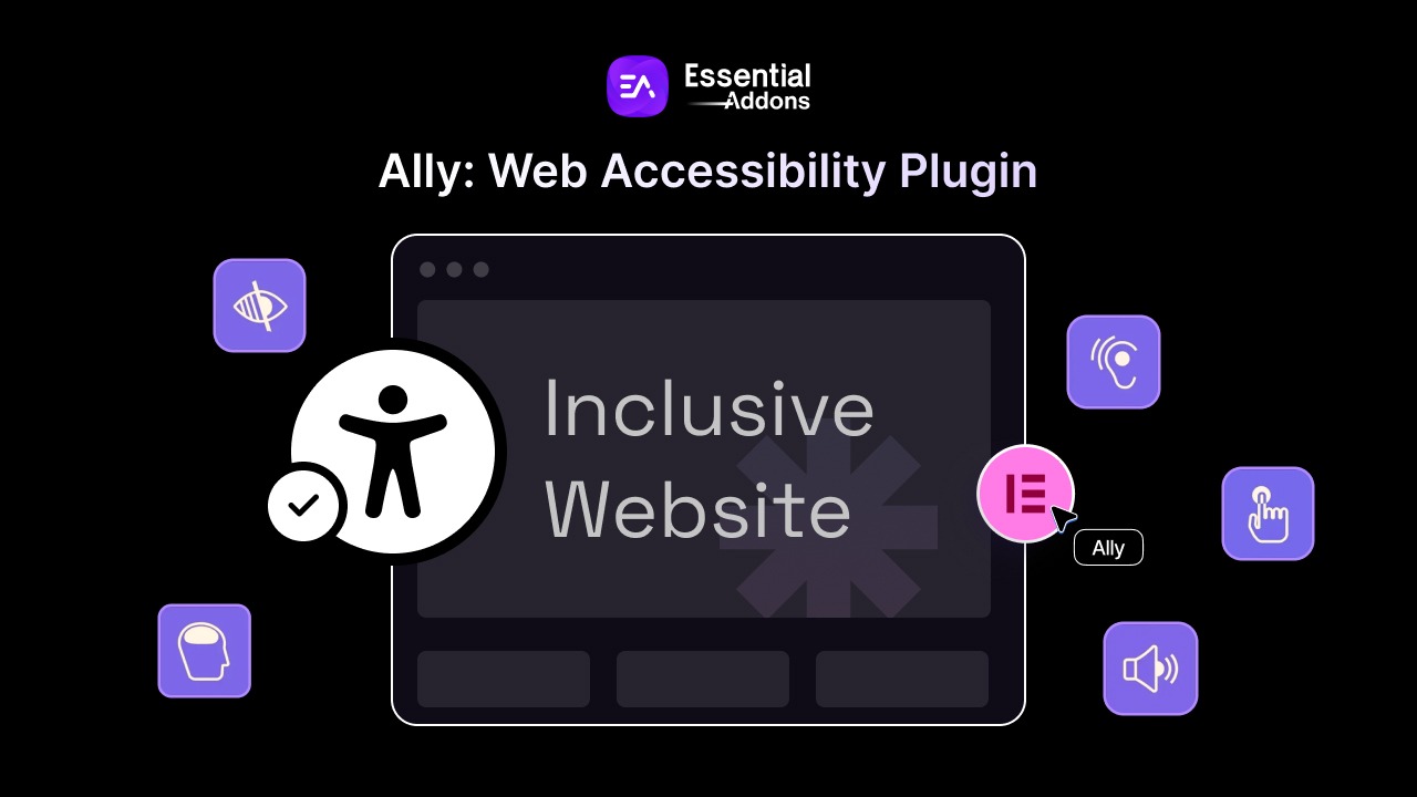
Elementor has built accessibility into the workflow: built-in accessibility audits scan for missing alt text, contrast problems and structural issues; semantic HTML output and improved keyboard navigation are core; and a usability widget lets visitors adjust text size, contrast, and spacing themselves. Designers are also advised to preview sites in both light and dark modes and verify legibility under each.
The creative payoff is real: accessible sites convert better, reach dramatically more people, and rank higher. Design for everyone and everyone, including search engines and AI crawlers, reads your content more easily.
9. Bold Typography & Asymmetrical Layouts
Type is having a maximalist moment. Huge, confident headlines, often filling the entire viewport, are the fastest way a 2026 site signals modern design. Paired with asymmetric layouts, bold typography creates editorial energy: oversized serif accents, expressive variable fonts and deliberate white space arranged off-center.
Consumer brands set the pace: Glossier and Samsung lean into oversized, expressive type, and editorial-style asymmetry gives their pages the feel of a printed magazine rather than a web template.
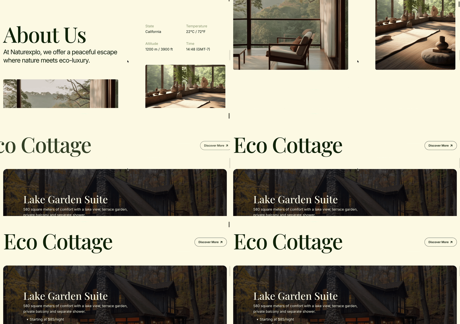
In Elementor, bold typography is straightforward: set fluid font sizes so headlines scale gracefully between mobile and desktop, use Global Fonts to keep type consistent across the site, and pair one display font with a utilitarian body font for contrast. For asymmetry, use Containers with custom alignment to offset columns, overlap blocks, and create tension that guides the eye from headline to call-to-action.
The rules keep it functional: keep line lengths readable at roughly 45–75 characters per line, maintain generous line-height for oversized type, and ensure contrast, especially when big type sits over imagery. Use uppercase sparingly, since it reduces readability at length. A good benchmark: one bold statement typeface, one workhorse body font, and a clear size scale defined in your design tokens.
10. Glassmorphism & Neumorphism
Two sibling aesthetics refuse to leave the 2026 scene and they are maturing from novelty into restraint.
Glassmorphism is the frosted-glass look: translucent panels with backdrop blur, subtle borders and soft highlights that make content feel layered over color. It is particularly popular in SaaS dashboards, pricing cards, and hero sections on vibrant gradient backgrounds.
UI elements that appear extruded from the background using two shadows, one light, one dark, rather than borders. Think soft, raised buttons and cards that look touchable.
In Elementor, a glass card is a two-minute build: a container with a semi-transparent background, a border at reduced opacity, and a backdrop blur effect. Neumorphic buttons come from shadow presets, a light top-left shadow plus a darker bottom-right shadow, with no border. Subtle versions work best: full-page glassmorphism hurts readability, but a glass navigation bar over a vivid hero, or glass pricing cards over a gradient section, hits the sweet spot.
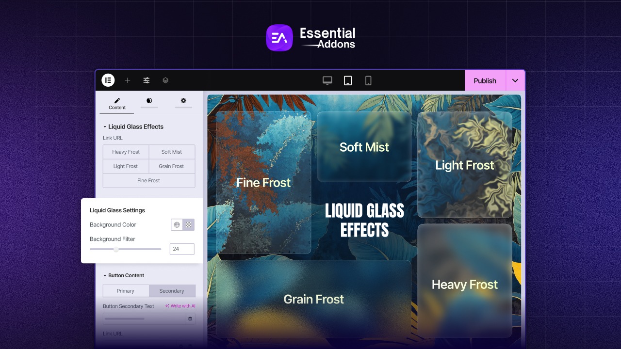
Accessibility caveat: translucent surfaces reduce contrast, so pair glass with solid, high-contrast text and always test over busy backgrounds. Use these styles as accents on top of strong base typography, not as the whole design.
11. Dark Mode as an Expectation
Dark mode is becoming a more common design consideration. Users increasingly prefer dark interfaces; YouTube, X and Slack all default to or heavily promote dark themes and 2026 sites are designed for both worlds from day one.
The trend connects to personalization and accessibility: honoring a visitor’s system color preference signals that your brand respects their environment.
Designing for both modes is where design tokens shine: define every color as a token, then swap the token values per theme. The layout, typography, and spacing stay identical; only the values change. That is dramatically easier than maintaining two separate designs.
In Elementor, you can preview your site in both light and dark modes during the design phase to catch contrast failures early. Use global color variables so a dark palette becomes a settings change rather than a per-widget rebuild. Practical rules: avoid pure black (#000), use dark grays instead; keep enough contrast for text on dark surfaces; and test every image and section over both themes. A dark hero with neon accents over a light content body is a low-risk, high-impact pattern that reads as premium in 2026.
12. Sustainable & Ethical Web Design
The green wave has reached web design. Sustainable web design treats every kilobyte as a cost, a lighter page consumes less energy, loads faster on weak connections, and emits less carbon per visit. It is better for the planet and better for your Core Web Vitals at the same time.
Sustainable practices in 2026: serve compressed images in modern formats at the right size, lazy-load below-the-fold media, prefer system or self-hosted fonts over third-party font services, avoid autoplaying video, and cut redundant scripts. Ethical design goes further: no dark patterns, honest pricing, transparent data practices and privacy-respecting analytics.
In Elementor, sustainability is largely a settings discipline: enable lazy loading, load Google Fonts locally to remove external requests, compress images before upload, and keep page templates lean. A fast, lightweight page is also an SEO win; every performance gain multiplies across thousands of page views.
13. Performance-First Creativity
Speed is now a creative constraint and great constraints produce great work. Performance-first creativity means building beautiful pages within a strict performance budget instead of optimizing after the fact. Core Web Vitals remain the scoreboard:
- Largest Contentful Paint under 2.5 seconds
- Interaction to Next Paint under 200 milliseconds
- Cumulative Layout Shift under 0.1.
The stakes are commercial. Slow sites bleed conversions and rankings, mobile visitors abandon slow-loading pages quickly, and search engines rank fast pages first. But performance-first isn’t “boring design”: the fastest sites in their categories, from cloud platforms to design tools, prove that speed goes hand in hand with stunning visuals.
What changed in the WordPress space: modern builders treat performance as architecture. Elementor’s recent releases emphasize CSS-first rendering, local font loading, and leaner DOM output. Good 2026 practice includes image CDNs with responsive srcset, critical CSS, lazy loading below the fold, and avoiding heavy slider plugins in heroes; a single well-composed image or video loop outperforms a flashy carousel that wrecks LCP.
A practical workflow: build the design, audit with PageSpeed Insights and Lighthouse, set a budget (for example, “hero ships under one second”), and let that budget drive your asset choices. Beautiful and fast is not a compromise; it is the only viable design trend.
14. The Connected Stack
Your website is no longer a destination; it is a hub. The connected stack trend treats the site as the center of a system that links CRM, email marketing, booking, payments, analytics, and automation. Every action on the site triggers activity elsewhere and every external system feeds back into the experience.
For WordPress, this means API-connected experiences: a booking form that syncs a provider’s calendar, an eCommerce store that updates inventory across channels, a lead form that drops straight into a CRM and fires an email sequence and live chat that hands off to a support desk. WordPress’s maturity here is a genuine advantage; the platform is built for integrations.
In Elementor, the connected stack is built from forms plus integrations: connect forms to CRMs and email providers through native integrations or webhooks, use dynamic content to pull live data into your pages and surface real-time inventory, pricing, or availability to visitors. Add conditional display logic so that system data, like a customer’s plan level, changes what they see.
The design implication: pages must accommodate live data and thoughtful empty states, and your “website” becomes a thin, beautiful layer over an always-synced business brain. Complete site packs with pre-connected structures, forms, sections, and flows give you a coherent base to wire integrations onto from day one.
15. Designing for AI Search
The search landscape just changed shape: AI overviews, conversational assistants and LLM chat experiences now answer questions that used to click through to websites. Designing for AI search means making your content the answer and giving humans a reason to visit anyway.
Practical moves: structure content with semantic HTML and a proper heading hierarchy, because AI systems read documents, not designs; write summary-first paragraphs so the key point arrives in the first sentence; publish clear FAQ blocks that map to real questions; implement structured data such as FAQ and Organization schema; and avoid burying value behind JavaScript, login walls, or auto-playing media.
The bigger shift is strategic. Summaries can be generated by AI; what can not be replicated is your original data, your unique experience, your proprietary research and your demonstrated authority. The 2026 winners publish primary-source content, original benchmarks, real case studies and expert opinions, rather than rewrites of everyone else’s page.
For Elementor sites, treat your FAQ section as an AI-facing asset with schema markup, and let your WordPress Web Design present expertise visually: author bios, real results, and original media signal trust to both algorithms and humans.
An SEO plugin built for AI search, like ThinkRank, handles the technical side of this. It generates an llms.txt file, turns your FAQ blocks into FAQ schema, and shows how many visitors reach your site from ChatGPT, Perplexity, Claude and Gemini.
Your 2026 Web Design Checklist
If 2026 has one message, it is this: design trends have pivoted from aesthetics to behavior. The sites that win aren’t the prettiest;, they are the fastest, most accessible, most personal, most agent-ready and most honest.
Where to start today:
- Set up design tokens (Global Colors, Global Fonts, Variables Manager) before touching a single page.
- Run an accessibility audit on your homepage and fix contrast and keyboard flow.
- Test your Core Web Vitals and cut the heaviest asset on the page.
- Add one functional micro-interaction (button feedback) and one personalization rule (a first-visitor offer).
- Structure your content for AI search with a summary-first intro and FAQ schema.
Start Building Your Website Today
Don’t rebuild from scratch. Templately’s AI template cloud matches 6,500+ WordPress-ready templates to your business in seconds, writes your content, and personalizes the design, a 2026-standard starting line instead of a blank canvas. From there, connect the interaction layer with Essential Addons for Elementor, the most popular Elementor addon, trusted by 1 million+ creators across 180+ countries. The tools to act on these trends are available today, and the direction is clear. Publishing to this standard is increasingly what a credible web presence looks like, not a differentiator, but the default.
Have you found this blog useful? If you do, please subscribe to our blog for more design tips, guides, and more. Also, don’t forget to join our Facebook Community and share which fonts you have liked most.