We’re halfway through the year, and we have learned about a plethora of design practices and trends to follow in 2026, as well as common mistakes in design that should be avoided. So, if creating a new website or revamping an existing one with modern styling is on your to-do list, then you must watch out for common design mistakes. We have highlighted the design errors that need to be avoided at the present time. Let’s check them out.

4 Dominating Web Design Trends of the Year
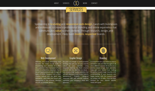
Keeping up with the latest trends in web design is the best way to make sure your website stands out from the competition. When you are all set to build or revamp a website and avoid common design mistakes, the first and foremost thing is to learn about the newest design trends and how to align your design plans accordingly. Here we are mentioning the most dominant ones.
Use of Blurred Backgrounds
Since iOS 7 was released in the summer of last year, designers have been utilizing it as a constant source of inspiration. The growing popularity of blurred backgrounds is one really awesome trend that has resulted from this.
The backgrounds are blurry because the current interface is supposed to be overlaying the previous one—think frosted shower doors or the idea of looking through glass. Since many of these backgrounds produce really amazing-looking nonlinear gradients, it is actually a pretty cool trend.
Add More Scrolling Less Clicking
According to web design researchers, there is a rise in users’ preference for scrolling over clicking. That would account for the success of single-page websites or even just lengthy pages. A lengthy page narrative is frequently the result of fusing user experience with storytelling. Websites will continue to experiment with that more and more, applying different scroll effects. Not that these pages will just scroll to the bottom of the internet; we believe that websites will test out scrolling before breaking them up into separate pages.
Big Font Typography
Typography has always been a matter of interest when it comes to web design and can have major impacts on the look and layout of a web page. These have also been growing in popularity due to the growing support for SVG icon fonts. Large, massive typefaces incorporated into designs come to mind when I think about typography on the internet. Although they are elegant, daring, and stunning, they are more than that. The amazing people at Iconic are presently revolutionizing icon typefaces by attempting to make icons responsive.
Use of Simple Colours in Web Design
Bold and vibrant hues have become increasingly popular in the past year. But there are also delicate color schemes that employ extremely light color palettes. Basically, when I discuss this tendency, I want you to think of Google. They employ a lot of light grays and tiny pops of color that represent their brand across their user interface to give the websites a clean, airy feel.
Common Design Mistakes to Avoid: Guide to Build or Revamp Your Website
Now that you know how to design your present website or would-be website for the best practices, then now you need to focus on which common design mistakes to avoid. Let’s check out the common design mistakes in web design and how to avoid them smartly.
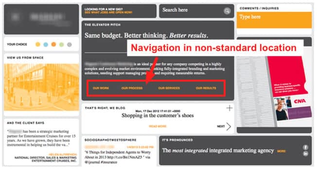
Common Design Mistake 1: Poor Navigation Layout
If you compare your website to a map, it would need to have clear navigational instructions that can take users to where the contact form, blog page, pricing, etc. are located, etc. Without these basic navigation instructions, your users will get lost, can’t reach their destination, and, most importantly, will increase the bounce rate!
However, many websites forget to design user-friendly navigation. It is considered one of the most common design mistakes. When designing a new website or redesigning an existing one, it is important to consider which pages are most frequently visited and to prioritize those.
Solutions to Fix Navigation Bar
- Make the hypertext on your website obvious; use a different color, boldface, or underlining to distinguish a hyperlink from regular text.
- For sidebar navigation, main header, design differently based on user data.
- Use a simple, short naming convention for the hyperlinks.
- Make sure the website is mobile-friendly in terms of navigation.
- Put buttons only on Calls to Action.
Common Design Mistake 2: Too Many Ads Running in the Back
Having too many ads is clearly a problem. The content you want visitors to read during their brief visit to your website may be overshadowed by excessive advertisements and promotions. Visitors also steer clear of anything that appears to be an advertisement. According to Nielsen Norman Group, an evidence-based provider of user experience research, training, and consulting, this is a very common design mistake known as “Banner Blindness.”

Solutions To Fix Too Many Ads
- No element should appear noticeably different from the others, and each element should have a clearly defined theme.
- Visitors will assume a headline is an advertisement without even reading it if it appears overly detached from the other elements on the page. So, try to avoid this.
- Go for popup ads, not harming the website’s appearance.
Common Design Mistake 3: Not Responsive for All Devices
Another common design mistake is not making the website responsive for all devices, The design needs to be consistent and responsive across browsers and devices to offer an omnichannel experience. One of the biggest mistakes made when building websites is not planning separate user experiences and roadmaps for different platforms and devices, such as for mobile or tablet views. This can lead to your design breaking into other-sized devices. Keeping everything as consistent as possible across all platforms should be the aim.
Solutions to Fix Mobile Responsive Issues
- A mobile-first approach should be taken into consideration when creating a new website. Make sure that everything on the website works perfectly on mobile devices. Next, go on to gadgets like laptops, tablets, and other gadgets with bigger screens.
- Give careful thought to creating excellent user interfaces (UX/UI) for mobile devices.
- Media Queries and CSS3 Modules are tools that web developers can use to hide, reveal, move, or change the size of the content per screen resolution and device size.
Common Design Mistake 4: Not prioritizing accessibility
Treating accessibility like an afterthought is the number one common design mistake you can make. A few years back, accessibility wasn’t an important need. But now in an era of inclusivity, we want to make every online material accessible for all kinds of people.
Accessibility design mistakes can happen easily by putting insufficient color contrast, not adding alt text in images, overlooking names or labels, etc. Your site will rank higher and be more visible if you correct these simple mistakes in website design.
Solutions to Fix Accessibility on Website
- Take a look at your website’s accessibility using the WAVE Web Accessibility Evaluation Tools.
- Choose neutral colors as your website’s primary colors. So that color blinds can easily read and see.
- Try to add alt text everywhere.
- Arrange your headings in order
Here is Elementor design guide to improve your website’s accessibility and inclusivity.
Common Design Mistake 5: Too Much or Too Little Spacing
One of the most popular trends in web design lately is minimalism. However, there are moments when we forget how much white space is appropriate. And that brings us to the most common design mistake: maintaining either too little or too much space.
It is common to come across excessively cluttered websites, which makes it difficult to focus on any one piece of information, much less the most important one. Most frequent explanations for not setting website elements properly. If you don’t research what elements are must-haves and what are not, you may make this spacing mistake.
Solutions to Fix Spacing Issues in Website Design
- One very useful tip is to group related sentences together and then create some white space (a heading and a subheading, for example) around the group.
- Minimalist web design is the finest. Take some time to narrow down your website’s content to just what is necessary.
- Use white space after representing important elements on site. It makes websites appear cleaner and facilitates user navigation. It improves browsing and makes it simpler for your audience to read content.

For later research: More web design mistakes you should avoid
Avoid Website Design Mistakes And Boost Your Online Presence 🚀
It takes talent and hours of trial and error to create a website that best captures your company’s vision and mission or professional brand. However, it does not take a highly skilled team or a large budget to design an interface that is both aesthetically pleasing and functional, even for beginners who have not yet built their first website.
By avoiding common website design mistakes, you’ll boost your site’s credibility and offer visitors an experience they’ll want to come back to. Have you found this article useful? Then don’t forget to share and subscribe. 👍