What is white space in design? Well, before we dive deep in, let us ask you a question. When you visit a website, what catches your attention first? Most people would say colors, images, or text. But an invisible hero is working behind the scenes. It is the empty space around all those elements. We call it white space and it is one of the most powerful elements in a designer’s toolkit.
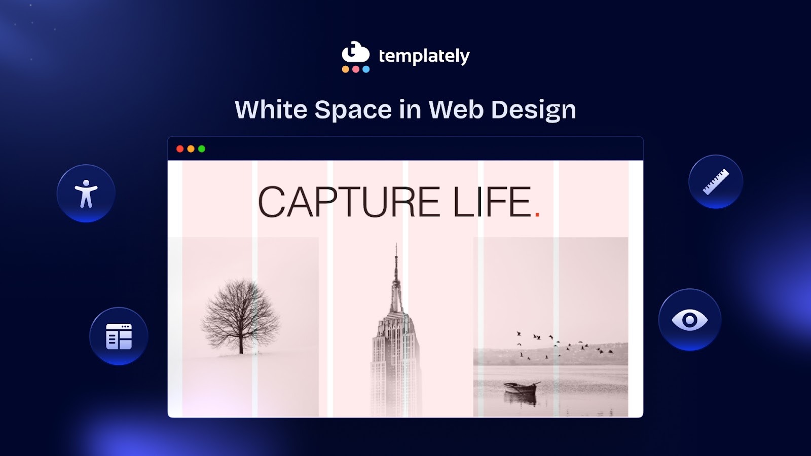
White space in a website is the area between design elements that remains empty. It is a conceptual term and does not literally mean white. It is the space that gives structure and focus to a design. Think of it as breathing room for your website. And just like we need air to breathe, websites need white space to function effectively.
Why White Space in Web Design Matters And How Does It Work?
Imagine walking into a room crammed with furniture, posters on every wall, and objects covering every surface. You would feel overwhelmed. Your brain would not know where to focus first. Now picture a minimalist room with a few carefully placed items. You immediately notice each piece because it has space to stand out.
Let us get practical about return on investment. Does white space actually impact business metrics? The answer is yes.
Enhances User Attention And Comprehension
The same principle applies to web design. White space gives your content room to breathe. It helps users process information without feeling bombarded. Studies have shown that proper use of white space can increase comprehension. That is a significant jump just from adding some emptiness.
When you reduce clutter on a page, something magical happens. Users can focus on what truly matters. Their eyes naturally flow from one element to the next. They do not have to work hard to find what they are looking for. This creates a pleasant browsing experience that keeps people engaged longer.
Studies have shown that increasing white space around text and titles can increase user attention. When users pay more attention, they retain more information. This leads to better brand recall and higher conversion rates.
Establishes a Brand Identity
Every brand has its own personality. Your use of white space should reflect that brand identity. Luxury brands command premium prices partly because of their generous use of white space in marketing materials. The space creates perceived value. If you are selling high-end products or services, white space is not optional; it is essential for positioning.
eCommerce sites that improved their white space usage have reported increases in conversion rate. That is a significant boost without changing what you are selling or your prices. You are simply making it easier for users to make decisions.
Tech companies often use lots of white space to appear modern and innovative. Fashion brands use it to convey elegance. Media sites use it more sparingly to pack in content while maintaining readability. There is no one-size-fits-all approach.
Consider your audience’s expectations. B2B software users might expect a clean, spacious interface that looks professional. Gaming website visitors might prefer a more energetic, densely packed layout. Understanding your users helps you make smart spacing decisions.
Your brand’s visual complexity should influence your white space strategy. If you use bold colors, patterns, or detailed illustrations, you need more white space to balance that complexity. If your brand is already minimal, you can push the boundaries of extreme simplicity.

Improves Site Loading Speed
Loading times can actually improve with better white space usage. How? By removing unnecessary elements. When you embrace white space, you often realize you do not need that extra sidebar, those decorative graphics, or those redundant text blocks. Fewer elements mean faster load times and better performance.
Remember that white space trends change over time. What looked modern five years ago might feel dated now. Generally, we are trending toward more white space, not less. Clean, spacious designs continue to win user preference tests.
Gives Users “Breathing Room”
Too much content cluttered together can overwhelm the eyes and brain. White space creates rest areas on the page, helping users feel relaxed and focused. Even if the content is the same, adding space around it makes the page feel calmer and easier to navigate.
Directs Focus Where It Matters
Big spaces around elements (called macro white space) guide users’ attention. By separating sections or highlighting key areas, you tell users naturally where to look first. Apple’s website is a great example—its clean layouts make it clear what is important.
Organizes Content Logically
White space helps group related elements together, following the Law of Proximity from Gestalt psychology. Items that are close together look related, while space separates unrelated items. Using margins and gutters in your layout makes your design feel neat and logical, even without extra labels. Next, we will talk about the psychology behind white space and how it guides user behaviour to know more about its importance.
The Psychology Behind Empty Space And How It Guides User Behavior?
Our brains are constantly processing visual information. When faced with too much input at once, we get cognitive overload. Website white space acts as a buffer. It gives our minds micro-breaks between processing different pieces of information.
There is also a perception of luxury attached to white space. High-end brands like Apple, Chanel and Tesla use generous amounts of empty space in their designs. This is not accidental. Space implies exclusivity and sophistication. It says, “We do not need to shout for your attention. Our quality speaks for itself.”
White space also builds trust. A cluttered website often looks spammy or unprofessional. Clean layouts with proper spacing signal that a company is legitimate and values user experience. When users trust your site, they are more likely to take action, whether that is to make a purchase, sign up for a newsletter, or share your content.
Let us talk about how empty space actually drives action. It is a design element that directs attention and influences decisions.
Creating Visual Hierarchy
White space establishes relationships between elements. When items are grouped closely together, we assume they are related. When there is more space around an item, it stands out as more important. This is called the principle of proximity, and designers use it constantly.
Consider a product page. The product image might have generous space around it. The “Add to Cart” button sits in its own zone with breathing room. These strategic gaps tell users exactly where to look and what to do next. Without saying a word, the design guides behavior through spacing alone.
Reducing Decision Fatigue
When users face too many choices at once, they often choose nothing. Psychologists call this the paradox of choice. White space helps combat this by limiting what’s visible in a user’s immediate field of vision.
An eCommerce site might display four products per row instead of six. The extra space between items makes each product easier to evaluate. Users spend more time considering each option rather than feeling overwhelmed by an endless grid. This often leads to higher conversion rates despite showing fewer products at once.
Drawing Eyes to Call-to-Action Buttons
Your call-to-action (CTA) button is often the most important element on a page. You want users to click it. White space makes this happen by creating isolation. When you surround a CTA with empty space, it becomes impossible to ignore.
Look at Dropbox’s homepage. Their sign-up button sits in a sea of white space. Your eyes go straight to it. There is no competition for attention. This simple technique can dramatically increase click-through rates.
Types of White Space In Web Design
Not all website white space is created equal. Understanding the different types helps you use them more effectively. Below are the types of white space that will help you understand better about white spaces.
Macro White Space
This refers to the big-picture spacing. It is the empty area between major sections of your page, the margins around your content, and the space in your layout’s structure. Macro white space shapes the overall feel of your site. It determines whether your design feels cramped or open.
A landing page might have large blocks of white space separating the hero section from the features section. This creates clear chapters in your content story. Users can mentally process one section before moving to the next.
Micro White Space
This is the smaller, more detailed spacing. It includes the space between lines of text, the padding around buttons, and the gaps between list items. Micro white space affects readability and usability on a granular level.
Increasing line height (also called leading) by just a few pixels can make text significantly easier to read. Adding padding inside buttons makes them look more clickable and prevents accidental taps on mobile devices. These small adjustments accumulate into a much better user experience.
Active White Space
This is white space added intentionally for a specific purpose. You deliberately leave areas empty to direct attention, create balance, or establish rhythm. Active white space is strategic and purposeful.
When you add extra space above a headline to make it stand out, that’s active white space. When you increase the gap between your product description and customer reviews to separate different types of content, you’re using active white space.
Passive White Space
This is the natural spacing that occurs from your design choices. It’s the space between words, the margins around images, and the default padding in your layout. Passive white space happens automatically, though you can adjust it.
While passive white space might seem less important, it still plays a crucial role. Poor management of passive white space, like text running too close to the edge of a container, can undermine your entire design.
Real-World Examples of White Space in Website Design
Now that you know about white space in web design, let us look at how successful companies use white space to drive action.
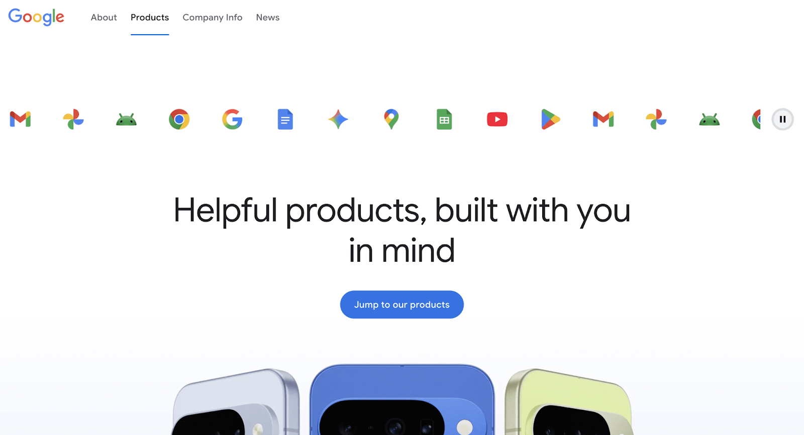
Google’s web pages are famous for their simplicity. A logo, a search bar, and mostly empty space. This radical minimalism focuses users on one action: searching. There are no distractions, no competing elements. The white space makes Google’s search box the undisputed star of the page.
This design philosophy has contributed to Google’s dominance. Users can accomplish their goal in seconds without confusion. The white space does not just look good; it removes friction from the user journey.
Pittsburgh Zoo & PPG Aquarium Logo

The Pittsburgh Zoo logo uses white space creatively. At first glance, you see the white tree and flying birds. On closer look, a gorilla and a lion appear in the negative space. This clever use of white space makes the logo memorable and gives visitors a delightful “hidden surprise,” leaving a strong first impression.
Medium

Medium, the blogging platform, understands that people come to their site to read. Their article pages feature wide margins, generous line spacing and ample padding around text blocks. This creates an immersive reading experience that feels more like a book than a website.
The white space reduces eye strain and helps readers maintain focus for longer periods. This keeps people on the platform longer and increases engagement with content. It is a perfect example of white space serving a functional purpose while looking aesthetically pleasing.
Circa 1886’s Hero Image Gallery
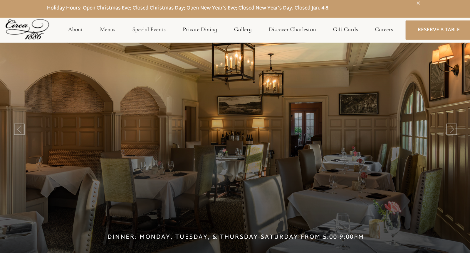
Circa 1886 showcases its dishes with hero images that let the food shine. White plates, linens, and clear glassware frame each dish, keeping the focus on the main subject. By minimizing distractions, white space emphasizes the food and creates a clean, elegant visual experience.
Apple’s Product Pages
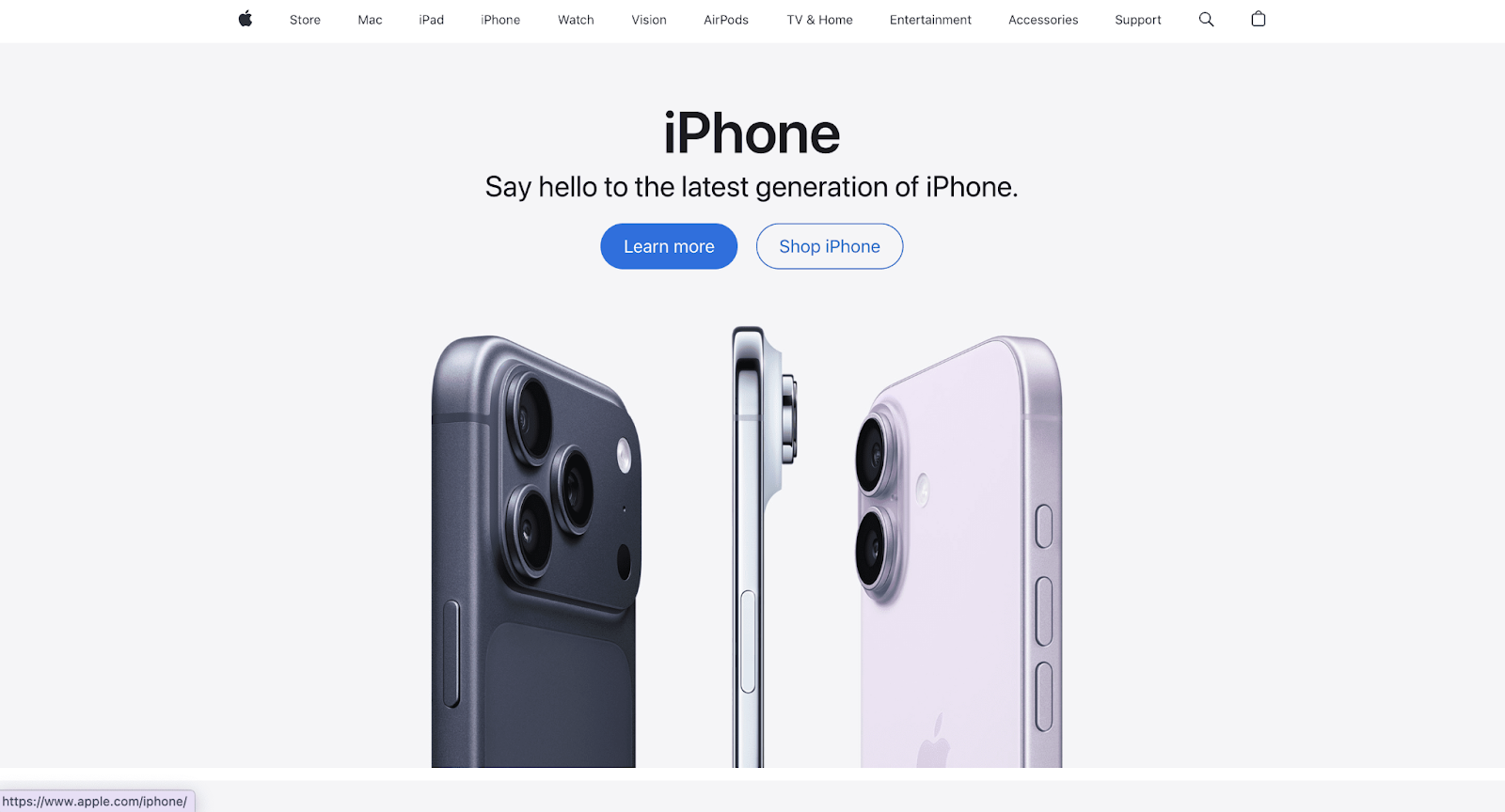
Apple‘s website dedicates massive amounts of space to showcasing products. Each device gets a hero shot with tons of breathing room around it. Scroll down, and you will find features presented one at a time with plenty of white space separating them.
This approach makes expensive products feel premium. It also makes complex technical specifications easier to digest. Instead of cramming everything into a dense block, Apple lets each feature shine in its own space. Users can absorb information at a comfortable pace, which ultimately helps them feel confident about purchasing.
Florian Schulz Productions’ Photography
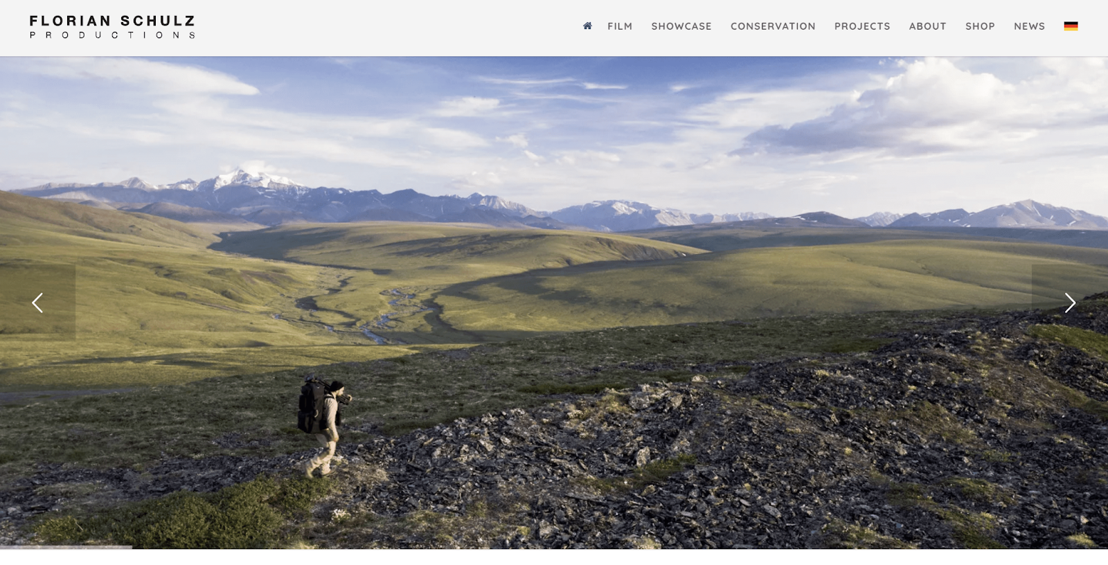
Florian and Emil Schulz, conservation photographers, use white space in their nature photography. For example, a single stingray in motion stands out against the darker mass of surrounding stingrays in green water. White space in photos directs viewers’ attention, making subjects pop and improving overall visual storytelling.
Udemy Line Spacing

Udemy organizes its course modules and lessons with plenty of space between lines, colored blocks, and bold headers. With over 150,000 courses on the platform, learners need to quickly scan and find what is relevant. The thoughtful spacing makes content easy to read and prevents information overload, helping users make fast decisions without feeling overwhelmed.
Common White Space Mistakes to Avoid And Practical Tips
Even with the best intentions, designers sometimes get white space wrong. While you are working with white space in web design, here are pitfalls to watch out for,
Using White Space Inconsistently
If your spacing follows no pattern, users will notice. Inconsistent gaps create visual confusion. Your margins should follow a system. This may be multiples of 8 pixels (like 8, 16, 24, 32). This creates rhythm and harmony across your design.
Random spacing makes your site feel unprofessional. It suggests a lack of attention to detail. Users might not consciously notice inconsistent spacing, but they will feel something is off. This erodes trust.
Being Afraid of Empty Space
Many clients and stakeholders fear white space. They see it as wasted real estate. “We are paying for that space,” they say. “Let’s fill it with something!” This instinct leads to cluttered designs that perform poorly.
The truth is, white space is not wasted. It is working hard to improve usability and guide attention. Sometimes the best thing you can add to a page is nothing at all. Educating stakeholders about white space’s value is part of a designer’s job.
Forgetting About Mobile
White space becomes even more critical on mobile devices. Smaller screens mean every pixel counts. You need adequate spacing to make touch targets easy to tap and content easy to scan.
Many sites reduce white space on mobile to fit more content on screen. This backfires. Cramped mobile designs frustrate users and increase bounce rates. Maintain generous spacing on mobile, even if it means showing less content at once.
Not Leaving Enough Breathing Room Around Text
Text crammed against edges or squished between elements becomes hard to read. Always give text plenty of padding. Line length matters too. Research suggests 50 to 75 characters per line is optimal for readability.
Long lines of text with no margin breaks create walls of words that intimidate readers. Break up text blocks with subheadings, images, or simply more space. Your readers will thank you by actually reading your content instead of skimming past it.
According to Nielsen Norman Group, spacing in typography is one of the top three factors that make a design visually appealing. Proper spacing between letters, lines, and paragraphs improves readability and creates a clean, balanced look. In short, well-managed spacing makes content easier to scan and more enjoyable to read.
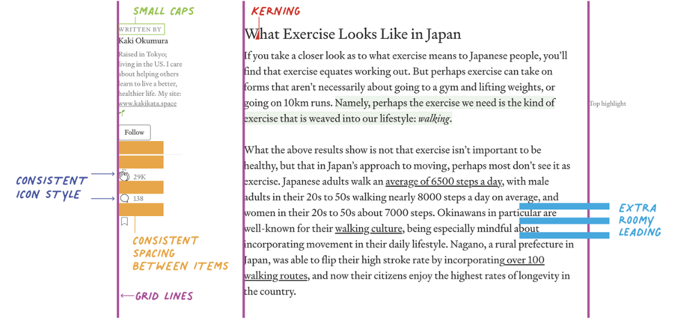
Source: Neilsen Norman Group
Remember that white space is not about minimalism for its own sake. It is about clarity and purpose. Every design element should earn its place on the page. If something does not serve a clear function, consider removing it and letting white space fill the gap. Here are actionable strategies you can implement today.
👉 Start by Auditing Your Current Website
Look at each page with fresh eyes. Where does it feel crowded? Which elements are competing for attention? Where do your eyes struggle to know where to look next? These problem areas need more white space.
👉 Increase Your Margins Gradually
Do not be afraid to push content away from the edges. Most designs benefit from wider margins than designers initially imagine. Test different margin sizes to see what feels most comfortable.
👉 Create a Clear Separation between Sections
Use white space as a divider instead of lines. A solid block of empty space often works better than borders or rules for sectioning content. It’s cleaner and more modern.
👉 Prioritize Your Content Ruthlessly
Not everything can be emphasized. Decide what’s most important and give those elements the most white space. Less important items can sit closer together or in denser groups.
👉 Use a Spacing System Based on Multiples
Pick a base number like 8 and use multiples of it for all spacing (8px, 16px, 24px, 32px, etc.). This creates consistency without requiring constant decisions about specific measurements.
👉 Test Your Designs with Real Users
Ask them to complete tasks on your site. Watch where they get confused or frustrated. Often, adding white space in those friction points solves the problem.
So, the next time you are tempted to add more content onto a page, pause. Ask yourself if white space might serve your goals better than more stuff. Often, the answer is yes. In web design, as in life, less truly can be more. Your users will not consciously praise your white space. They will just find your site easier to use, more pleasant to navigate, and more trustworthy. And that is exactly what drives action.
Use the Power of Nothing to Build Something Mesmerizing
Website white space is proof that sometimes doing less achieves more. In a digital world screaming for attention, restraint becomes radical. The courage to leave space empty, to let content breathe, to guide rather than shout; that is what separates good design from great design.
Every pixel does not need to work overtime. Sometimes a pixel’s job is simply to exist as empty space, giving its neighbors room to shine. This humble role might be the most important one in your entire design.
Start seeing white space not as a leftover area but as a powerful design element. Use it deliberately. Add it generously. Let it guide your users naturally toward the actions you want them to take. Your conversion rates, user satisfaction scores, and brand perception will all improve.
Hope this article was useful to you. Please remember to let us know about your experience. Additionally, subscribe to us and join our community for additional eCommerce advice. See you at the next one.