Planning to launch a website but struggling to find the perfect color that will attract your visitors? While designing a website, this is a common problem that web designers face. However, following some principles in color theory for web design, these problems can be easily solved. These principles not only work in graphic or creating any printed material, but also in landing pages.
In this blog, you will learn everything you need to know about color theory, as well as which colors can be perfect for specific sections in website design. Let us deep dive into it.
Color Theory for Web Design: What Is It & Why Does It Matter?
Color theory means the science and psychology of color that indicates how different color works together and affect our emotions and perceptions. The main concept of color theory is to combine different colors in a graphic, website or branding so that it can instantly create a psychological appeal among others. This theory helps designers or artists to make informed decisions about which colors or combinations to choose that evoke specific emotions. So why does color theory matter in web design?
Colors are not only important in physical environments, but they are also important in digital environments. A website that follows proper color principles creates a great user experience. Color theory and web design are interconnected.
The appearance of your website and its ability to generate more traffic depend on the colors you use. Without implementing proper color in web design, this will not attract visitors and increase traffic. Let us have a look at why color theory matters for your website.
Shapes First Impressions
First impressions matter most. When a visitor visits a website and gets a stunning look, it immediately creates a good impression on them. There is some color theory as well, which we will know later on. But as a general rule, a perfect color combination can soothe the visitor’s eyes. Above all, it helps create a memorable user experience that encourages visitors to return to your website.
Communicates Brand Personality
Whatever color theory you choose, you always have to keep in mind that it perfectly aligns with your brand identity. One of the main concepts of color theory is that it represents the proper color psychology of users and represents your brand perfectly. In a website that communicates its brand personality through color, every detail should be intentional to ensure an emotionally resonant experience for your visitors. When done right, color becomes a silent yet powerful brand ambassador.
Improves Readability & Accessibility
Using the perfect color theory ensures that your website content is easily readable and accessible. Proper contrast between text and button or background improves the visibility and makes sure your visitors can read and get a proper idea about the website. A high contrast color scheme also helps to navigate through your website more comfortably. An inaccessible color website not only creates a bad impression in user experience but also impacts SEO and increases the bounce rate.
Drives Emotional Engagement
Color is a powerful emotional trigger. Warm colors like Red and Orange in website design can influence energy and excitement, while cool tones like blue and green create a sense of calm and trust. By understanding the psychology of color in web design theory, you not only make a website but also create an experience among your visitors. This emotional connection encourages longer visits, stronger brand recall, and more meaningful interactions.
Enhances Visual Hierarchy & UX
Properly applying color theory in a website creates a visual hierarchy. Using different colors for different sections makes sure what each section is about and can easily differentiate from a user perspective. By assigning different colors to headings, buttons, or key sections, you guide users’ attention in a structured way. A well-designed color scheme for each section improves scannability and makes the website feel more organized and user-friendly.
Color Vocabulary: Terms That You Should Know
Before going deep into the color theory for your website, you need to understand some of the standard color vocabulary better. That means these are some of the key terms that will help you to better understand different colors and how they work in various types of color theory.
Primary Color
Primary color means a set of colors that can not be mixed. These colors have their separate identity. Traditionally, Red, Yellow and Blue are the primary colors. These are the foundation of creating all the other colors and through different mixing methods, you can create different colors with them.
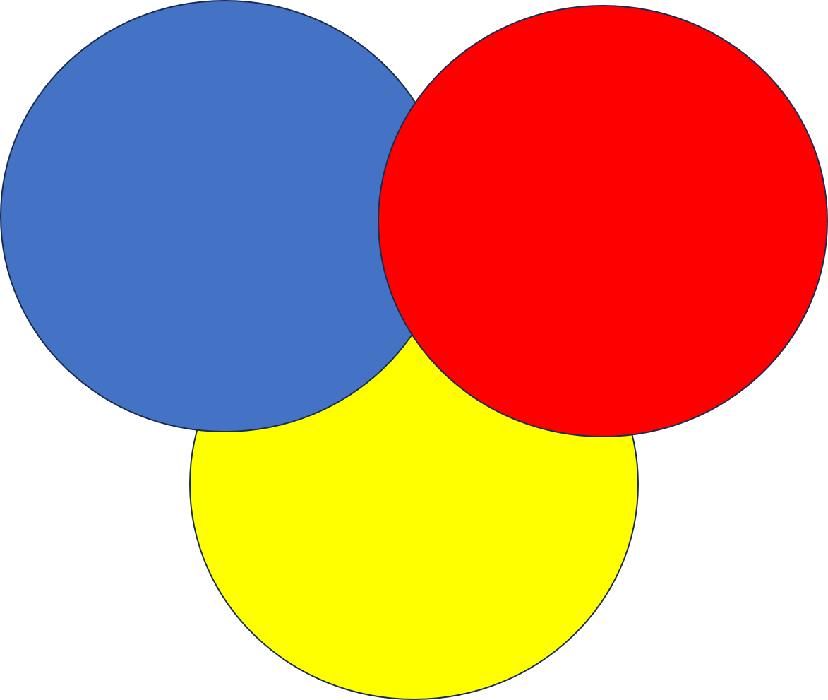
Even though these colors are traditionally called the primary colors, recent studies suggest that magenta, cyan, and yellow provide a more accurate representation of how we visually experience these colors.
Secondary Color
Secondary color means when you mix two separate colors and create a new combination of colors. Usually, with the mixture of primary colors, you can create different secondary colors. For example –
Orange: Mixture of red and yellow.
Green: Mixture of blue and yellow.
Tertiary Colors
While primary colors focus on only one color and secondary colors are a mixture of two primary colors, tertiary colors are a combination of primary and secondary colors. Sometimes this is also referred to as intermediate colors. There are 6 types of tertiary colors –
- Red-orange
- Yellow-orange
- Yellow-green
- Blue-green
- Blue-violet
- Red-violet
These are the basic color vocabulary that you should understand before diving deeper into the color theory. Next, let us learn more about the different types of color theories.
Color Theory Types That Web Designers Must Understand
Now, you have understood why color theory for website design is important, it is time to know deep down about different types of color theory. Each type of color theory defines what will be the perfect approach for you to implement the perfect color scheme on your website. Let us know more about it.
Color Wheel
The color wheel is a visual representation of color combinations that is represented in a circle. This is mainly a tool that defines the combination of primary, secondary and tertiary colors. The wheel is based on natural visual perception and making it an essential guide for building beautiful color combinations.
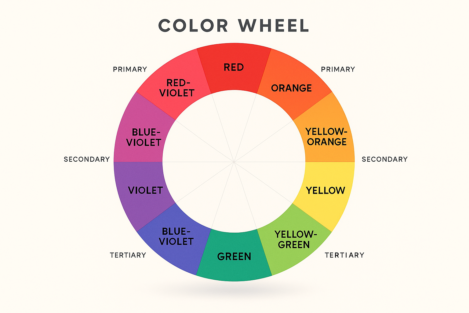
In web design, the color wheel is mainly used to create visually appealing color schemes. No matter which palette you choose, you will get a clear idea about which color combinations can perfectly align with your brand tone. It ensures your website maintains a consistent tone, improves readability, and enhances user experience.
Color Relationships
To create visually appealing and impactful compositions, color relationships are important. This relationship depends on how each and every color interacts with each other and how they are perceived in the color wheel. There are five main types of color relationships, including:
- Monochrome: Various shades, saturation of a single color.
- Triadic: Using three colors that are evenly spaced around the color wheel, forming a triangle.
- Analogous: Three colors that are next to each other in the color wheel.
- Complementary: Two colors from the opposite side of the color wheel.
- Split Complementary: Created by choosing a base color and pairing it with two colors that sit next to each other in the color wheel.
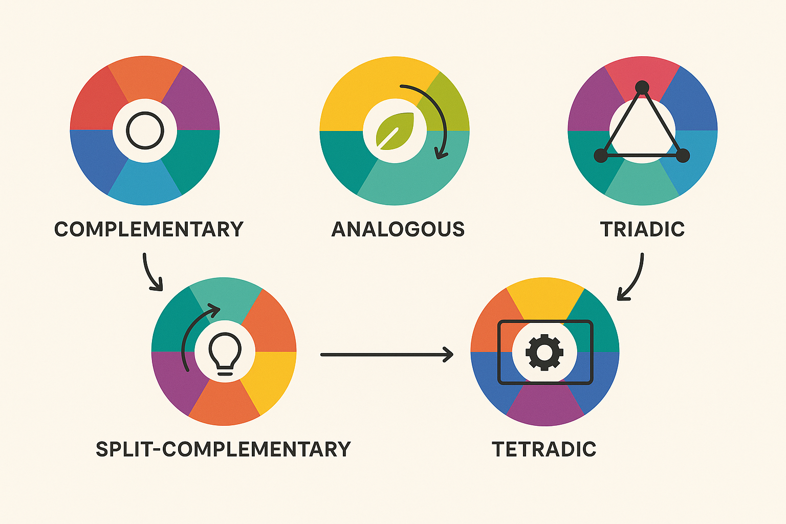
In web design, to create a visual hierarchy and to maintain aesthetic consistency, understanding this color relationship is important. For example, complementary colors can make call-to-action buttons stand out, while analogous schemes are great for creating a smooth and unified visual flow.
Color Temperature
Color temperature is about how warm or cold the light from a source appears. Colors that contain a higher amount of red or yellow are called warm colors and colors that have a higher amount of blue and purple are called cold colors.
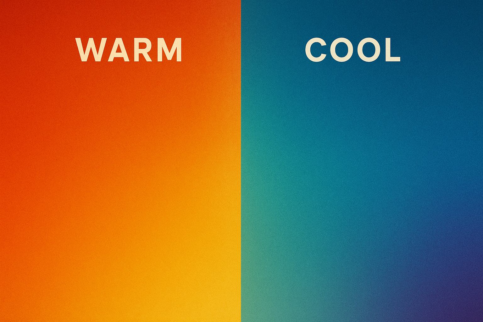
While choosing colors for website design, you have to set the color temperature based on the user’s perception and behavior. For example, you can use a cool background color for your website to get a clean and professional look. On the other hand, you can use warm colors in the button or important messages to draw the attention of the visitors in order to take action.
Color Systems: RGB, CMYK, and HEX
There are three standard color systems. RGB (Red, Green, Blue), CMYK (Cyan, Magenta, Yellow, Black), and HEX. Here, RGB color system is based on light, where value is represented by a number from 0 (black) to 255 (white).
On the other hand, CMYK is better for printing design and is standard for cartridge prints. The HEX color system uses a six-digit, three-byte, hexadecimal description of each color.
On the website, you can choose any color system you want. The RGB system is suitable for website design because, in web design, colors are created by adjusting the intensity of each of the three colors, ranging from 0 to 255. CMYK is suitable for printing, so there is not much use of it in website design. But the HEX color code is necessary in HTML or CSS to generate the color based on the code.
Tints and Shades
Tints mean adding white to a color to make it lighter, but shades are created by adding black to it to make it darker. For example, pink is a tint of red because it shows a lighter red color. On the other hand, a darker red, which is created by adding black color, is mainly a shade of red.
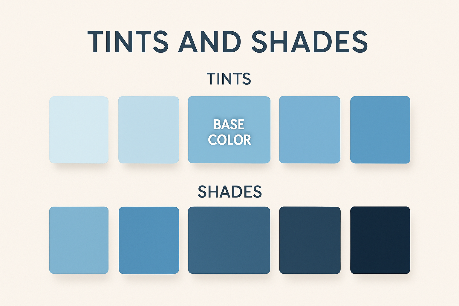
In web design, it is important to know where to use what. For tint color shade, you can add this color to CTAs, buttons or any other place where it is better to show a light or soothing color. But in terms of highlighting something on the website to emphasize certain areas of the design
Contrast
Contrast is the most important part of website design. Because background colors and text mostly depend on the color contrast. If you color contrast is not proper, then the possibility is that the text might not be shown properly with the color.
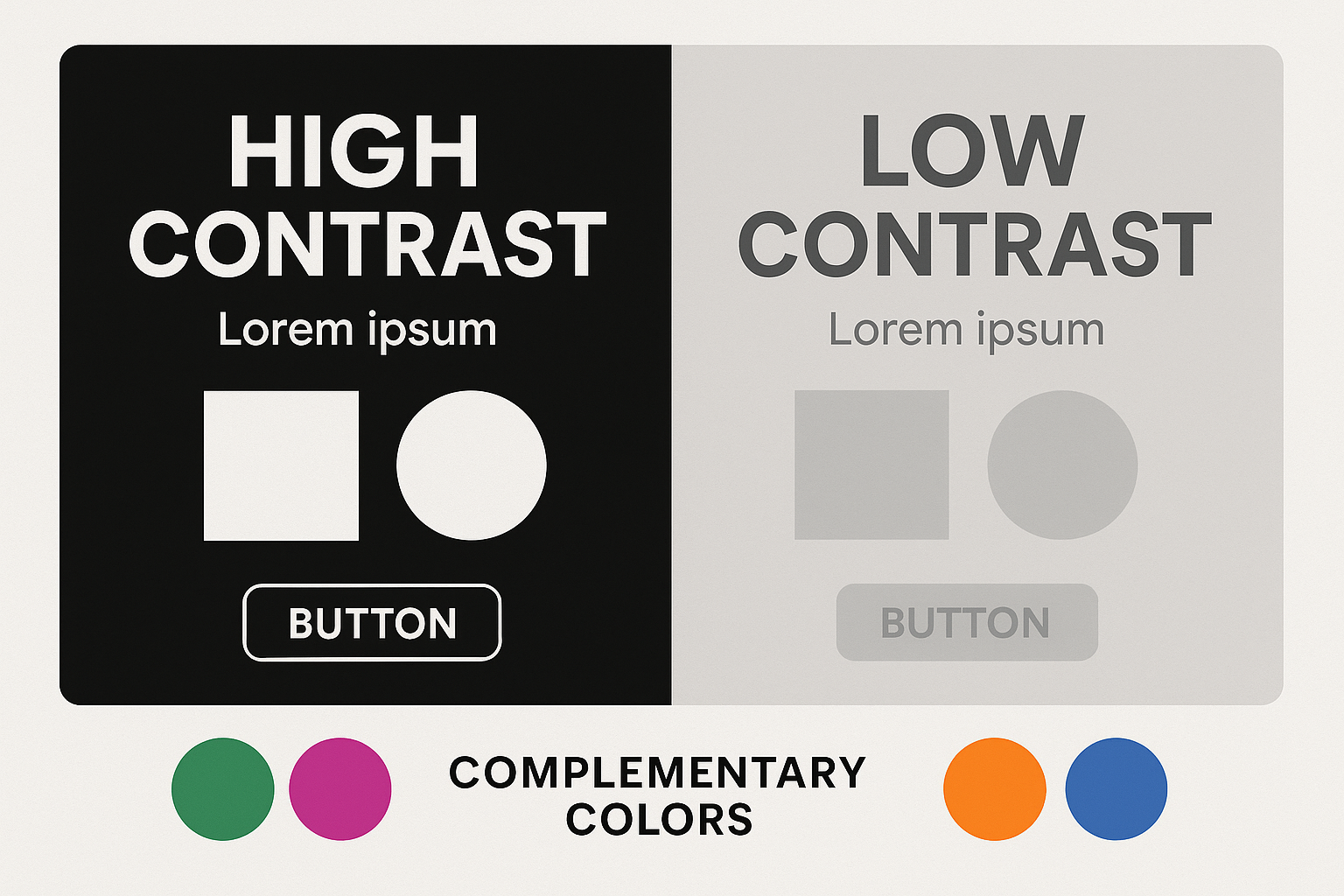
For example, using a white background paired with dark text is the best way to keep pages clean and well-organized. These two color schemes have become popular trends in web design, with many templates and apps now offering both “Dark Mode” and “Light Mode” options.
How to Use Color Psychology and Meaning to Influence Emotions
While using different colors on the website, there is specific psychology behind it. Every color shows different psychological and emotional influences on a website. What exactly is your brand voice? It can be easily represented by the color psychology.
Well-selected color can influence visitors to take action and visitors can make a clear decision out of it. Here is the psychology behind the different colors of the website:
🔴 Red: Expresses excitement, passion, and urgency. frequently employed to attract attention or elicit action.
🔵 Blue: Stands for professionalism, serenity, and trust. frequently found on corporate and tech websites.
🟡 Yellow: Indicates hope, vitality, and joy. It works well for discreetly highlighting or drawing attention to something.
🟢 Green: Stands for development, harmony, and well-being. Often utilized in designs about finance or the environment.
🟠 Orange: Enthusiasm, creativity, friendliness. Great for call-to-action buttons or playful brands.
🟣 Purple: Denotes spirituality, creativity, and luxury. used frequently for high-end or beauty-oriented brands.
⚫ Black: Expresses strength, grace, and sophistication. Perfect for high-end, minimalist, or contemporary websites.
⚪ White: Stands for space, simplicity, and cleanliness. frequently seen in designs that are content-focused or minimalist.
🌸 Pink: Conveys softness, youthfulness, and femininity. Typically used in fashion, beauty, or lifestyle sites.
🔘 Gray: Professional, impartial, and balanced. Frequently utilized.
Based on every color combination for your website, you will find Templately as your web-building solution. In Templately, there are 6,000+ templates for both Gutenberg and Elementor, where you will find websites in different color combinations, keeping in mind all the emotions that are represented by different colors.

Practical Tips to Apply Color Theory in Web Design
With different colors, you can apply different tips for your website to make it look more stylish and attractive to your visitors. By following a few practical tips, you can use web design color schemes effectively to communicate your message clearly through your website.
Using the Color Wheel
The main goal of using the color wheel is to identify the best possible colors for your website. By looking at different colors, you can combine and get a practical idea about which color you should choose based on different color palette types. So, make sure you are using the color wheel properly while creating your website so that it perfectly aligns with your brand guidelines and gives proper color combinations to your website.
Limit Your Color Palette
Using too many colors will not make much sense on a website. Because then it will not give your visitors a soothing experience. Rather, it will be annoying and visitors will not understand what this website is about. That is why it is best to keep the color palette within 2-4 colors, so that it gives a fresh and attractive look to your website.
Background & Text Color Combinations
It is important to make a perfect combination of background & text color. If you keep the same color for your background and text on the website, then there is a high possibility that the text will not be visible to the visitors. So, make sure you have perfect color combinations for this. For example, using white text on a black background can make sure your website visitors can read the text properly.
Maintain Accessibility Standards
Websites should be for everyone. Websites should serve everyone. That’s why inclusive design and accessibility for all users are so important. Specifically for those who find it difficult to understand any color. For example, avoid using light gray text on a white background or red and green together. These can be difficult for many users to distinguish. Instead, use high-contrast color pairs and test them using accessibility tools.
Follow Cultural Color Sensitivities
If you are using your website as a global brand, then you also need to keep in mind the cultural sensitivities for different colors. Different cultures have different color theories. So, based on that, make sure you have those colors on the website that are acceptable for everyone. For example, while red symbolizes passion, love, danger, or anger in Western cultures, it represents good fortune and celebration in China, commonly used in weddings and festivals.
Create Eye-catching and Impactful Websites with Color Theory
Colors are the heart of a website. How you choose and implement the perfect color combination represents your brand identity and attracts more visitors. Using the right colors makes a long-lasting positive impression on visitors. This also increases the chance of repeated visitors who help boost your traffic. So, make an impactful website with the right color in the right place.
Was this blog helpful to you? To get more blogs like this, subscribe to our blogs and join the Templately Community to connect with fellow enthusiasts.