Have you ever noticed in nature how the circle around the storm looks perfectly aligned? Or maybe the pyramid of Giza, with a perfect proportion? This all happened because of the Golden Ratio rule. Whether it is in nature or modern website design, this rule applies perfectly everywhere. The Golden Ratio in web design is one of the most important topics for modern web designers to create a visually appealing website with proper alignment and ratio.
In this blog, we will learn more about the golden ratio rule and how it can be properly implemented and executed in the website design.
What Is the Golden Ratio?
The golden ratio, also called the golden number, golden proportion, or divine proportion, is the ratio between two quantities that is approximately equal to 1.618. It is associated with the Fibonacci sequence. In design, the line is divided into two parts and the longer part is divided into smaller parts.
This Golden Ratio has been used for centuries in arts, architecture and design to create visually pleasing compositions. In web and graphic design, the Golden Ratio helps establish balanced layouts, guiding designers to determine element sizes, spacing and typography that feel naturally appealing to the human eye.
Real Life Golden Ratio Examples
The golden ratio can be seen everywhere. From historical architecture to different brand logos, the Golden Ratio is implemented almost everywhere. In modern website design, the Golden Ratio is also used in different website pages with different combinations. In this section, let us look at some real-life golden ratio examples.
Nature
In nature, the Golden Ratio appears in countless fascinating forms, showcasing the inherent harmony of the natural world. The spiral arms of galaxies often align with the proportions of the golden circle, maintaining the same elegant ratio found in art and design. Similarly, the swirling patterns of hurricanes follow a spiral formation that reflects the Golden Ratio’s geometry.
Among living organisms, this ratio is evident in the spiral growth of seashells, the curved shapes of animal horns, and even the structure of the human inner ear (cochlea), all mirroring the same mathematical balance that defines natural beauty.
Architecture
Different architectural structure represents the golden ratio rule to specify the pattern of different designs. The pyramids of Egypt follow the pattern of the golden ratio. Also, it is believed that the Taj Mahal and ancient Greek temples were also built with the concept of the golden ratio.
Brand Logo
Popular global brands follow the pattern of the Golden Ratio in their modern logos. Pepsi, Apple, Former logo of Twitter all represented their logo based on the rule of the Golden Ratio. By defining with the logo, these brands have shown modern creativity and aesthetics.
Key Benefits of Using the Golden Ratio in Web Design
While from nature to modern aesthetics, the Golden Ratio is appropriately maintained, in web design, this is also a crucial part. There are a lot of key benefits of implementing the Golden Ratio in modern web design. Here are some of the benefits mentioned.
Improves Layout Composition
Website layout composition, when blended with the Golden Ratio rule, helps create a natural sense of balance and visual flow that feels pleasing to the eye. By applying ratios to different website elements, such as the grid, spacing, images and text, the designer can achieve layouts that grab user attention and enhance readability.
For example, the Golden Ratio clearly determines the gap between a sidebar and the main content area, making sure that neither overwhelms the other and gets a clean, well-structured interface. This also helps to maintain the visual hierarchy, so that key elements such as heading, hero image and call-to-action stand out naturally.
Enhances Visual Harmony
Since the golden ratio frequently appears in nature, it creates a visual harmony in our brain as well. This subconscious effect draws a visual in our mind, perceiving each element as more orderly and beautiful. When this is applied in website design, it makes sure that there is a visual rhythm, where layouts do not feel out of place.
For instance, this rule ensures that images, text blocks and other components are aligned properly on a website. So the visual harmony is proper and this balance not only improves the visual hierarchy but also allows users to process information quickly and efficiently.
Guides Typography And Hierarchy
By applying the ratio (1:1.618) to font sizes, line heights and spacing, designers can create text that is visually appealing as well as easy to read. This rule ensures that the text and typography have proper line spacing and alignment with every element.
For example, if the body text is set at 16px, multiplying it by 1.618 gives a heading size of about 26px, which creates a balanced, natural contrast between text levels. This proportion helps users to easily distinguish between headings, subheadings and body texts. Also, with this rule, the line gap between the paragraphs does not appear stretched or cluttered. Overall, this rule in typography creates a smoother and readable website experience for the visitors.
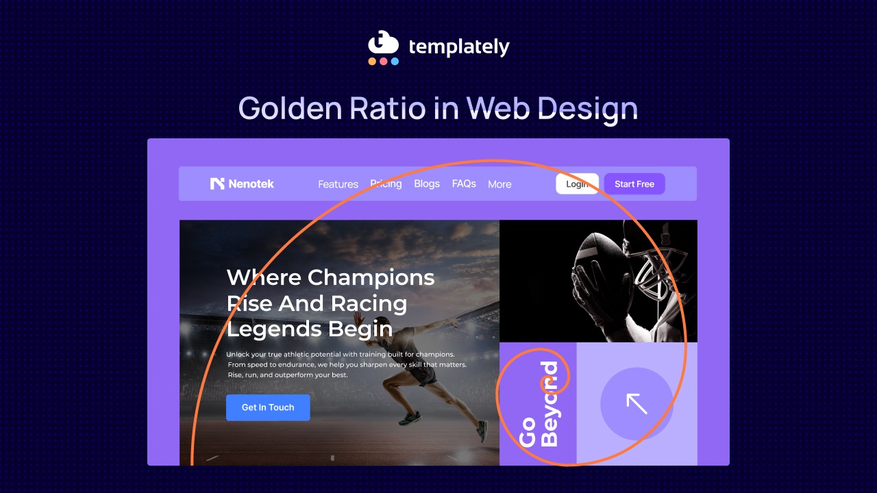
Creates Better Image Composition
The key to applying this rule to the image is to capture the visitor’s attention at the focal point. By applying the Golden Spiral or Golden Rectangle, images can be cropped or arranged so that the main subject aligns with the areas where the viewer’s eyes are most likely to focus.
For example, for an eCommerce website, placing a product on the focal object along the curve or intersection of the Golden Spiral enhances visual interest. Whether it is used in the hero section, website graphics, or typography, this maintains a sense of proportion and harmony, resulting in the image feeling natural.
Strengthens Brand Aesthetics
Golden ratio maintains a brand’s aesthetics by creating the sense of balance, professionalism and visual consistency. The symmetry of the Golden Ratio increases the feeling of trust, sophistication of the brands.
For example, applying the brand guidelines in grids, typography, layouts and spacing ensures every element feels connected and purposeful. As a result, the overall design not only looks polished but also communicates the brand’s message more effectively, leaving a lasting and professional impression on visitors.
Where to Apply the Golden Ratio in Web Design?
We have already covered why it is important to implement the Golden Ratio in website design. Now it is important to understand where a web designer or UI designer has to implement the Golden Ratio in the website design. In this section, we will look at where to apply the ratio.
Typography
The first thing the Golden Ratio can be applied to in website design is typography. Different fonts might have different types of style. But even though there are different styles, the proper alignment and positioning of the texts are important to make a visually pleasing website. That is why it is important to maintain the Golden ratio in typography.
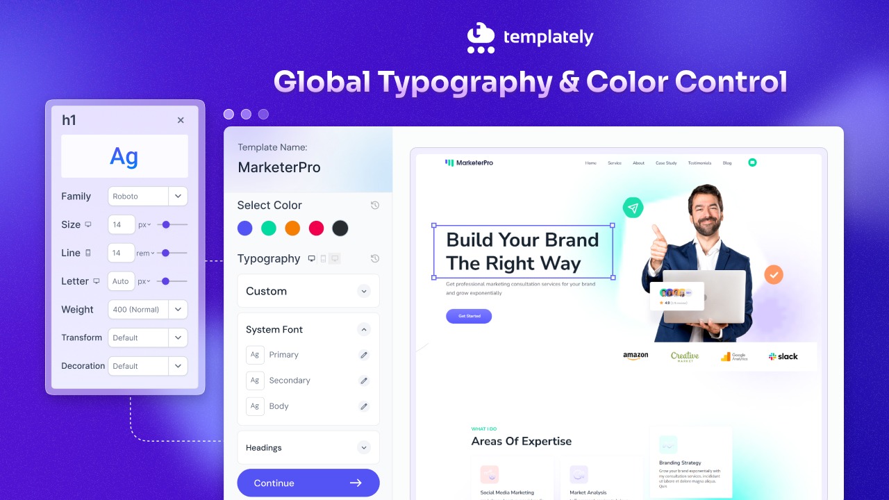
For example, according to the Golden Ratio rule, if the body text is set at 16px, multiplying it by 1.618 gives a heading size of about 26px. This maintains the visual consistency in the text and heading formatting of a website. It will be much easier to maintain when you have a website template library like Templately. There, you will find a typography customization option, where you can adjust headings, subheadings, or texts based on the Golden Ratio rule, so you can get started instantly.

Images
Another important part is images. When you have a lot of images on your website, it is important to maintain a gap between them to make it look good on your site. If images are not properly aligned and spaced, they might look cluttered on a website, making it harder for visitors to understand what they are about. So, to reduce the bounce rate, the image gap should align with the proper Golden Ratio.
One example can be Templately, where the images are set based on different business niches; in this way, it aligns with the overall website template properly. The image section is properly compatible with the Gutenberg and Elementor editors, so you can add different images based on the business niche as well.

Layouts
On the website layouts, the Golden Ratio is applied in grids and different elements. With texts and images, maintaining a proper alignment within the grids and elements is equally important. It shows how the elements or blocks will be shown side by side on a website. For instance, if your landing page’s total width is 1200px, divide it using 1200 ÷ 1.618 ≈ 740px for content and 460px for the sidebar. This ensures neither section overwhelms the other.
A ready website template where this alignment is maintained properly can reduce the hassle of calculating the ratio. For instance, in a WordPress template library like Templately, you will find the alignment properly between elements. If you want to customize and add a new element, just choose your template and add the content or image wherever you want. This is properly aligned based on the elements of Essential Addons and Essential Blocks.
Logos
Another important part of a website is the logo. A logo represents a business brand and showcases this on a website. Sometimes the logo can be aligned with typography and texts. If your logo combines an icon and typography, you can use the Golden Ratio to determine:
- Icon size relative to text
- Letter spacing
- Height differences between the logo symbol and the brand name
For example, if the text height is 20px, the icon can be 20 × 1.618 ≈ 32px for optimal balance.
Let’s think about how great it would be if you could add a logo to your website and have it automatically adjust on every page, like Templately. Here, you can add your logo from the styling section and it will be set automatically on your website.
Bring Harmony to Your Website with the Golden Ratio
The Golden Ratio is applied everywhere. From nature to modern website design, to have a proper visualization and bring harmony, it is important to follow the rules. Even though the rule is not always necessary but it better aligns the website content and elements properly. With plugins like Templately, you can also create a website instantly and efficiently.
If you have found this blog helpful, feel free to share your opinion and feedback on how you would agree or disagree with our Facebook community. You can also subscribe to our blogs for valuable tutorials, guides, knowledge, tips, and the latest updates.