Do you prefer using ready templates while building a website on WordPress? Creating a visually stunning and cohesive website is not only about selecting an attractive template. Your website leaps a step forward when you master the art of typography and color matching. These are two fundamental design elements that can significantly impact your site’s professional appearance and user experience.
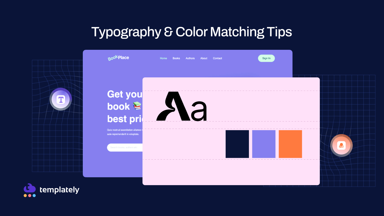
While ready-made WordPress templates offer convenience and beautiful starting points, they often come with generic fonts and color schemes that may not align perfectly with your brand identity. The challenge lies in customizing these elements to create a unique, consistent look that reflects your brand while maintaining design harmony throughout your site.
This blog will guide you through website typography and color matching tips when you are using ready templates for building WordPress websites.
Great Web Design Guide 101: Typography And Color Matching
Typography and color are the silent communicators of your website. They work together to convey your brand’s personality, guide user attention and create an emotional connection with your visitors.
When these elements are properly matched and consistently applied, they transform a generic template into a professional, branded experience that builds trust and engagement. The impact of consistent typography & colors extends far beyond mere aesthetics:
- Brand Recognition: Creates a memorable visual identity that visitors instantly recognize
- User Experience: Improves readability, navigation, and overall site usability
- Professional Credibility: Signals attention to detail and builds trust with visitors
- Accessibility: Ensures content is readable for users with varying abilities
- SEO Benefits: Better user engagement metrics can positively impact search rankings
A Common Web Design Challenge with Ready-Made Templates: Typography-Color Combination
Even the most beautiful WordPress templates come with inherent limitations that can frustrate site owners trying to achieve a truly branded experience. Most templates offer limited font options that rarely match specific brand requirements, forcing businesses to compromise on their visual identity. The generic color palettes provided may clash with established brand colors, creating an inconsistent experience across marketing materials and digital presence.
The biggest challenge often emerges when trying to maintain consistency across different pages and elements. Making a simple color change to your homepage might require manually updating dozens of other pages, templates, and components to maintain visual harmony. This tedious process creates several pain points:
- Time-consuming manual updates across multiple pages
- High risk of human error leading to inconsistent styling
- Complex technical requirements for safe implementation
- Difficulty maintaining changes during theme or plugin updates
Traditional WordPress customization requires significant technical knowledge to implement changes safely without breaking the website design structure. Many site owners find themselves caught between accepting generic styling or investing considerable time and resources into complex customization processes.
Mastering Typography for WordPress Website Templates
Choosing the right typography is like selecting the voice for your brand in written communication. Your font choices should reflect your brand’s personality and resonate with your target audience. A traditional law firm requires different typography than a modern tech startup or a playful children’s brand. Understanding font personalities helps guide your selection process:
- Serif fonts (Times New Roman, Georgia): Traditional, trustworthy, professional
- Sans-serif fonts (Arial, Helvetica, Open Sans): Modern, clean, approachable
- Script fonts: Elegant, personal, creative (use sparingly for accents)
- Display fonts: Bold, attention-grabbing (best reserved for headlines only)
Creating Effective Typography Hierarchy
Establishing a clear typographic hierarchy guides readers through your content naturally and improves overall user experience. Your design should create a visual roadmap that helps visitors quickly understand content organization and find the information they need.
Start with your main headlines, which should be the largest and boldest elements, immediately drawing attention to key messages. Subheadings should decrease in size progressively, organizing content into digestible sections that make scanning easy for busy visitors.
Body text requires careful consideration. 16px is generally considered the minimum for comfortable reading across devices, while line height should be set between 1.4 and 1.6 times the font size for optimal readability.
The most successful websites follow the two-font rule: selecting one primary font for headings and another complementary font for body text. This approach creates visual interest while maintaining cohesion and readability. The key is ensuring your chosen fonts complement rather than compete with each other.
Strategic Color Matching Tips for Brand Consistency
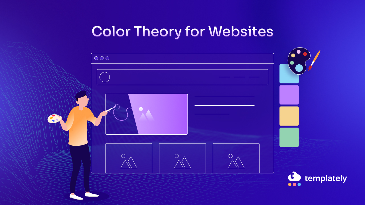
Color psychology plays a crucial role in how visitors perceive and interact with your website. Colors evoke specific emotions and associations that can significantly influence user behavior and brand perception.
Understanding these psychological connections enables you to make strategic color choices that support your business objectives. Let’s see how different colors communicate different brand qualities with ready templates from Templately, maintaining this color scheme.
🔵 Blue: Trust, reliability, professionalism (ideal for finance, technology, healthcare)
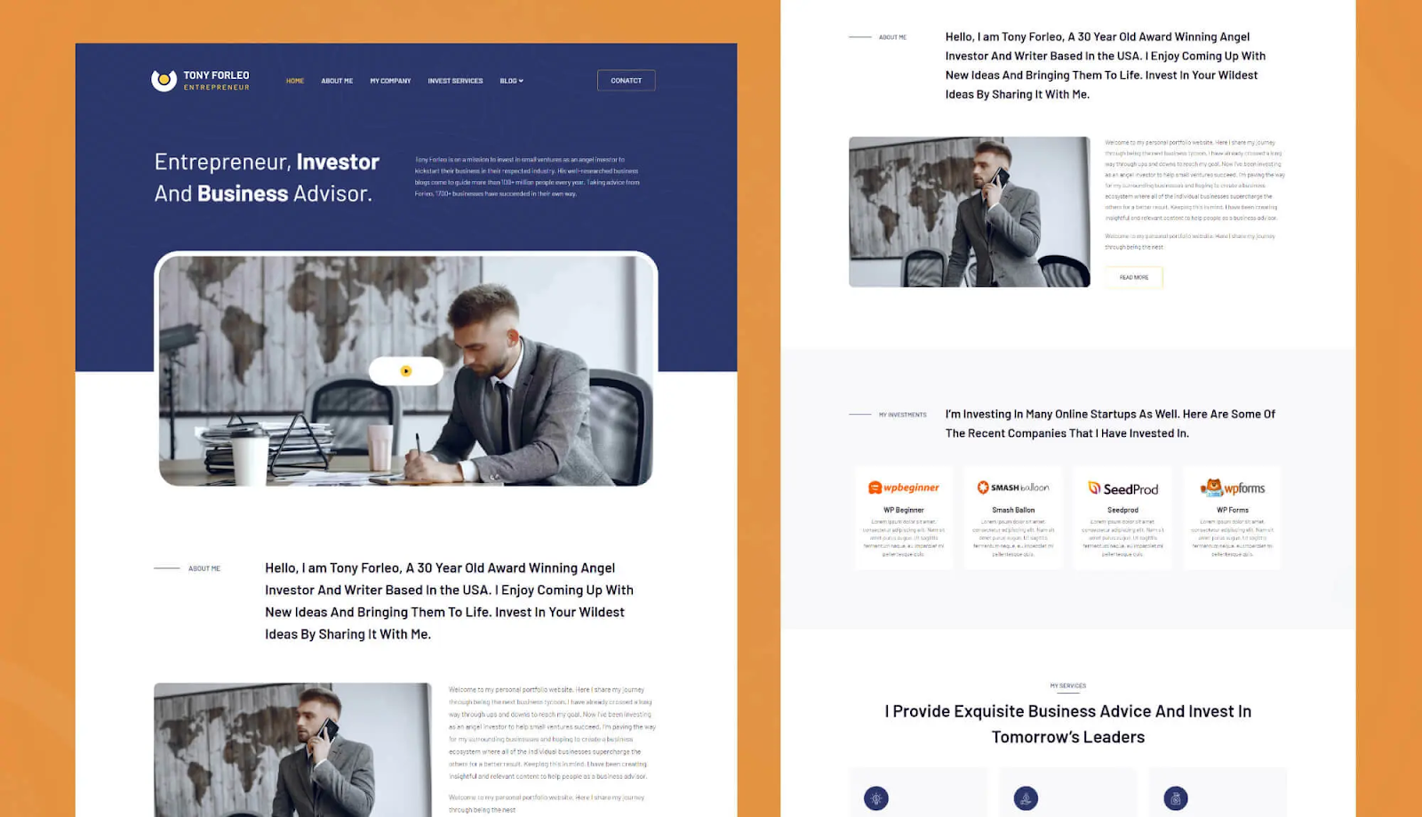
You can check out the Tony Forleo template from Templately. It is an entrepreneur website template reflecting professionalism with minimalist colors, combining blue and white.
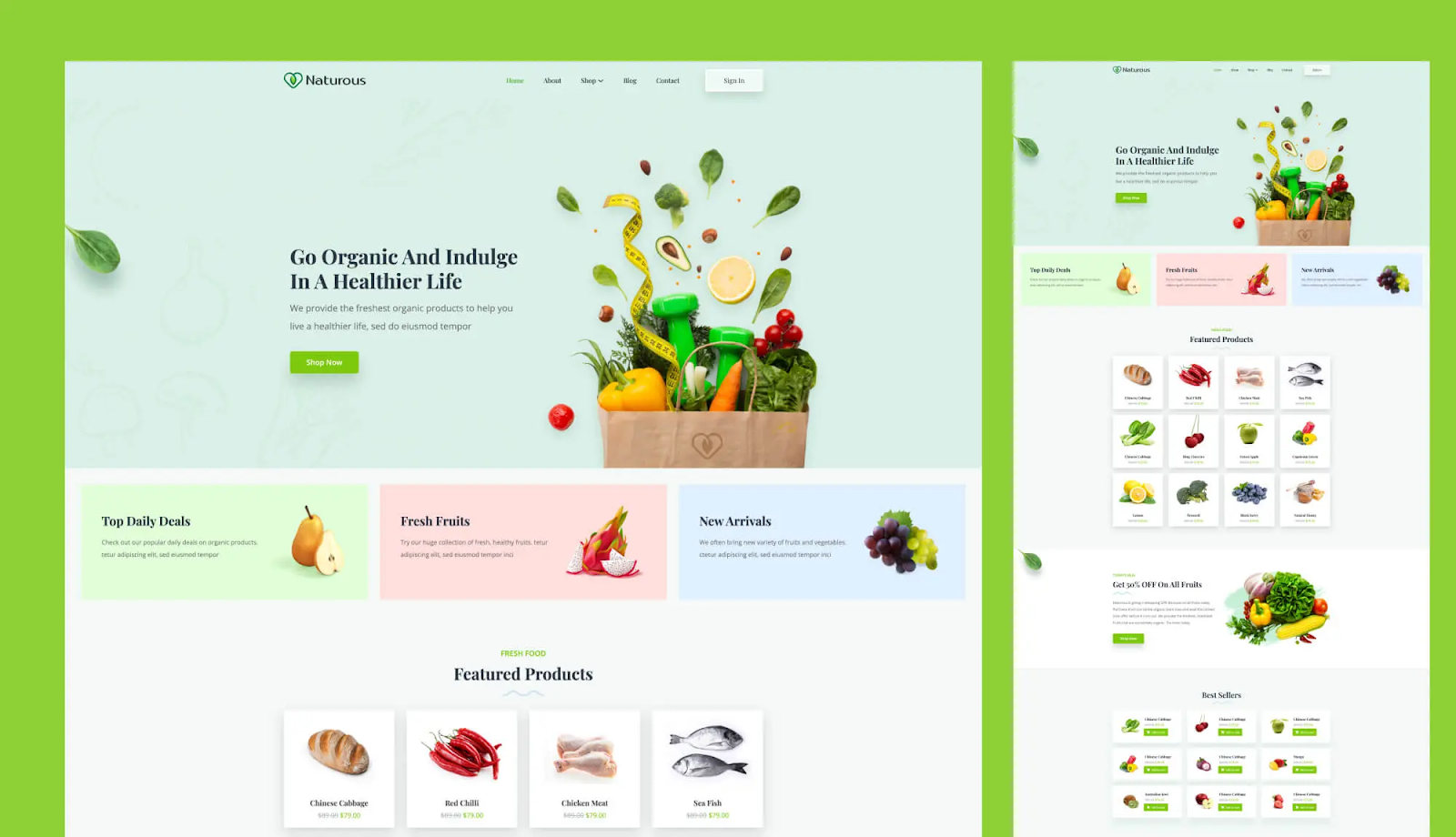
🟢 Green: Growth, nature, health (perfect for environmental, wellness, financial services)
Naturous – one of the beautifully designed WooCommerce website templates from Templately. This is an example of how the color Green has been used, reflecting the true spirit of organic food and lifestyle.
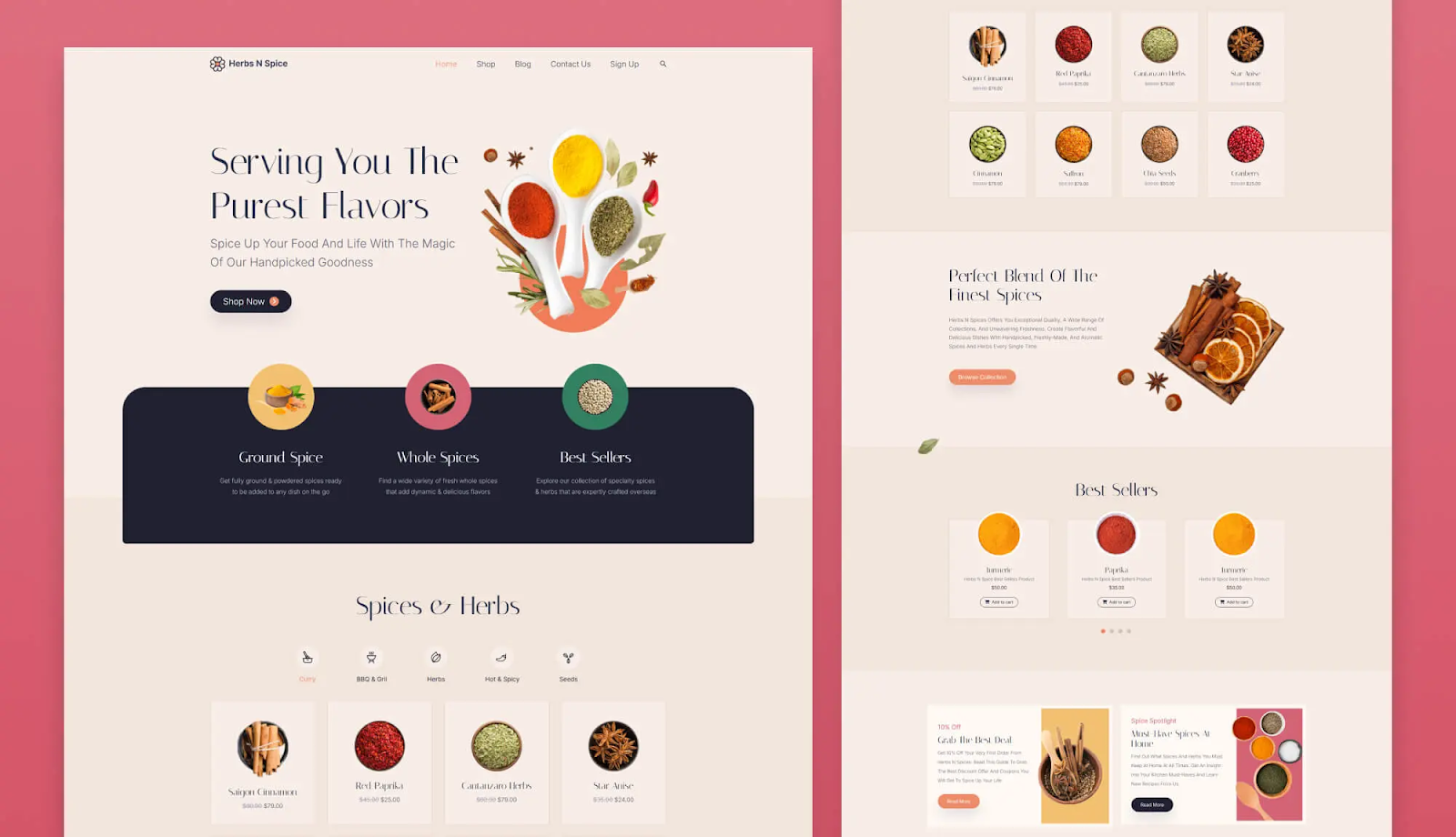
🔴 Red: Energy, urgency, passion (effective for food, entertainment, sales)
The Herbs N Spice template, with its warm and harmonious color palette, perfectly captures the inviting essence of spice shops, grocery stores, and similar businesses.
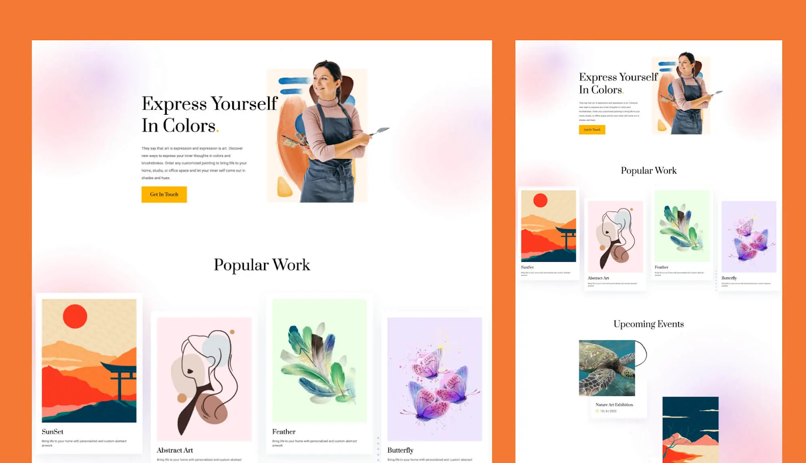
🟠 Orange: Enthusiasm, creativity, affordability (great for retail, creative services)
Another great example of a ready-made WordPress template that radiates creativity while maintaining a vibrant orange core is the Acrylic template from Templately — a perfect personal website design for artists.
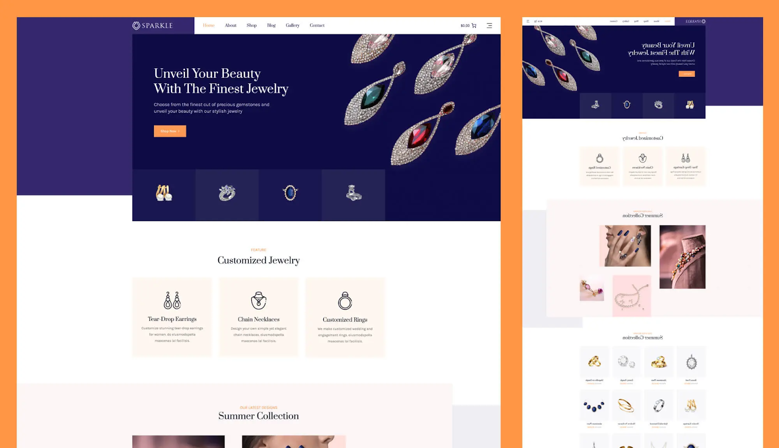
🟣 Purple: Luxury, creativity, spirituality (suitable for beauty, premium brands)
Sparkle, a WooCommerce template designed for jewelry stores, blends rich purple tones to capture the elegance, beauty, and premium feel of fine jewelry.
Building Your Color Palette Flow
Developing an effective color palette starts with your existing brand colors and expands thoughtfully to create a comprehensive system. Your color strategy should follow a structured approach that ensures consistency while providing enough variety for different design needs.
Begin with your primary color. This is your main brand identifier that should be used consistently for logos, call-to-action buttons and important links. Secondary colors provide supporting elements for backgrounds, sections, and decorative elements, while neutral colors form the foundation for text and backgrounds. Accent colors should be used sparingly for highlights, special offers and elements that require immediate attention.
The classic 60-30-10 design rule provides a proven framework for color distribution:
- 60%: Dominant neutral color for backgrounds and large areas
- 30%: Secondary color for sections, cards and structural elements
- 10%: Accent color for buttons, links and attention-grabbing highlights
This distribution creates visual balance while ensuring your most important elements stand out effectively.
Ensuring Accessibility & Performance While Using Ready WordPress Templates
Accessibility considerations are not just moral imperatives but also legal requirements in many jurisdictions. Proper color contrast ensures that users with visual impairments can comfortably read your content and navigate your website effectively. Meeting accessibility standards requires attention to specific contrast ratios:
- Standard text: Minimum 4.5:1 contrast ratio against background
- Large text (18pt+): Minimum 3:1 contrast ratio acceptable
- Interactive elements: Must be distinguishable through color and other visual indicators
Testing your typography and color choices across multiple devices and viewing conditions is essential for ensuring a consistent user experience. What looks perfect on a high-resolution desktop monitor might be difficult to read on a mobile device in bright sunlight. Consider how your typography color combinations appear to users with different types of color blindness, and avoid using color alone to convey critical information.
The Global Typography & Color Control Solution to Simplify the Design Process
Managing typography and color consistency across an entire WordPress site traditionally requires deep attention to detail and endless manual updates. Every time you want to change your brand colors or update your font choices, you face the daunting task of updating dozens of pages, templates and individual elements. This manual process creates significant challenges for website owners:
- Hours spent updating individual pages and elements
- High probability of missing elements, creating inconsistencies
- Risk of breaking design layouts during updates
- Difficulty coordinating changes across team members
- Inability to preview site-wide changes before implementation
Global control systems ease this process by allowing you to make universal changes from a single interface. Instead of spending hours updating individual pages, you can modify your site’s entire typography and color scheme in minutes. This approach guarantees consistency across all pages and elements while dramatically reducing the risk of human error.
Introducing Templately: Your Go-To WordPress Templates Solution
Templately has emerged as one of the most popular WordPress template libraries, offering an impressive collection of over 6,000 ready-made templates designed for every industry and business type.
What distinguishes Templately from other template providers is not just the quantity of options available, but the innovative approach to solving real-world design challenges that WordPress site owners face daily. The platform provides a comprehensive solution that includes:
- Extensive library of professionally designed templates
- Industry-specific designs for every business type
- Advanced global customization for Typography & Color
- One-click full site import functionality
- Regular updates with fresh, modern designs
Beyond its extensive template collection, Templately provides powerful design management features that bridge the gap between beautiful pre-made designs and truly customized, branded websites.
The platform understands that while templates provide excellent starting points, businesses need the flexibility to adapt these designs to match their unique brand identity without requiring technical expertise.
Templately’s Global Typography And Color Control Feature
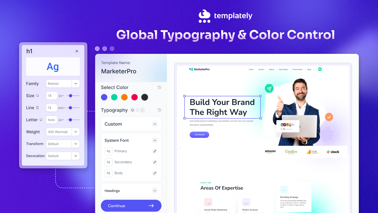
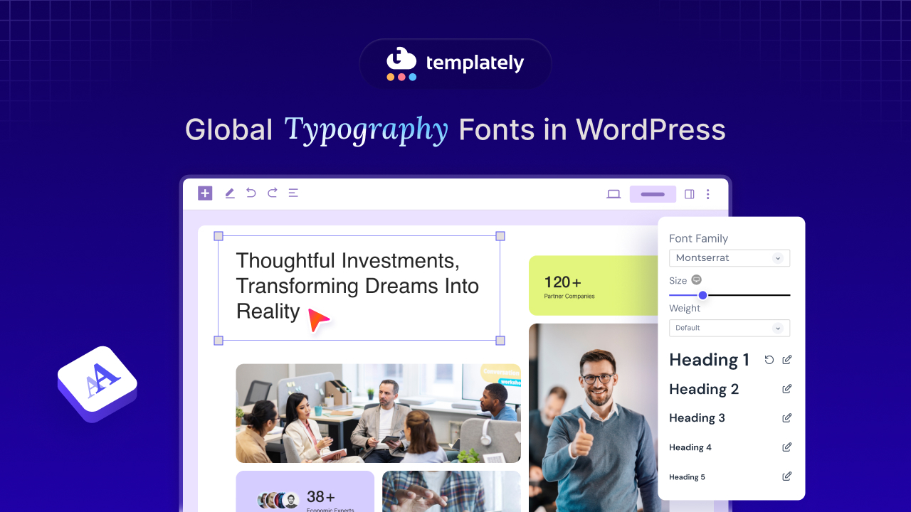
The Global Typography and Color Control feature represents Templately’s solution to one of WordPress users’ most persistent challenges. And that is maintaining design consistency across complex websites. This powerful feature transforms the traditionally tedious process of site-wide design updates for typography & color.
Global Typography Control
The global typography system provides complete control over every text element on your website through three main categories. The System Font section allows you to customize fonts for general text, links and buttons with full control over font family, size, line height, letter spacing, weight, transform properties and decoration options. These changes apply instantly across your entire website, ensuring every piece of text maintains your chosen styling.
The headings section offers individual control over each heading level from H1 through H6, allowing you to create a perfectly balanced typographic hierarchy. You can adjust font families, sizes, line heights and other properties for each heading level, creating a cohesive system that works across all your pages and content types. Key typography control features include:
- Font Family Selection: Choose from system fonts, Google Fonts, or custom uploads
- Size and Spacing Controls: Precise adjustment of font size, line height, and letter spacing
- Weight and Style Options: Control font weight, text transform, and decoration
- Real-time Preview: See changes instantly before applying them site-wide
Advanced Color Control System
Global color control operates through an intuitive palette system that manages every color element across your website. The Primary Color setting controls the most important brand elements, including buttons, links, and key interactive components, ensuring your brand’s main color appears consistently throughout the user experience. The color management system covers all essential elements:
- Primary Color: Main brand color for buttons, links and key elements
- Secondary Color: Supporting colors for backgrounds and structural elements
- Text Color: Ensures optimal readability and consistency throughout content
- Accent Color: Highlights important elements like calls-to-action and special offers
- Heading Color: Maintains uniformity across all titles and subheadings
- Background Color: Controls overall site appearance and atmosphere
Each color option can be customized using traditional color pickers or precise hex codes, with real-time preview capabilities that let you see changes immediately before applying them across your entire site.
The implementation process begins with selecting from Templately’s vast library of professionally designed templates, each created with specific industries and use cases in mind. The Full Site Import feature allows you to install complete website packages with a single click, including all pages, content, and design elements.
Once your base template is installed, the Global Customization panel becomes your command center for typography and color management. Changes made in this interface apply instantly across your entire website, and the real-time preview system lets you fine-tune your design with confidence.
Typography And Color Theory: Best Practices While Using Ready Templates
Successful typography & color matching require strategic planning before you begin making changes to your chosen template. Let’s know the best practices to maintain typography and color theory while using ready WordPress templates,
🎯 Understand Brand Personality & Target Audience
Start by clearly defining your brand personality and understanding your target audience’s preferences and expectations. Gather all existing brand assets, including logos, established color codes, and any existing font preferences or guidelines. Essential preparation steps include:
- Brand Asset Inventory: Collect logos, color codes and existing style guidelines
- Audience Research: Understand your target demographic’s design preferences
- Competitor Analysis: Identify differentiation opportunities in your industry
- Content Planning: Consider how your typography will work with your content types
🎯 Check Similar Websites & Collect Visual Reference
Creating a mood board or visual reference collection helps you visualize how different typography color combinations might work together before committing to specific choices. Study competitor websites well. This is not just for inspiration but to identify opportunities for distinctiveness that will help your site stand out in your industry.
🎯 Preview Design to Ensure Consistent User Experience
Testing your design choices across multiple devices and viewing conditions is crucial for ensuring a consistent user experience. Preview your typography selections on desktop computers, tablets, and smartphones to verify that text remains readable and visually appealing across all screen sizes. Comprehensive testing should include,
- Multi-device Preview: Test on desktop, tablet and mobile devices
- Accessibility Validation: Check contrast ratios and readability standards
- Performance Testing: Ensure custom fonts do not slow page loading
- User Feedback Collection: Gather input from actual target audience members
🎯 Monitor Your Website Analytics
After implementing changes to understand how your design decisions impact user behavior, it is important to monitor web analytics. Look for improvements in metrics such as bounce rate, time on page, and conversion rates that may indicate better user engagement with your updated design.
🎯 Document Your Typography & Color Decisions
Including specific font names, sizes, color codes and usage guidelines, document your decisions. This documentation becomes invaluable when adding new pages, updating content, or working with team members who need to maintain design consistency.
🎯 Stay Updated with Web Design Evolution
While maintaining brand consistency, you need to stay current with web design evolution. Be informed about emerging design trends while carefully evaluating their compatibility with your brand identity and user needs. Current trends favoring variable fonts, dark mode compatibility, and high-contrast designs can enhance user experience when implemented thoughtfully. However, focus on updates that genuinely improve user experience and support your business goals rather than chasing every trend.
Ready to Transform Your WordPress Site with Professional Typography & Color Control?
Mastering typography & color theory and matching it transforms generic WordPress templates into distinctive, professional websites that effectively communicate your brand identity and engage your target audience. While beautiful templates provide excellent starting points, success lies in thoughtful customization that maintains consistency while reflecting your unique brand personality. Templately’s Global Typography and Color Control feature addresses the fundamental challenges.
The combination of Templately’s extensive template library with advanced global control capabilities creates an opportunity for WordPress users to achieve professional design results quickly and efficiently. Explore Templately’s comprehensive template collection and experience how Global Typography and Color Control can elevate your website from ordinary to extraordinary, creating the branded, consistent experience your audience deserves.
Was this blog helpful to you? Subscribe to our blogs for more blogs like this and join the Templately Community to connect with fellow enthusiasts.