One-page websites are getting popular in 2025. They are simple, sleek, and super effective. Instead of jumping between pages, visitors just scroll to explore everything: who you are, what you do, and how to get in touch—all in one smooth flow. These sites are great for telling a story, keeping users engaged and guiding them toward a clear action, like signing up, booking a demo, or making a purchase.
In this article, we are showcasing 10 exclusive one-page websites leading the way this year. From smart layouts to creative design choices, each one offers lessons for designers, marketers, and business owners to boost their sites.
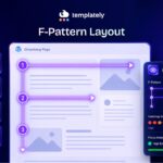
What Is a One-Page Website?
A one-page website, as the name suggests, is a site that contains all of its content on a single web page. Instead of clicking through multiple pages, visitors navigate by scrolling down or using anchor links that jump to different sections within the same page.
Why Single-Page Websites Are Taking Over the Internet?
The appeal of one-page websites lies in their storytelling potential. This format excels at simplicity, eliminating complex navigation and reducing decision fatigue. Below are some reasons why single-page websites are getting popular.
Faster Loading & Performance
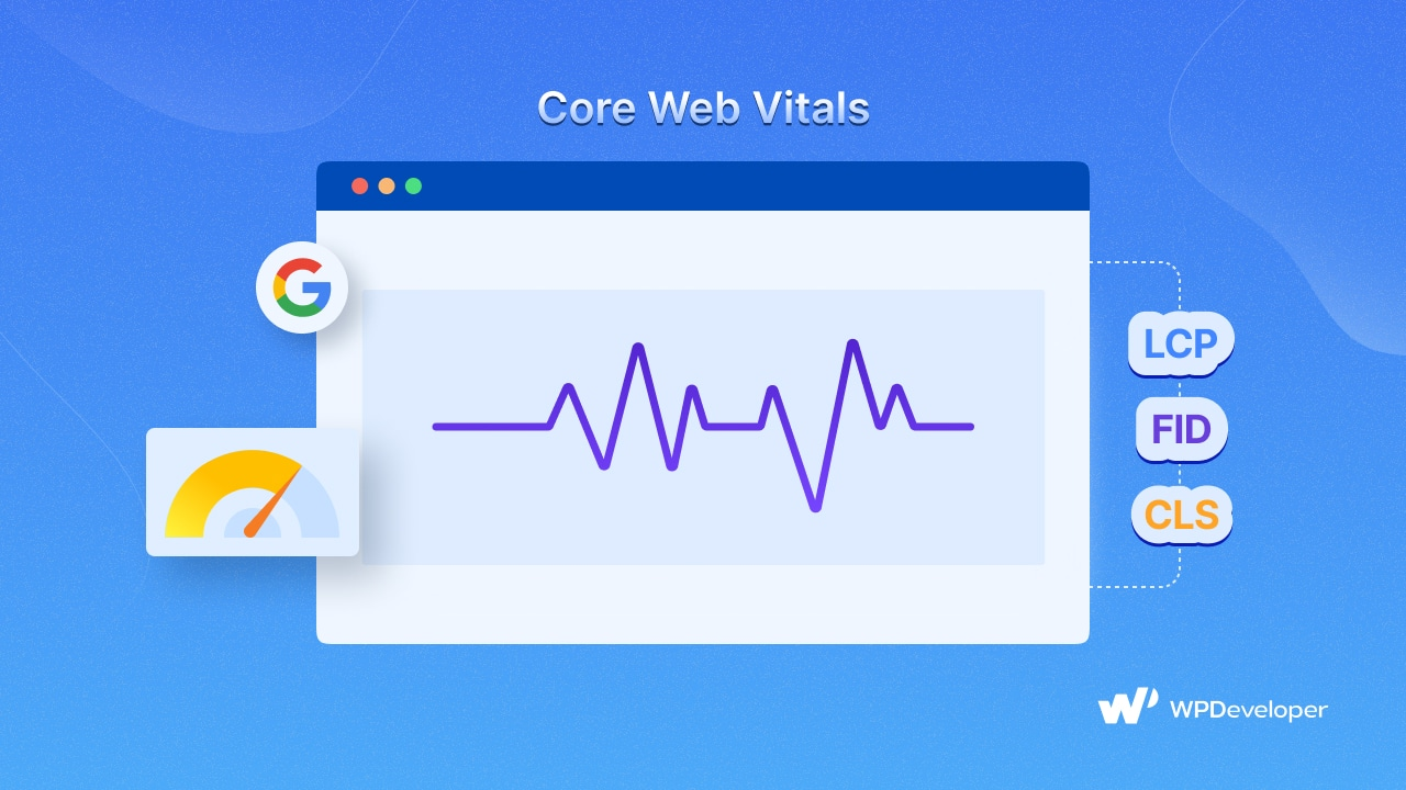
With just one page to load, these sites typically deliver content more quickly than multi-page alternatives. In 2025, with Google’s continued emphasis on Core Web Vitals and page experience signals, this performance advantage translates to better search rankings.
Streamlined Smooth Navigation
Users do not need to learn complex menu structures or remember where content lives. The intuitive scrolling interface makes for a frictionless experience that works across devices.
Enhanced Storytelling & Engagement
The linear format creates a controlled narrative flow, allowing designers to reveal information in a strategic sequence that builds toward conversion goals.
Simplified Analytics & Tracking
Tracking user behavior becomes easier when everything happens on a single page. It gets easier to identify drop-off points and optimize accordingly.
Mobile-Friendly by Design
One-page sites naturally adapt to mobile screens, where scrolling is the primary interaction method. This alignment with mobile user behavior makes them particularly effective for the mobile-first web of 2025.
While not ideal for content-heavy sites like news platforms or extensive eCommerce stores, one-page websites excel when the goal is to communicate a focused message effectively. Single-page websites are particularly suitable for:
- Personal portfolios that showcase work samples in a cohesive flow create a stronger impression
- Product launches that need to tell a compelling story about a single offering
- Event sites where all information (schedule, speakers, location, registration) can be logically presented in sequence
- Service-based businesses with focused offerings that benefit from a linear explanation
- Startup landing pages that need to quickly communicate value propositions
- Personal branding sites that present a cohesive narrative about an individual
Why Single-Page Websites Are Trending in 2025?
One-page websites are getting popular in 2025—not just because they look nice, but because people want faster, easier ways to browse. New technology has also made these websites better and more powerful than ever.
The Rise of Minimalist UX/UI
As people spend more time online, many feel tired and overwhelmed. To help with this, web designers are starting to believe that “less is more.” One-page websites are a great example of this idea. They remove extra stuff and focus only on what’s important. This simple style makes websites easier to use and helps people feel less stressed when browsing online.
The 2025 aesthetic favors clean layouts with purposeful white space, limited color palettes, and typography that prioritizes readability. One-page sites excel at this restrained approach, avoiding the temptation to overcomplicate the user experience.
Improved Mobile Experiences

Since most people now use phones more than computers to go online, one-page websites have become useful. These websites let you scroll naturally, just like you do on social media. And because phone screens are getting bigger and better, scrolling through a nicely designed one-page site feels more fun and interesting than ever.
The elimination of page loads between content sections creates a smoother experience, particularly on variable mobile connections. This seamless flow keeps users engaged rather than waiting for new pages to render.
Scroll-Triggered Animations & Interactivity
One big reason one-page websites are becoming so popular is that scroll-based animations have gotten a lot better. New tools now make it super easy to add cool visual effects that show up as you scroll. This turns a boring, still page into something fun and exciting to explore. In 2025, we are seeing some creative uses of these animations, like:
- Parallax effects that create depth and dimension
- Reveal animations that gradually unveil content
- Scroll-triggered transitions between color schemes and visual themes
- Interactive elements that respond to scroll position
- Horizontal scrolling sections within vertical layouts
- 3D elements that rotate or transform based on scroll position
Performance Advantages in SEO & Page Speed
Google now cares more about how well websites perform. So, fast-loading sites have a better chance of showing up higher in search results. One-page websites can be faster than regular multi-page sites if they are built the right way. They can load important content quickly, which helps improve performance scores and search rankings. Smart tricks like only loading content when it is needed and breaking up the website code into smaller parts help one-page sites stay fast and smooth.
10 One-Page Website Examples for 2025
Are you looking forward to seeing the best single-page website design? Let’s explore the 10 single-page websites, the best practices, and the innovative approaches defining web design in 2025.
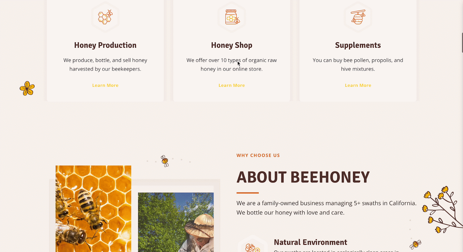
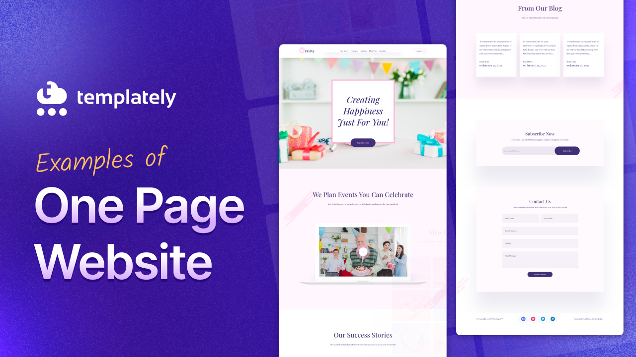
First, we are going to mention HoneyBee. This website shows how a one-page website can use cohesive visual design to convey a brand message that is as sweet and essential as its namesake.
Key Highlights:
- Warm, honey-inspired color palette evokes natural sweetness and purity
- Textures, lines, and shapes work together to create a handcrafted, organic feel
- Carefully chosen fonts and icons reinforce the brand’s identity and purpose
- Minimalist layout subtly ties human well-being to environmental sustainability
- Smooth scroll-driven navigation makes for a seamless and engaging journey
HoneyBee proves that effective design does not need complexity—just consistency and intention. Every element is purposefully chosen to reflect nature, health, and harmony. It is a single-page site that not only introduces a product or cause but tells a visual story that lingers long after the scroll ends.
If your brand is rooted in nature or wellness, lead with authenticity. Let texture, color, and simplicity carry your message home.

Bruno Simon is another single-page website design that you can look up. It is a creative portfolio website that presents his creative development portfolio through an extraordinarily interactive one-page experience where users navigate a 3D environment using a car.
Key Highlights:
- Features a fully interactive 3D environment with physics-based navigation
- Uses WebGL and Three.js to create an immersive experience
- Integrates portfolio projects as discoverable elements within the 3D world
- Includes intuitive keyboard controls that make exploration enjoyable
What makes Bruno Simon’s portfolio exceptional is how it transforms the typically passive experience of viewing a portfolio into an interactive game. The playful driving mechanics create a sense of discovery as visitors explore his work samples. Despite the technical complexity, the site maintains impressive performance, demonstrating that rich experiences don’t have to compromise on speed.
Consider how interactive elements can transform passive content consumption into active exploration. The site also demonstrates effective use of 3D on the web without creating overwhelming cognitive load or performance issues.
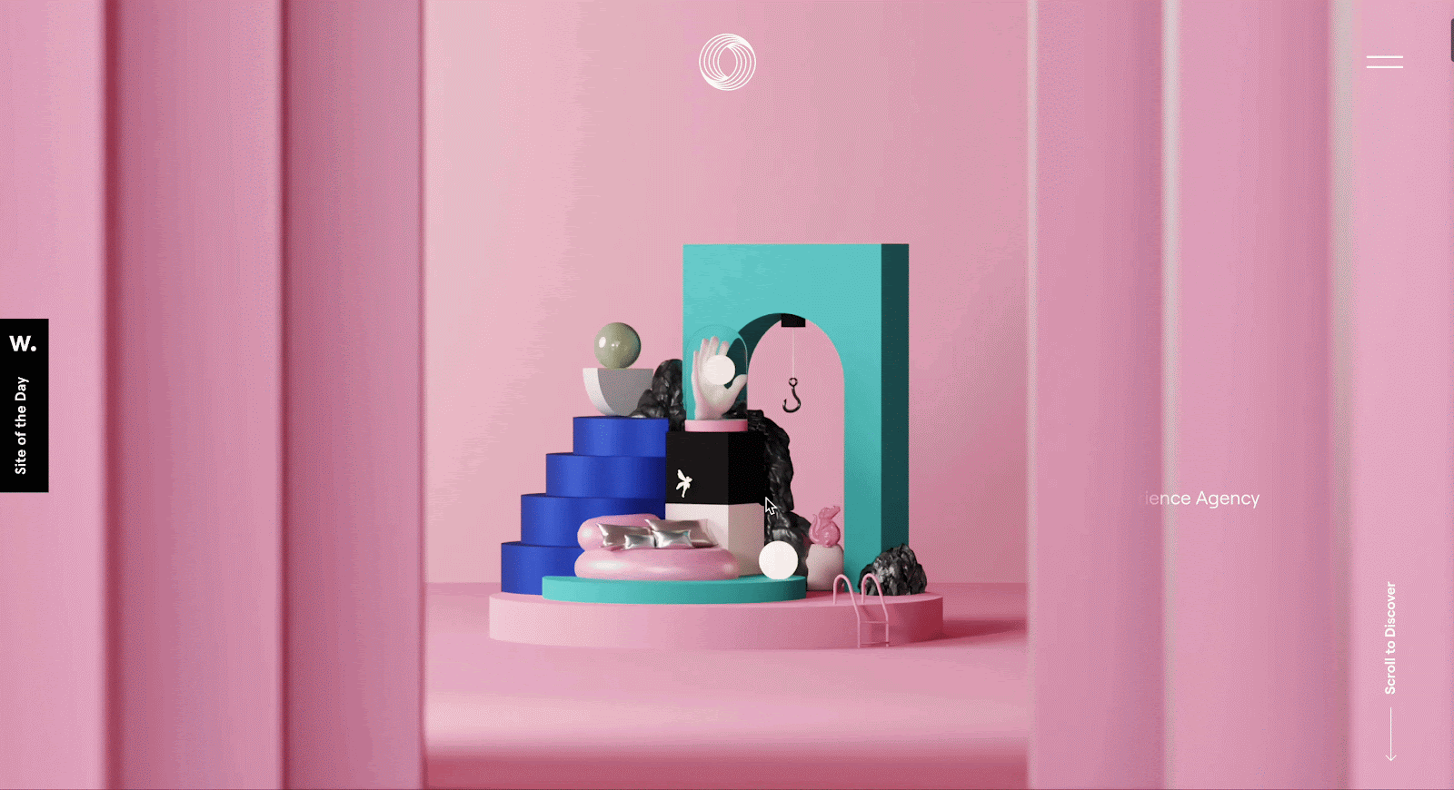
Next, we have Neverland Agency. It crafts a cinematic one-page experience that blurs the line between web design and digital storytelling, ideal for a creative agency.
Key Highlights:
- Features immersive scrolling with parallax effects and narrative-driven text
- Custom cursor (a simple black dot) matches the brand aesthetic
- The right-hand expandable menu gives optional navigation support
- Rich visuals and animations guide users through the agency’s story and team
- Balanced use of text and imagery keeps the journey intuitive and captivating
Neverland turns a single-page website into a full-blown experience. The intentional use of narrative, coupled with thoughtful design choices like the minimalist cursor and scroll-first layout, draws visitors in and keeps them engaged from start to finish.
When storytelling is your strength, let it lead the design. This site proves that even a one-pager can feel rich and expansive with the right visuals, structure, and subtle interaction cues.

This educational one-page site uses scroll-triggered animations to tell a story about water conservation through the daily routines of an average person.
Key Highlights:
- Features a character that progresses through daily activities as users scroll
- Uses animation to visualize water usage in different scenarios
- Incorporates factual data points throughout the narrative
- Includes a clear conservation message and actionable tips
Every Last Drop turns what could be dry statistical information about water conservation into an engaging narrative. By following a character through daily routines, visitors immediately contextualize water usage in familiar activities. The scroll-triggered animations create a sense of cause and effect, helping users understand their impact on water consumption in a memorable way.
What can you learn? Consider how character-driven narratives can make abstract concepts tangible. The site also demonstrates how educational content can be engaging without sacrificing factual accuracy.
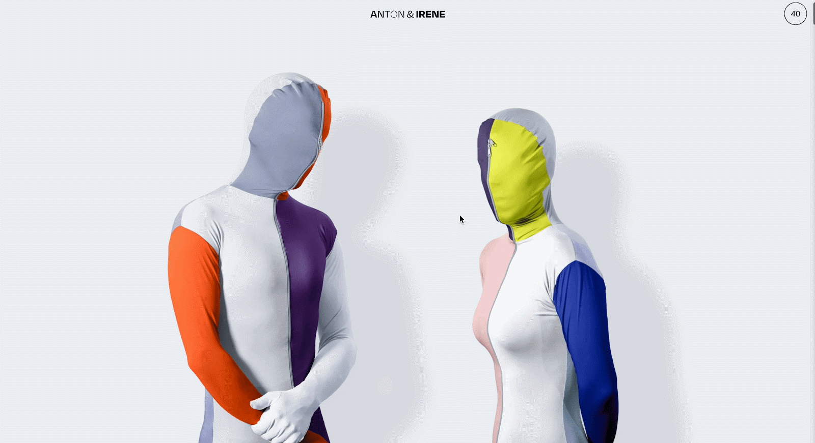
This design studio presents its portfolio and services through a minimalist one-page site with sophisticated typography and subtle interactions.
Key Highlights:
- Features a restrained black and white color palette with occasional color accents
- Uses typographic hierarchy as the primary organizational element
- Incorporates subtle hover states that reveal project details
- Includes smooth transitions between content sections
Anton & Irene demonstrate that simplicity can be sophisticated. The site uses white space strategically, allowing content to breathe while creating clear visual relationships between elements. Their project showcase relies on thoughtful typography and minimal interactions rather than flashy effects, reflecting confidence in their work’s strength without needing embellishment.
How restraint in design can highlight content more effectively than elaborate effects is what you can learn from the site. The site also demonstrates how typography alone can create sufficient visual hierarchy and interest.
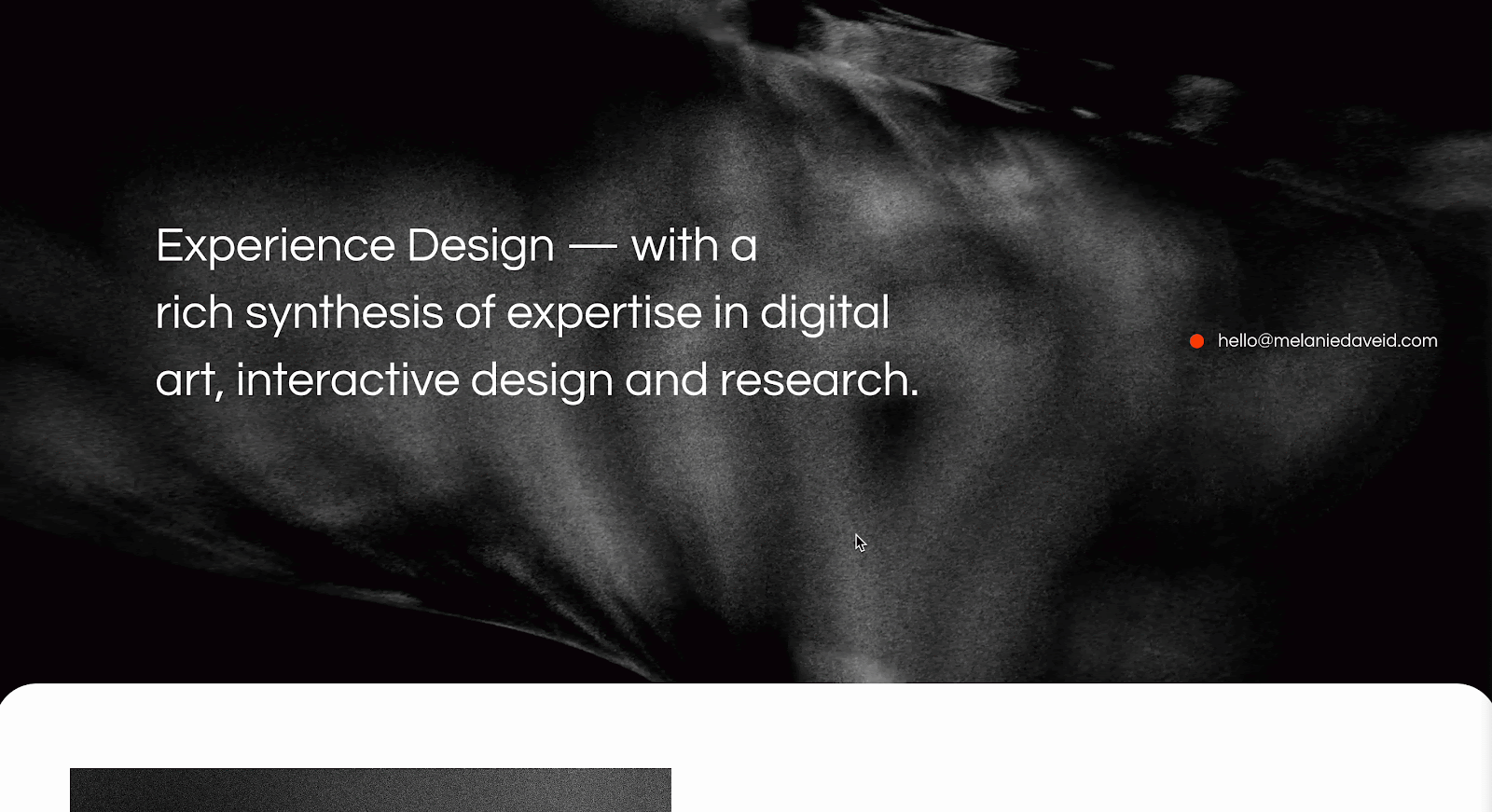
This designer’s portfolio uses a one-page approach to showcase her work through carefully choreographed sections that reveal her personality and projects.
Key Highlights:
- Features thoughtful micro-interactions that respond to user behavior
- Uses scroll-triggered animations that reveal content progressively
- Incorporates case studies directly within the flow
- Includes personal insights alongside project work
Melanie Daveid’s portfolio creates a perfect balance between showcasing professional work and personal character. The animations are purposeful rather than decorative, often revealing new content in ways that enhance understanding of her process. The site creates a sense of discovery as visitors scroll, with each new section revealing another layer of her professional identity.
Consider how animations can serve narrative purposes by revealing content at appropriate moments. The site also demonstrates effective integration of personal brand with professional work.

Orbital Systems presents its water-recycling shower technology through an immersive one-page experience that combines stunning visuals with compelling storytelling. As users scroll, they see how water cycles through the system, creating an intuitive understanding of the technology
Key Highlights:
- Uses horizontal scrolling within sections to break the vertical monotony
- Features 3D product renderings that rotate as users scroll
- Implements a clever water-drop animation that follows scroll depth
- Includes interactive comparison tools to demonstrate water and energy savings
What makes Orbital Systems exceptional is how they use scroll-triggered animations to visualize the water-saving concept at the heart of their product. The site balances technical information with emotional appeals about sustainability. This site maintains a luxury aesthetic that positions the product as premium rather than purely utilitarian.
Consider how scroll animations can illustrate complex concepts in intuitive, visual ways. The site also demonstrates how to maintain brand positioning (premium/luxury) while communicating technical benefits.
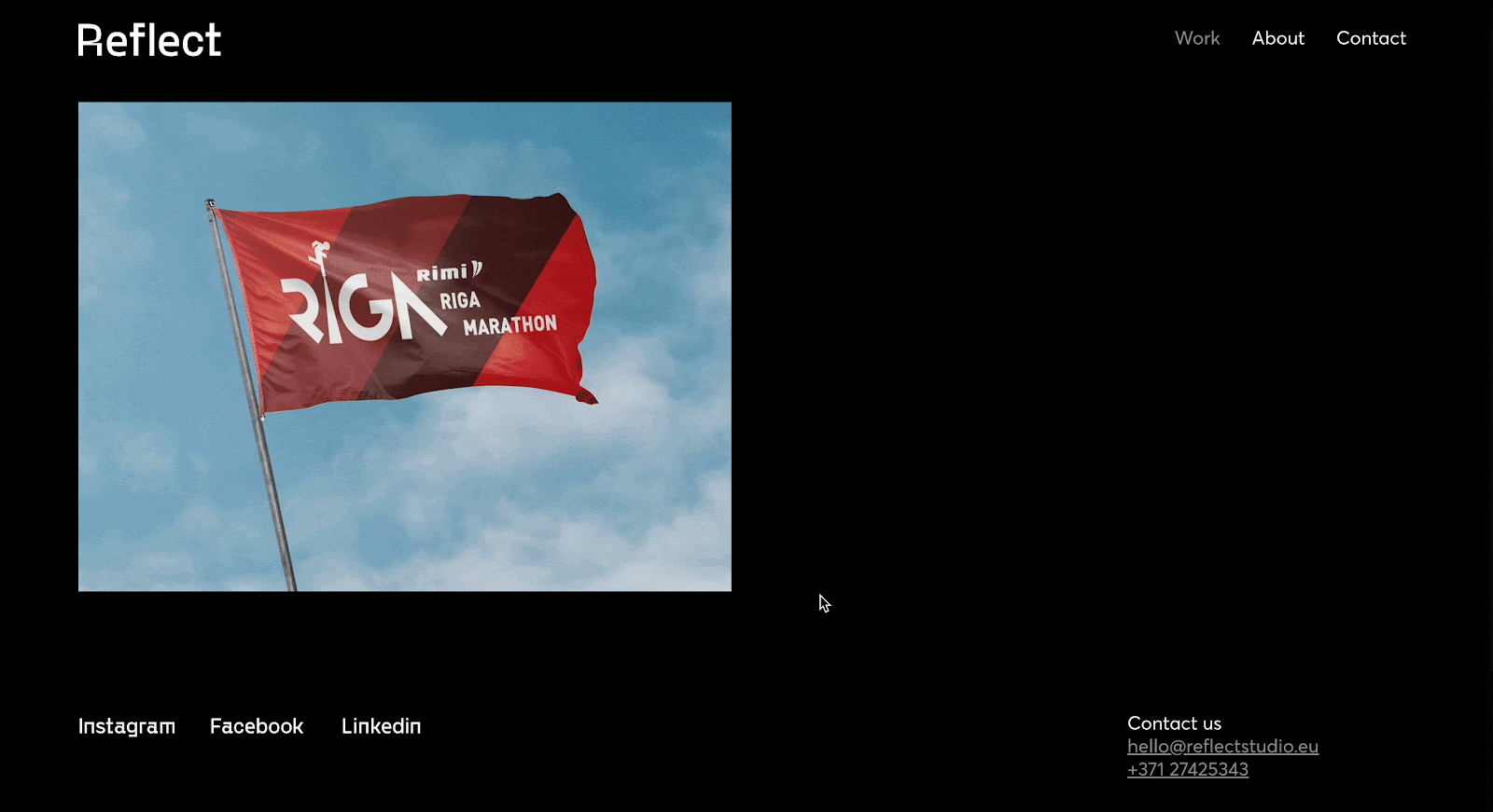
Though it may not seem entirely a single-page website, this design agency’s site showcases its portfolio through a unique scrolling experience. The minimal design and navigation give a one-page site experience and reflect their creative approach and technical expertise.
Key Highlights:
- Features a sticky side navigation that doubles as a scroll progress indicator
- Utilizes a dynamic grid layout that reorganizes as users scroll
- Incorporates subtle sound design elements that respond to interaction
- Showcases work samples through embedded, interactive case studies
Reflect Studio transforms the potentially limiting one-page format into a playground for interaction design. Their navigation system is particularly noteworthy—the fixed sidebar not only helps users understand where they are in the journey but also previews upcoming sections through subtle animations. The site feels both playful and precise, reflecting the agency’s creative personality while demonstrating its technical capabilities.
How navigation can do more than just direct users—it can become a design element that enhances the overall experience. The site also shows how to create distinct “chapters” within a single page while maintaining cohesion.
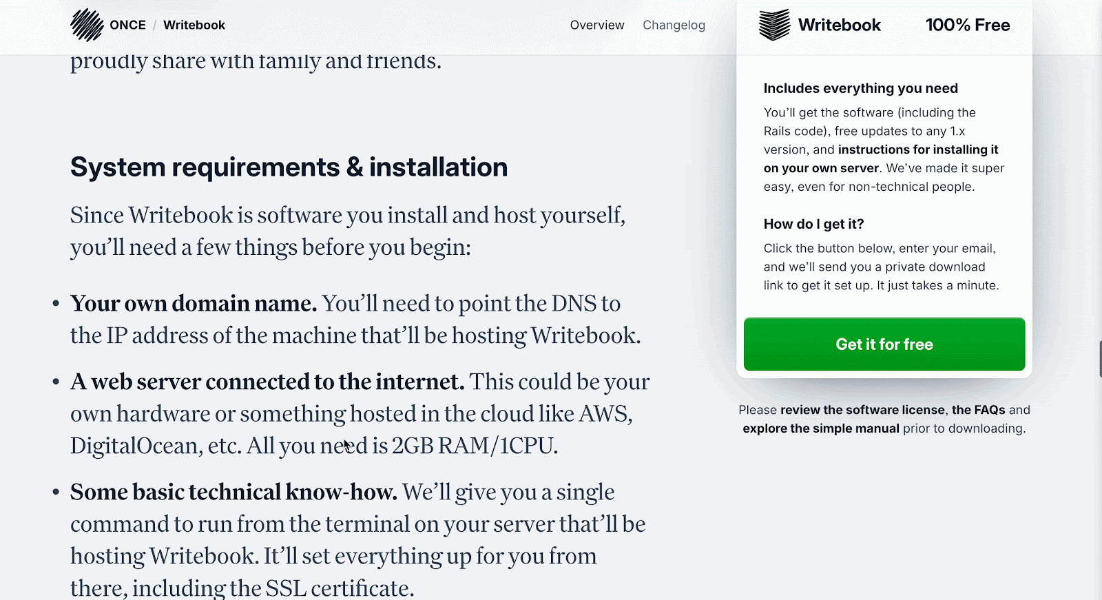
ONCE – Writebook shows how you can pack loads of practical information into a one-page layout without overwhelming your audience, perfectly tailored for writers and authors.
Key Highlights:
- Text-heavy structure caters directly to an audience of writers and self-publishers
- Screenshot visuals support the content, illustrating key features of the platform
- The FAQs section provides quick answers and builds user confidence
- Clean, distraction-free layout ensures the content shines
- Sticky CTA in bookmark style nudges users to take action as they scroll
This site knows its audience and delivers exactly what they need—clear, informative content. The seamless integration of visuals and persistent CTA positioning enhances both readability and conversions.
Know your audience and build your layout around their priorities. In this case, clear language, clean structure, and contextual visuals do more than flashy animations ever could.
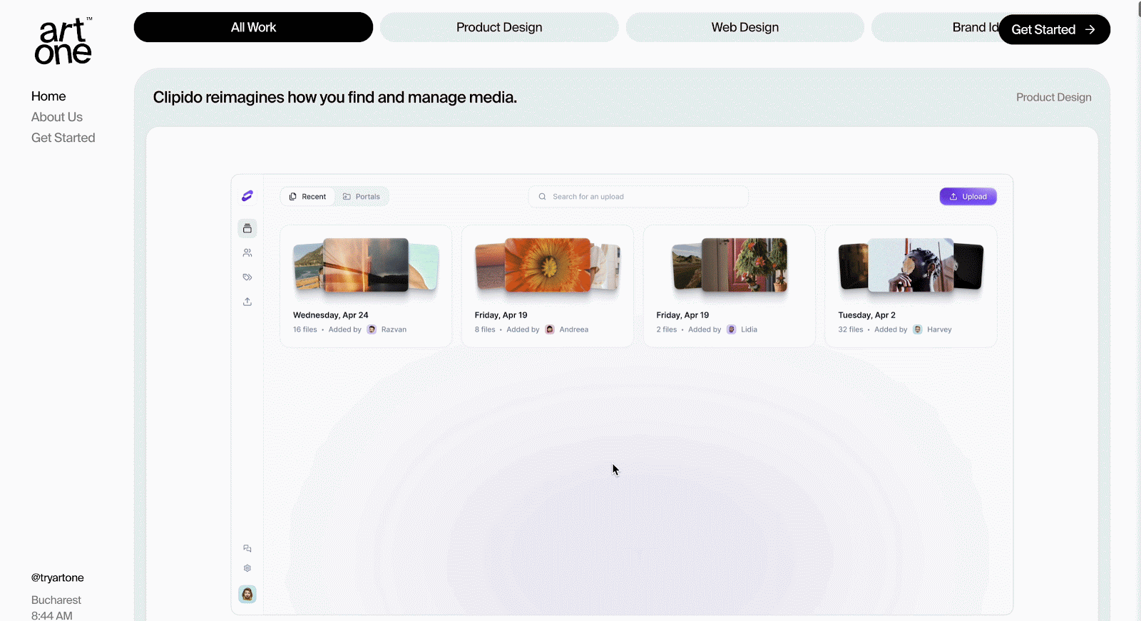
Artone Studio brings its creative portfolio to life with a one-page website packed with interactive elements and sleek visuals that reflect its design expertise.
Key Highlights:
- Interactive sliders and pop-ups keep users engaged within a single page
- Carousel gallery showcases high-resolution project visuals
- Smooth transitions and animations add a dynamic edge
- Feature-to-benefit copy style makes service value easy to grasp
- Interactive elements highlight technical skills without overwhelming the visitor
Artone’s one-page website looks amazing and is super easy to use. It shows off their creativity in a fun and simple way that makes exploring the site feel smooth and enjoyable
Interactivity does not have to be overwhelming. Thoughtful UI features like galleries and pop-ups can enhance engagement and communicate capability, especially when your work speaks visually.
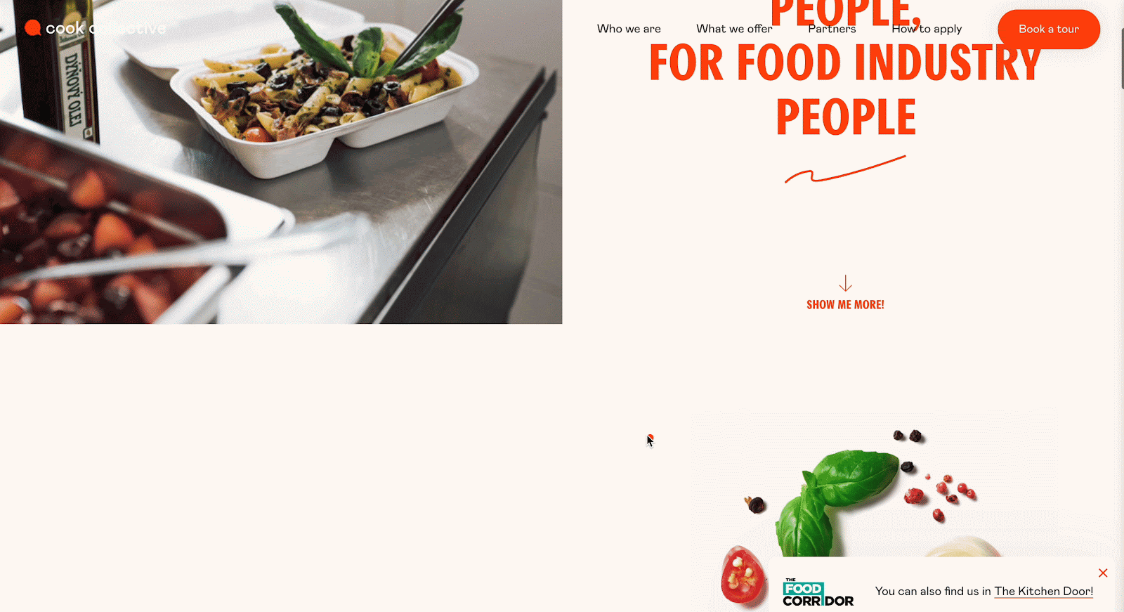
Cook Collective is a compelling example of a single-page website that immediately communicates purpose and value through powerful design and focused messaging.
Key Highlights:
- Features a bold tagline that instantly communicates brand identity: “Shared kitchen by food industry people, for food industry people.
- Utilizes a sticky menu for seamless jump-to-section navigation
- Maintains a clean, consistent orange-and-black color scheme throughout
- Strategically placed call-to-action button encourages users to book a tour
- Visuals and copy are aligned to reflect professionalism and clarity
Cook Collective shines through its clarity and purpose-driven design. Everything—from the color palette to the tagline—serves to reinforce the brand’s identity and make it easy for visitors to understand what they offer. The sticky menu ensures a user-friendly experience, while the focused CTA enhances conversion potential.
Do not underestimate the power of focused messaging and intentional design. Keeping things simple, clear, and visually cohesive can deliver an effective and user-friendly one-page website experience.
Common Features Found in Great One-Page Sites
After analyzing these exemplary single-page websites, certain patterns emerge that contribute to their effectiveness. Here are the key features that consistently appear in successful designs:
Sticky Navigation or Scroll Indicators
Most top one-page websites use a fixed menu or navigation bar that stays in the same place as you scroll. This helps users know which part of the page they’re on and lets them easily jump to other sections. These range from traditional sticky menus to more creative implementations like:
- Vertical progress bars that fill as users scroll
- Dot navigations that highlight the current section
- Side-anchored labels that change based on visible content
- Timeline-style indicators showing progression through a narrative
These navigation elements provide crucial orientation when standard URL changes are absent, helping users maintain their sense of location within the site.
Clear Calls-to-Action
Good single-page websites focus on getting visitors to act, like signing up or buying something. They do this by placing clear and helpful buttons (called CTAs or Calls-To-Action) in the right spots on the page. Rather than limiting action opportunities to the end of the page, great designs typically:
- Include a primary CTA in the initial viewport
- Repeat action opportunities at logical conclusion points throughout the page
- Use sticky CTAs that remain accessible regardless of scroll position
- Evolve CTA messaging based on the content being viewed
- Use contrasting colors and animations to draw attention at key moments
This approach ensures that users can take action whenever they feel sufficiently informed, rather than forcing them to scroll to a specific location.
Visual Storytelling
The best one-page websites use pictures, videos, and other visuals to tell a story. As you scroll down the page, the story continues in a smooth and connected way, making it more interesting to follow. Common techniques include the following, and these visual storytelling techniques transform passive scrolling into an engaging, movie-like experience that keeps users invested in the journey.
- Thematic color transitions that reflect content shifts
- Illustrations or animations that build upon each other
- Visual metaphors that reinforce key messages
- Progressive disclosure of complex information through animated elements
- Cinematic transitions between sections that maintain narrative continuity
Responsive, Fast-Loading Designs
One-page websites need to load quickly and work smoothly, even though they often use lots of images, videos, and animations. Good performance keeps the website fast and easy to use. Successful implementations typically feature:
- Aggressive image optimization and modern formats (WebP, AVIF)
- Progressive loading techniques that prioritize visible content
- Lazy-loading of off-screen media and components
- Efficient animation techniques that don’t tax device resources
- Responsive layouts that adapt meaningfully to different screen sizes
- Fallback experiences for devices with limited capabilities
Section-Based Layout with Anchor Links
Single-page websites are usually divided into clear sections. Each section feels like its own page, even though everything is on one long webpage. This sectional approach creates organization within the page while maintaining a cohesive scrolling experience. This helps people find what they need more easily. These sections commonly include:
- Clear visual boundaries without feeling disconnected
- Consistent internal structures that aid comprehension
- Logical progression from one section to the next
- Targeted anchor links for direct navigation
- Appropriate padding to accommodate fixed headers when using anchor links
- Natural breakpoints that invite brief pauses in scrolling
How to Create a Stunning One-Page Website
Ready to create your one-page website? Here is a streamlined approach to designing an effective single-page experience:
1. Define the Goal
Having clear answers to these questions will guide your content hierarchy and help determine what elements deserve prominence. Before diving into design, clarify what your single-page website needs to accomplish:
- Is it primarily informational or conversion-focused?
- What single action do you most want visitors to take?
- What key messages must be communicated?
- Who is your primary audience, and what matters to them?
- What objections or questions will they have that the site needs to address?
2. Plan Your Content Flow
Content mapping helps ensure your one-page narrative builds naturally toward your goals. Map out the logical sequence of information that will guide visitors toward your desired outcome:
- Start with an attention-grabbing hook that clarifies your value proposition
- Build credibility through evidence, social proof, or demonstrations
- Address key questions and objections at the right moments
- Present features and benefits in a meaningful progression
- Include clear calls-to-action at logical conclusion points
- End with reinforcement of key messages and final conversion opportunities
3. Choose Your Tools
Pick tools that help you build the kind of website you imagine, while keeping things running smoothly and easy to fix later. Go for what works well with today’s one-page websites.
- Visual Page Builders: Platforms like Elementor, Divi Builder, or Webflow offer dedicated one-page features, including anchor links, scroll effects, and sticky elements.
- WordPress Block Editor: Use Gutenberg with plugins like Animation Toolkit, Essential Blocks for Gutenberg to create scroll-triggered effects.
- Templates and Themes: Consider starting with one-page templates to accelerate development.
- Web Animation Libraries: For custom development, libraries like GSAP (GreenSock Animation Platform), Locomotive Scroll, or ScrollTrigger provide powerful scroll-based animation capabilities.
4. Design with Scroll Flow in Mind
Remember that scroll position becomes your primary tool for controlling the user’s attention and experience. Create a design that leverages the vertical scrolling format:
- Use scroll-triggered animations to reveal content at appropriate moments
- Create visual continuity between sections through overlapping elements or transitions
- Incorporate scroll indicators that help users understand page length and position
- Consider varying content density to create rhythm, alternating between content-rich and more spacious sections
- Design for key “breakpoints” where the screen composition changes significantly
5. Optimize Navigation and Orientation
These navigation aids help prevent the disorientation that can sometimes occur in longer one-page experiences. Help users maintain their bearings within your one-page site:
- Include a sticky header with section links or a hamburger menu
- Consider adding scroll progress indicators
- Use visual landmarks that help users remember their position
- Implement smooth scrolling for anchor links
- Ensure scrolling speed feels natural on different devices
6. Prioritize Performance
A beautiful design means little if performance issues create a frustrating experience. Optimize your one-page site for smooth, responsive performance:
- Compress and optimize all images and videos
- Implement lazy loading for off-screen content
- Use CSS animations where possible instead of JavaScript for better performance
- Test scrolling performance across devices, especially mobile devices
- Consider using intersection observers to trigger animations efficiently
- Optimize fonts and third-party scripts that might impact loading time
7. Test and Refine
These insights will help you refine your one-page experience for maximum effectiveness. Evaluate your one-page website with real users to identify improvements:
- Watch how people naturally scroll through your content
- Track where users pause, rush, or show confusion
- Analyze heat maps to understand interaction patterns
- Test on various devices to ensure consistent experiences
- Conduct A/B tests on key elements like CTA placement or section ordering
One-page websites are not just simple anymore. Now, they can tell a full story and give people a great experience. When done right, they guide visitors from start to finish in a smooth and fun way.
Whether you are making a website for yourself, a product, or a small business, a one-page site is a great way to keep it simple and still make an impact. Check out the examples we shared, try using some of the ideas, and build your one-page site. If you are just starting, look for ready template sources. You can also explore Templately, providing 5,500+ ready WordPress templates along with some one-page website templates as well.
Ready to Build Your Own? Keep It Simple, Make It Great
In 2025 and beyond, these websites will get even more popular, with things like moving animations, sound effects, and content that changes based on who’s visiting. People do not always have the time or patience to click through many pages. That is why single-page websites are a smart choice too. Everything is in one place, and it is easy to follow.
Was this blog helpful? If you want to read more articles like this, subscribe to our blogs. Also, we would love to have you in our Facebook community, where you can share your knowledge and views with others.