
Designing websites has become fun, easy, and seamless due to the availability of ready web templates. All it requires is to pick a design you prefer, follow some required steps, and your website’s landing pages will be ready.
However, there is always room for improvement and customization, which gives the website a unique feel and sets it apart. If you want to tweak and turn your website front, you must know CSS tricks; it will make your work effortless.
Today, we will share 10 CSS tricks that you should know as a designer while working on web templates. Let’s get started.
Should a Web Designer Know HTML and CSS? What Are the Benefits?
When we see them, we immediately assume that HTML and CSS are meant for web developers rather than designers. But when designing web templates for live websites, you must know them to make the site engaging, interactive and user-friendly. Mastering HTML and CSS empowers designers to achieve it.
Moreover, it enhances collaboration with developers, speeds up the design process and unlocks advanced CSS tricks for personalized styling. Let’s take a look at the reasons you should know about HTML or CSS tricks as a designer.
✅ Better Collaboration: Communicate design ideas more clearly with developers and share input when CSS customization is required. Avoid inconsistencies between design mockups and final implementation.
✅ Practical Implementation: Understand the scope of website design freedom and limitations and design accordingly.
✅ Faster Prototyping & Unique Designs: Experiment with layouts, animations and responsiveness directly in code.
✅ Boost Creativity: Explore advanced CSS tricks like flexbox, grid and custom animations. Use CSS tricks to add animations, hover effects and modern UI elements.
✅ Career Growth: Stand out in the competitive field of WordPress template design.
Designers can push the boundaries of creativity while ensuring their designs are functional and developer-friendly by mastering CSS tricks and fundamentals.
10 CSS Tricks Every Designer Should Know for Stunning Web Templates
Now we have some fine ideas about how HTML and CSS knowledge can help designers to think, work and collaborate better with developers. Let’s look into 10 CSS tricks that you, as a designer, can use on your own. Knowing all of these tricks can help you tweak your created web templates, and if they interest you, then you can dive deep into the HTML/CSS world. As a designer, you can use these tips to improve your own portfolios and, if you are interested, delve deeper into the HTML/CSS realm.
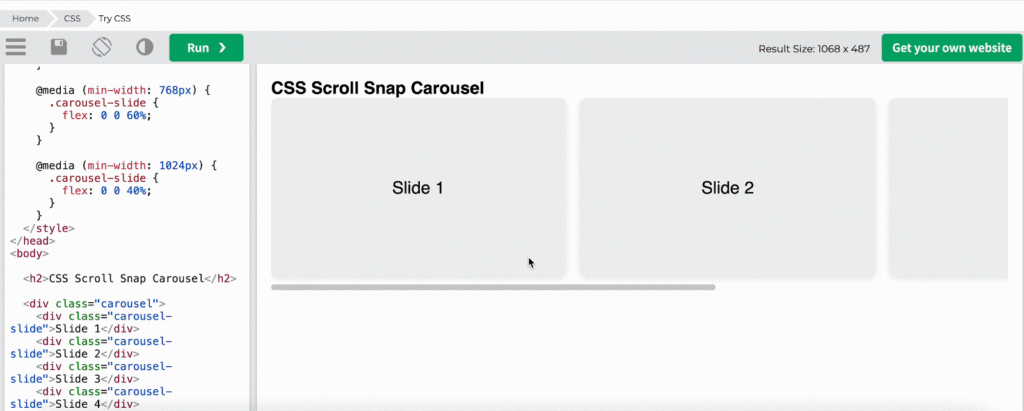
1. Scroll Snap for Carousel-like Layouts
CSS Scroll Snap lets you control how scrollable containers “snap” to child elements, so instead of stopping mid-way, the scroll smoothly locks onto defined points. When making horizontal sections or carousels for web templates, scroll-snap provides a smooth and touch-friendly experience.
You can implement this CSS trick on images or product carousels. It will help you showcase e-commerce or portfolio sites, display one quote at a time with intuitive scrolling and so on.
Here is an example of the Scroll Snap effect:
.carousel
{
display: flex;  overflow-x: scroll;  scroll-snap-type: x mandatory;  scroll-behavior: smooth;}
.carousel > div {  flex: 0 0 100%;  scroll-snap-align: start;
}
2. Fluid Typography with clamp()
A contemporary method for creating device-friendly font sizes that scale fluidly across various screen sizes without the need for media queries is fluid typography with clamp() in CSS. It is a more streamlined and dynamic method of making text look good on desktop and mobile devices alike. This approach is cleaner, more dynamic, and compatible with both desktop and mobile devices.
This CSS trick can help you make your large titles look great on all devices, simplify your code by lowering breakpoints, make your content easier to read on desktops and mobile devices and more.
Here is an example of Fluid Typography with clamp():
h1 {      font-size: clamp(2rem, 6vw, 4rem);      margin-bottom: 1rem;    }
p {      font-size: clamp(1rem, 2.5vw, 1.5rem);      max-width: 60ch;    }
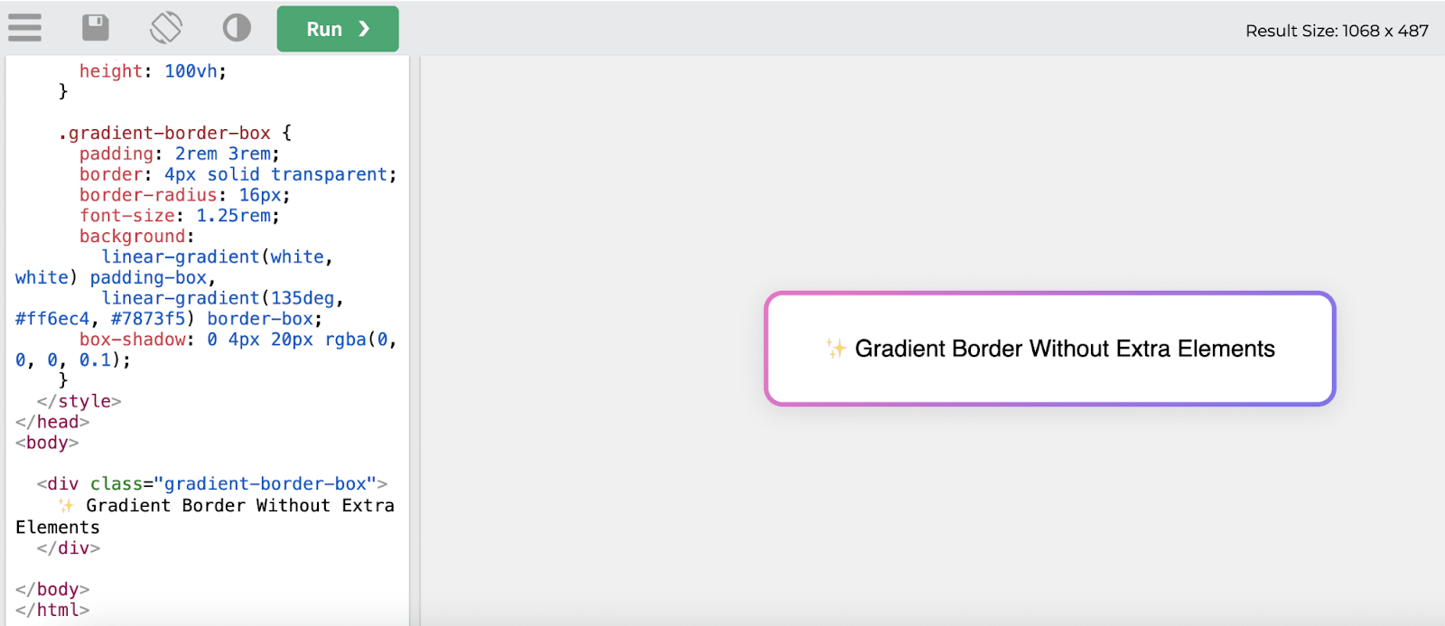
3. Gradient Borders without Extra Elements
In the past, additional wrapper elements or pseudo-elements (::before or ::after) were needed to add gradient borders. Modern CSS, however, allows you to directly create gradient borders for your web templates by combining:
- border + border-image
- OR background-clip + padding-box + border-box (advanced)
- OR using mask and background for more flexibility
No extra divs or wrappers are needed, just clean CSS. This CSS trick will be useful if you want to use gradient rings around images for a trendy user interface, make your buttons or containers stand out visually and more.
Here is an example of gradient borders with an extra element:
.gradient-border
{
border: 5px solid;  border-image: linear-gradient(45deg, #ff6ec4, #7873f5) 1;  border-radius: 12px;
}
4. CSS Animations
CSS Animations allow you to animate HTML elements using just CSS; no JavaScript is required. You specify a collection of keyframes (the way an element should look at specific times), apply it with the animation property and so on.
Below is a breakdown of common CSS animation properties:
| Property | What it does |
| @keyframes | Defines the animation frames |
| animation-name | Name of the keyframes |
| animation-duration | Time the animation takes (2s, 1s) |
| animation-delay | Delay before it starts |
| animation-iteration-count | How many times to run it (infinite, 1) |
| animation-direction | Normal, reverse, alternate |
| animation-timing-function | Speed curve (ease, linear, etc.) |
| animation-fill-mode | How styles are applied before/after |
This CSS trick is suitable if you want to apply page load effects, the transition between states, hover animation on buttons, etc., on web template design. You can create dynamic backgrounds, animated borders and loading indicators without any JS.
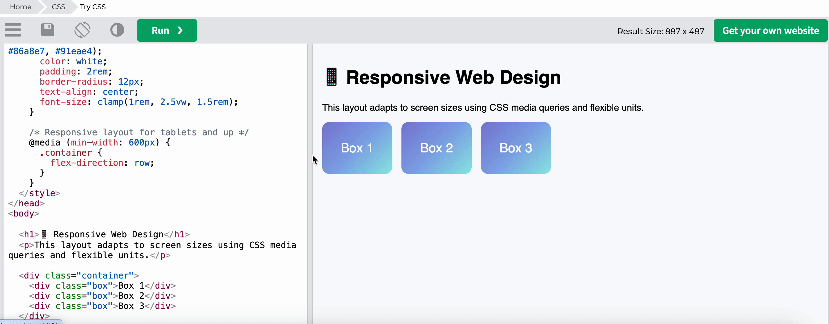
5. Responsive Web Design
The CSS technique, responsive web design (RWD), ensures that websites function and look fantastic on all screen sizes, from tiny mobile devices to large desktop computers. CSS achieves this using fluid units, flexible layouts, media queries, mobile responsiveness, etc. This CSS trick will ensure your site is readable and usable on smartphones and tablets.
Here is an example of responsive web design:
.container {
display: flex;      flex-direction: column;      gap: 1rem;
}
.box {      background: linear-gradient(135deg, #7f7fd5, #86a8e7, #91eae4);      color: white;      padding: 2rem;      border-radius: 12px;      text-align: center;      font-size: clamp(1rem, 2.5vw, 1.5rem);    }
 /* Responsive layout for tablets and up */    @media (min-width: 600px) {      .container {        flex-direction: row;      }
}
6. Flexbox and Grid layout
Flexbox and Grid are two essential layout systems in CSS that empower designers to create flexible, responsive and complex layouts for web templates with minimal code. Even with unknown or dynamic item sizes, the flexbox layout makes it simple to align items along rows or columns, distribute space within a container and adapt to viewport changes.
You can create rows and columns simultaneously with Grid, a two-dimensional layout system. It is ideal for more intricate arrangements where objects must be simultaneously aligned in both directions.
This CSS trick will help you to create horizontal or vertical menus, arrange images in responsive grids that adjust based on the viewport size and so on.
Here is an example of Flexbox Centering (Both horizontal & vertical)
.container { display: flex; justify-content: center; align-items: center; height: 100vh;}
Here is an example of a grid layout with explicit rows and columns.
.container { display: grid; grid-template-columns: repeat(3, 1fr); grid-gap: 1rem;}.item { background-color: #f4f4f4; padding: 1rem;}
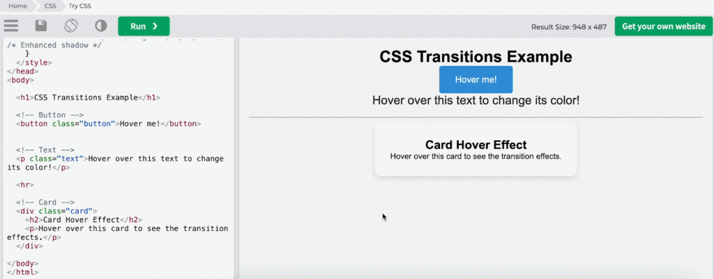
7. CSS Transitions
CSS Transitions are a super powerful tool in web design. They allow you to add smooth, interactive animations to elements without needing JavaScript. When an element’s state changes (like on hover or focus), you can specify how and over what period those changes should occur. This CSS trick is suitable for animating icons, images, or other UI elements for smoother transitions between states
Basic Syntax for CSS Transitions:
.element { transition: <property> <duration> <timing-function> <delay>;}
Here is an example of using CSS Transition:
8. Advanced Input & Form Styling
Advanced Input & Form Styling refers to using CSS to create unique, visually appealing layouts, designs and user experiences. This is accomplished by using a variety of CSS selectors, properties and methods to alter elements and add uniqueness to a website. Applying custom styling instead of the default browser styles enables designers to produce web templates with branded, customized experiences for particular audiences.
Utilizing this custom CSS trick, you can:
- Create custom layouts
- Adjust typography, colors and spacing
- Style interactive elements (like buttons, links, forms)
- Add visual effects (like shadows, borders, transitions, animations)
- Enhance the user experience with responsive and adaptive design
Here is an example of custom form input styling:
input[type="text"], input[type="password"], textarea {  padding: 12px 15px;  border-radius: 5px;  border: 2px solid #ccc;  width: 100%;  font-size:clamp(14px, 0.875rem + ((1vw - 3.2px) * 0.227), 16px);  transition: border-color 0.3s ease, box-shadow 0.3s ease;}
input[type="text"]:focus, input[type="password"]:focus, textarea:focus {  border-color: #3498db;  box-shadow: 0 0 8px rgba(52, 152, 219, 0.5);}
9. CSS Media Queries
CSS Media Queries is a helpful tool in CSS that lets designers apply different styles to a webpage according to the viewport or device specifications. This covers attributes like the user’s preferred color scheme, screen size, resolution and orientation (landscape or portrait). Media queries make it possible to create responsive web designs, which guarantees that websites adjust and display beautifully on a range of screen sizes, including tablets, smartphones and PCs.
You can use this CSS trick if you want to do visibility controls, typography adjustments, create mobile-friendly layouts, etc. for your website design.
Here is an example for CSS media queries:
/* Tablet Layout (Min width 600px) */    @media (min-width: 600px) {      .grid {        grid-template-columns: 1fr 1fr;      }    }
    /* Desktop Layout (Min width 1024px) */    @media (min-width: 1024px) {      .grid {        grid-template-columns: 1fr 1fr 1fr;      } /* Large Screen Layout (Min width 1440px) */    @media (min-width: 1440px) {      .container {        width: 70%;      }
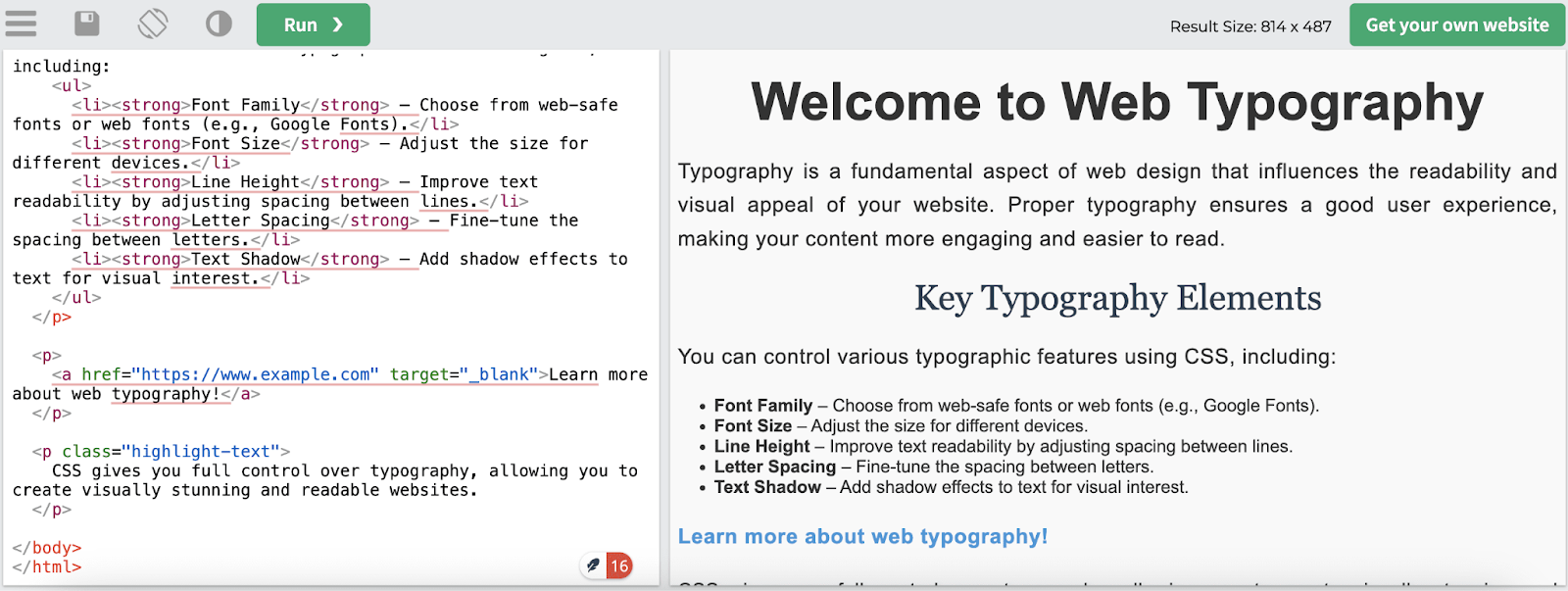
10. Web Typography with CSS
Web typography is the process of designing, organizing and styling text on a website using CSS (Cascading Style Sheets). It has an impact on readability, user experience and aesthetic appeal, making it a vital component of web design. You can use CSS to control a variety of typographic elements, such as font size, line height, letter spacing and selection, to make sure your website looks fantastic and is readable on a variety of screens and devices.
Here are the essential CSS properties used for web typography:
| font-family | font-size | line-height |
| letter-spacing | text-align | font-weight |
| text-transform | font-style | text-decoration |
Bonus: Access 5000+ WordPress Templates For Inspiration & 1-Click Website Creation
Understanding the aforementioned CSS tricks is regarded as a fundamental component of frontend design for web templates. However, in order to succeed in creating the greatest website templates, you will require direction and motivation. Especially if you are planning to create websites in 1-click, no extra steps are needed.
Let us introduce you to Templately, the ultimate template cloud for designing stunning websites. This popular template library has 5000+ uniquely designed templates and helps you design websites for portfolios, agencies, eCommerce, travel, marketing and so much more. You won’t need extra CSS techniques to complete the web design.
If you are looking for ready solutions and want to complete the website development in 1-click, then Templately templates are the best option. It offers full site import support, so you do not need to know any code to create a whole website with headers, footers and extra pages. Moreover, you can utilize CSS tricks on these templates well for advanced customization. Templately is now considered a must-have template hub for web designers.
Get Templately for Your Websites
Excel in Web Template Designs with CSS Best Practices
The dynamic combination of HTML and CSS makes digital experiences come to life. This tour of the most useful HTML/CSS tips reveals a multitude of techniques that elevate the functionality and inventiveness of designers of web templates. Designers can produce logical layouts that captivate and easily lead visitors.
These are more than just ten pieces of CSS code; they serve as the cornerstone of digital art, enabling designers to produce engaging and user-friendly virtual environments. That concludes it; I hope this article was helpful to you! Subscribe to our blog to get more of these insightful web design tips and tricks.