In 2023, online Black Friday sales reached a record-breaking $9.8 billion in the United States alone! It is no secret – Black Friday is the peak shopping season in the retail world, with millions of people on the hunt for the best deals, both online and in physical stores.
With so much competition, standing out can be tough. That is why having a well-designed website is crucial if you are selling online, to grab the attention of high-intent shoppers. With the right approach, you can create a smooth, enjoyable shopping experience that helps visitors become customers.
Thinking of designing your website for Black Friday? In this blog, we will dive into 10 Black Friday eCommerce Website Design Tips for optimizing your Black Friday website to drive success—and make things easier. We are also offering free templates that you can use to implement these tips right away.
Website Design for Black Friday: 10 Tips to Skyrocket Sales
Research shows that 88% of online shoppers are unlikely to return to a website if they have a poor user experience. So, it is crucial to optimize your website design not just for aesthetics, but for conversion and sales. Below you will find 10 tips for Black Friday website design to skyrocket sales.
1. Optimize for Speed And Performance
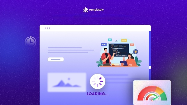
Website speed can make or break your Black Friday sales. According to BigCommerce Essentials, a one-second delay in loading time can lead to a 7% reduction in conversions, and with increased site traffic on Black Friday, speed becomes even more crucial. If your website does not load quickly, customers are more likely to abandon it and move on to a competitor.
Tips:
- Compress images without losing quality using tools like TinyPNG.
- Enable lazy loading for images and videos so they load only when scrolled into view.
- Minimize JavaScript, CSS, and other script files to reduce loading times.
2. Simplify the Checkout Process
One of the major causes of cart abandonment is a complex approach to checkouts. During Black Friday, shoppers are rushed and therefore any checkout should be as smooth and fast as possible. The Baymard Institute found that conversion rate benchmarks hover at around 70% of users abandoning their carts, primarily because of long and complex checkout procedures.
Tips:
- Reduce the number of steps in the checkout process.
- Enable guest checkout so users are not forced to create an account.
- Offer a variety of payment options like PayPal, credit cards, and mobile wallets.
3. Make Use of Urgency and Scarcity
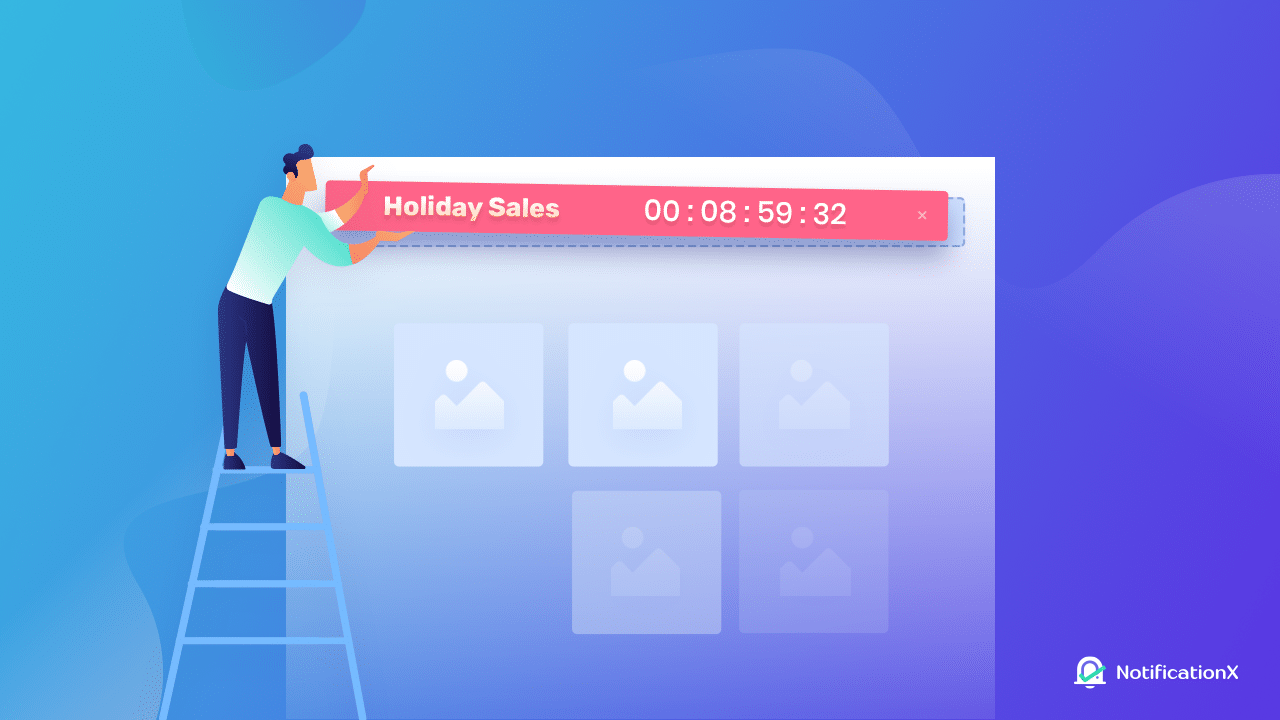
The sense of urgency and scarcity are two social proof techniques that encourage the consumer to make quick decisions when making a purchase. Things such as countdown timers, stock alerts, and any offers that are limited by time encourage shoppers to purchase as is the case with Black Friday.
Examples:
- Display a countdown timer for specific deals.
- Show the number of items left in stock for popular products.
- Highlight that certain discounts expire within a few hours or minutes.
4. Highlight Discounts And Promotions Clearly
With so many deals happening at once, it is crucial to make your discounts easily visible and stand out. To prepare your website design for Black Friday, you need to ensure that, when customers land on your website, they immediately see the best deals. This will entice them to explore further.
Tips:
- Use banners, pop-ups, and headers to showcase your Black Friday deals.
- Use contrasting colors or bold typography for promotional text.
- Avoid cluttering the page; focus on the most important deals to prevent overwhelming visitors.
5. Add Social Proof And Trust Elements

Including different aspects of social proof in your design helps to create trust by featuring customer reviews, ratings, and testimonials. According to GMR Web Team, 92% of potential buyers go through online shopping reviews before making a purchase decision. When potential consumers see that more people have bought from your store, they are more likely to buy from that store.
Tips:
- Display customer reviews and ratings near the product listings.
- Add trust badges, like “Secure Checkout” or “Free Returns,” on your product and checkout pages.
- Showcase studies or testimonials to reassure new visitors of the value your brand offers.
6. Focus on Black Friday-Specific Landing Pages
A Black Friday landing page also assists in enhancing the shopping experience. It provides an easy way for visitors to access the specials, leading to more chances of conversion. An effective landing page layout can help increase the number of sales and thus the level of interest.
Tips:
- Create a specific URL for your Black Friday deals page and promote it across channels.
- Organize deals by categories for easy browsing.
- Use SEO best practices to attract organic search traffic from users looking for Black Friday deals.
7. Enhance Mobile Responsiveness
Mobile commerce has become vital these days. More than 54% of Black Friday sales are made via mobile devices. (Source: EMARKETER)
Black Friday mobile sales are a necessity; therefore, your site has to be mobile-friendly and optimized for those users.
Tips:
- Ensure all images, buttons, and forms are optimized for mobile.
- Test your site on various devices to ensure easy navigation and fast loading.
- Simplify the layout to prevent mobile users from getting lost or overwhelmed.
8. Personalize User Experience
Making the shopping experience personalized can help increase sales by showing people exactly what they are interested in. Black Friday is the perfect time to use this idea to boost sales. For example, if someone has looked at certain products before, you can show those items first, or you might send special offers based on their interests. When people feel like the store understands what they want, they are more likely to buy.
Examples:
- Display personalized product recommendations based on browsing history.
- Use personalized email marketing to alert customers of relevant deals.
- Offer tailored discounts or bundles based on previous purchases or interests.
9. Incorporate Eye-Catching Visuals

Black Friday is all about driving attention, so your website should look eye-catching and exciting! Use clear, eye-catching images, fun videos, and small animations that match the Black Friday theme. This can make people curious to look around your site and see what is on sale. The more interesting it looks, the more likely they will stay and shop.
Tips:
- Use Black Friday-themed banners, headers, and pop-ups.
- Include video demos or tutorials for top products to enhance user understanding.
- Add interactive elements, like hover effects or image sliders, to make the shopping experience more engaging.
10. Use Clear Calls to Action (CTAs)
Strong CTAs guide visitors to take action, whether it is to “Shop Now”, “Get 50% Off“, or “Claim Your Deal”. The right CTA can significantly boost conversions by clearly directing visitors to what you want them to do next.
Tips:
- Use action-oriented language and make CTAs prominent and visually distinct.
- Position CTAs strategically on product pages and the checkout page.
- Test different CTA placements and wording to find the most effective combinations.
[Free & PRO ] WordPress Templates for Black Friday Website Design
Are you looking forward to an easy and no-coding solution for Black Friday website design? We are here to help you. You can use ready templates for Black Friday from one of the most popular WordPress template clouds – Templately. It offers 5000+ ready templates with amazing designs, perfect for creating stunning websites that make a lasting impression. You can check out the FREE templates for Black Friday to give your website a refreshed outlook for the biggest shopping season of the year.
| Black ESALE [FREE] | FlashFriday [FREE] |
| Monoculus [FREE] | BlackNov [PRO] |
| BFriday [PRO] | |
Remember, the competition is fierce, and capturing customer attention requires a combination of speed, design, and usability. To help you get started, we have shared the free templates for Black Friday, incorporating all the tips above. Get started with them now, and give your customers an unforgettable shopping experience that will keep them coming back.
Get Your Website Ready for the Busiest Shopping Season of the Year
Preparing your website for the holiday shopping rush is essential to maximizing sales and providing a seamless experience for your customers. Through performance optimization, enhancing user experience, and utilizing effective marketing strategies and tools, you will be ready to handle the high traffic and increase conversions. Start implementing these strategies now to make this shopping season your most successful yet.
Was this blog helpful for you? Do share your thoughts and subscribe to our blogs for more insights, tips, and design hacks.


